35 Checkerboard Tile Bathroom Designs Taking Over Homes
Black and white squares are not a fad, and a checkerboard tile bathroom is the clearest proof. The pattern has outlasted Dutch painters, Dorothy Draper’s hotel lobbies, and every minimalist phase since, and it’s climbing again in renovation briefs and saved-pin folders.
Below are 35 ways to do it, from 1-inch mosaics to 24-inch marble. Each one comes with the sizes, materials, and mistakes that decide whether a floor looks intentional or like a chess set dropped in a closet.
Why a checkerboard tile bathroom is everywhere right now
The short answer: after a decade of gray-on-gray bathrooms, people want pattern that isn’t wallpaper. A checkerboard floor gives graphic punch without a single trend-dependent motif, and it works in a 4 x 6 foot powder room as well as a 150-square-foot primary bath.
Several forces are pushing it along:
- The grandmillennial and Parisian-apartment revival, both built on black and white floors.
- A swing toward honest materials like honed marble, terracotta, and handmade ceramic.
- Small bathrooms becoming the one room where homeowners will gamble on a bold floor.
- Better porcelain that copies stone convincingly, which lowers the risk of committing.
Light decides how all of this lands. A floor that looks crisp at 8 a.m. under a bright east window can turn muddy at 9 p.m. under a single dim bulb, so each idea below pays attention to where the windows are and what the lamps do.
1. 12-inch black and white marble squares
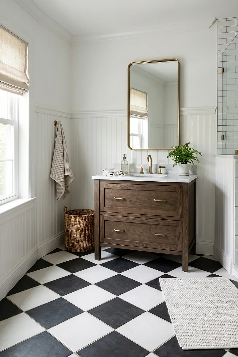
A 12-inch square is the proportion that reads as checkerboard instead of noise in a standard 5 x 8 foot bath. That room takes about 40 tiles, so the pattern repeats often enough to feel deliberate.
It suits owners who want the classic version and the resale appeal that comes with it. Real Carrara and Nero Marquina run roughly $15 to $30 per square foot before labor.
Order 10 to 15 percent extra, because marble veining varies and cuts at the walls eat tiles.
2. Matte porcelain squares for a kids’ bathroom
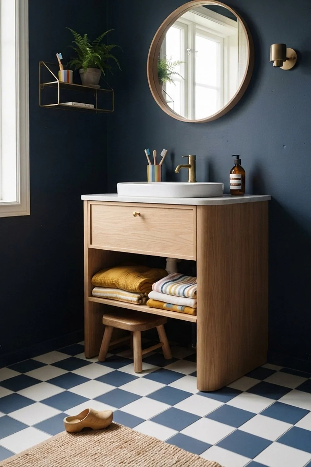
Matte porcelain in 8-inch squares survives a toddler’s bath-time flood far better than polished stone. The surface grips bare feet, and the glaze won’t etch when someone spills bubble bath.
Look for a wet DCOF rating of 0.42 or higher on the spec sheet, the standard threshold for wet interior floors. It matters most for families and for anyone planning to stay in the house into their seventies.
Skip anything labeled “high-gloss” for this room, no matter how good it looks in the showroom.
3. Honed finish under a skylight
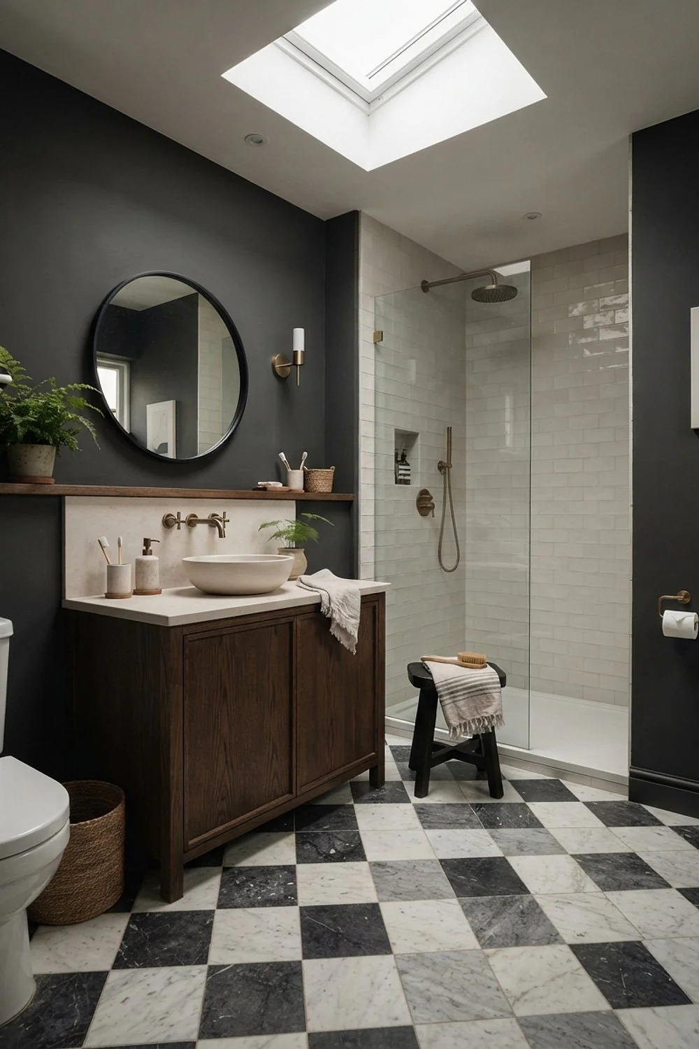
Polished black tile under a skylight gleams like the side of a toaster at noon, and every water droplet shows. A honed finish scatters that overhead light into a soft, even surface.
This is the right call for top-floor baths and any room with a roof window. The trade-off is that honed marble absorbs more, so it needs a penetrating sealer before grout goes in.
4. Centering the pattern on the doorway
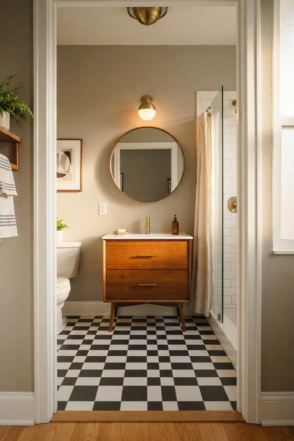
Starting the first row at the wall instead of the door line is how a floor ends up with slivers of half-squares greeting everyone who walks in. Snap a chalk line from the center of the threshold and dry-lay the grid before any thinset is mixed.
Aim for cut pieces at least half a tile wide along the walls. Anything under 2 inches looks like a mistake, and it will be the first thing guests notice.
5. Handmade zellige-style squares
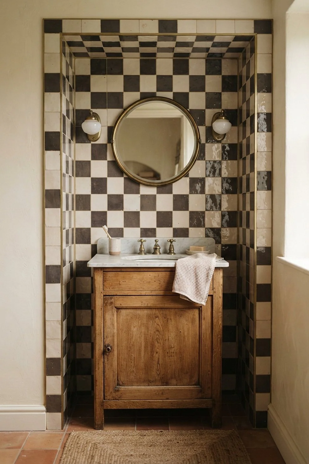
Hand-glazed zellige squares wobble by a millimeter or two, and that wobble is the entire appeal. Light slides across the tilted surfaces so the floor never looks flat, even in a dim room.
They suit people who prefer a lived-in feel to showroom precision. Expect $20 to $45 per square foot, and confirm the specific tile is rated for floors, because many handmade ones are wall-only.
6. Diagonal layout on a narrow bath

Turning the grid 45 degrees makes a long, narrow room read wider, because the eye travels corner to corner instead of straight down the tub. A 5 x 9 foot bathroom is basically a shoebox, and the diamond layout loosens it up.
Plan for about 15 percent waste instead of 10, since every edge becomes an angled cut. It’s worth it for galley layouts, less so for square rooms where the effect is lost.
7. Closed drawers instead of open baskets
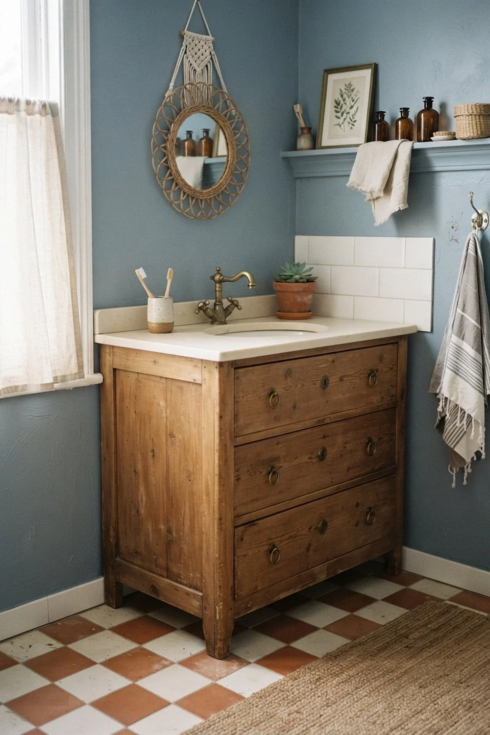
A checkerboard floor gets noisy fast when three cleaning bottles and a laundry hamper sit on it. A wall-hung vanity with closed drawers does more for the pattern than any grout upgrade.
Floating vanities also expose more floor, which makes a small room look larger. Just remember the wall needs 3/4-inch plywood blocking behind the drywall to carry the weight of a stone top.
8. Sage green and cream
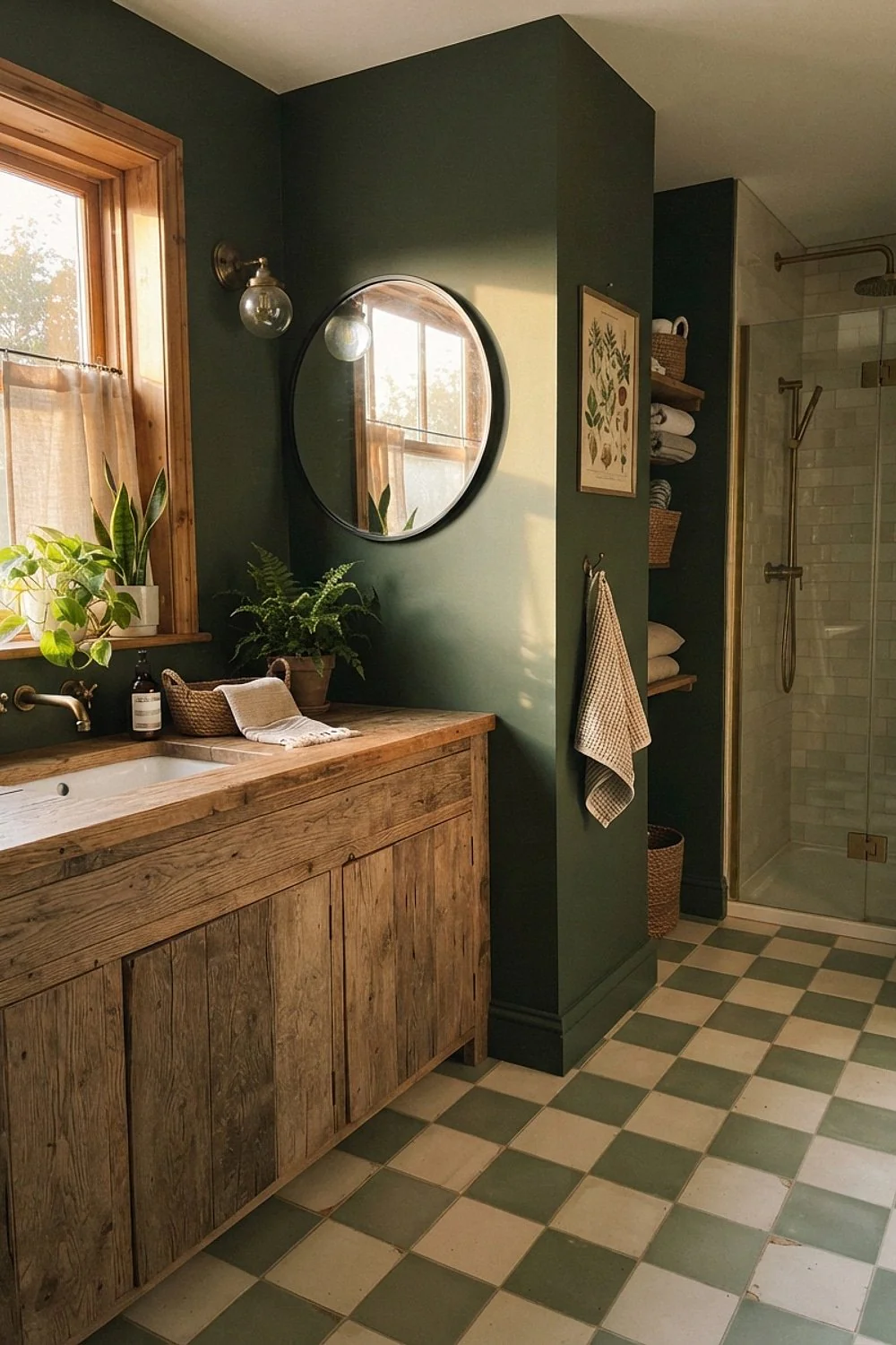
Sage and cream squares calm the pattern down, which suits north-facing bathrooms that already lean cool and gray. The two tones sit close in value, so the floor reads as texture rather than a graphic.
Pull room colors from the adjoining hallway so the bathroom feels like part of the house. Test a full 12-inch sample at the actual floor for a day, since sage shifts toward blue in cold light.
9. Unlacquered brass against black and white
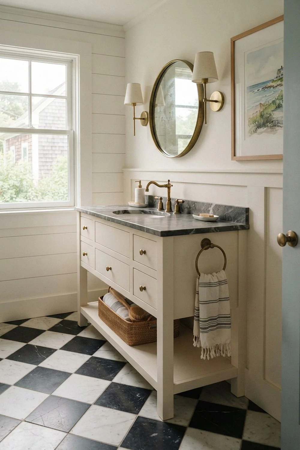
An unlacquered brass faucet gives a black and white floor a middle tone to rest on. Within a few months it darkens to a soft brown, and that aging is the point.
It suits people who don’t mind a little polishing. Anyone wanting a fixed color should choose lacquered or PVD-finished brass instead, because the patina can’t be paused once it starts.
10. Radiant heat mat under the tile
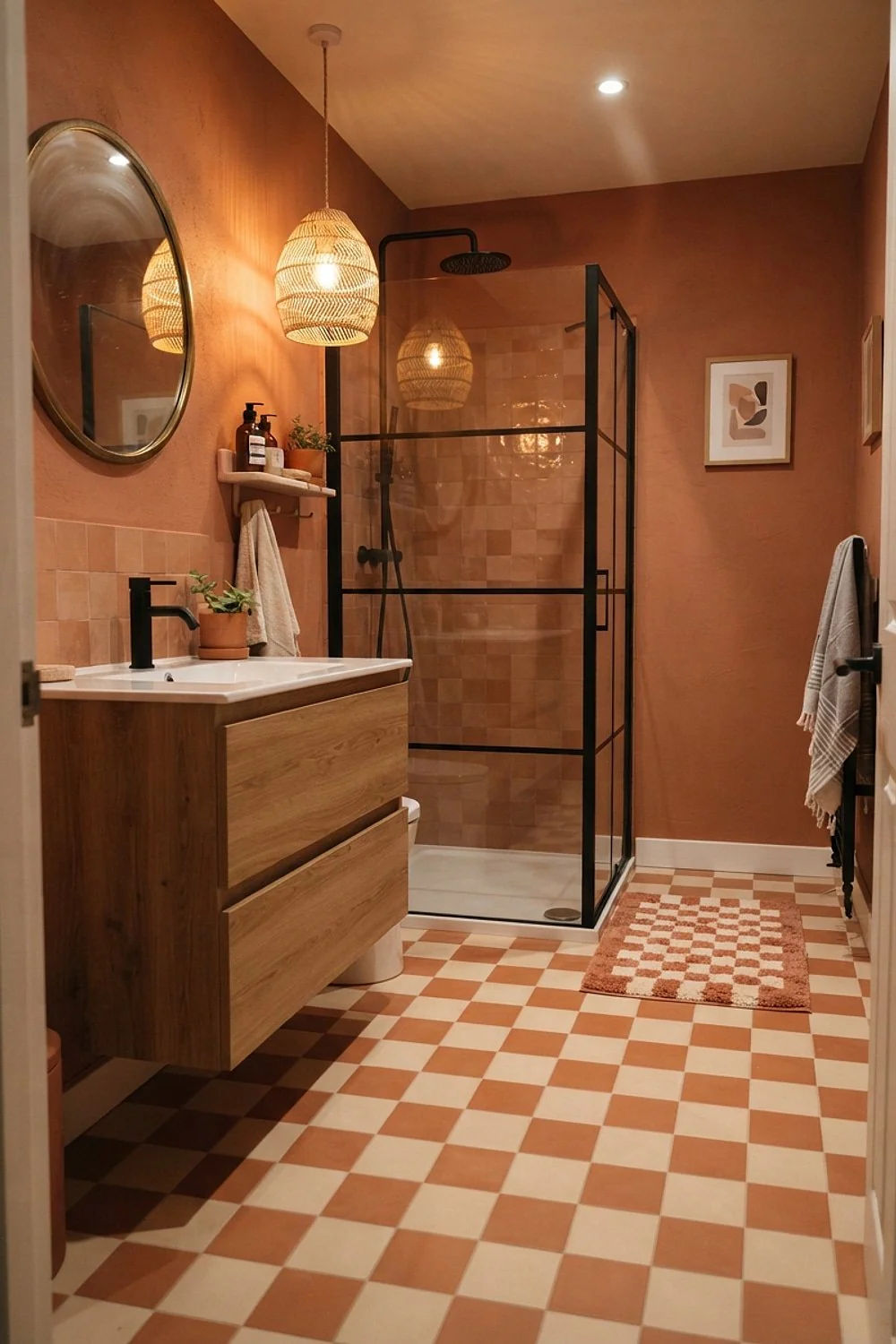
Marble can sit in the low 60s Fahrenheit during a February cold snap, and bare feet notice immediately. An electric mat under the tile brings the surface to a comfortable temperature in about 30 minutes.
A mat for a 40-square-foot floor often runs a few hundred dollars before installation. Put it on a timer and a floor sensor, and install it before the tile, because retrofitting means pulling everything up.
11. 24-inch squares in a small bath

Large squares look bigger in a small room, which sounds backwards. With only two and a half tiles across a 5-foot width, there are fewer grout lines to chop up the floor.
This works for someone who likes a quiet, gallery feel. Center a full tile in the room and keep edge cuts above 6 inches, and check flatness carefully, since big tiles show lippage.
12. A 2-inch checkerboard shower pan

A shower floor in 2-inch squares follows the slope to the drain without awkward cuts, and the dense grout lines give wet feet extra grip. The pattern also carries the bathroom floor into the shower.
It suits anyone who wants continuity without a seam. The catch is cleaning, so choose epoxy grout, which resists staining far better than cement-based grout in a daily-use shower.
13. 2700K sconces beside the mirror

Warm 2700K bulbs turn white squares butter-yellow in the evening, which is flattering at 9 p.m. and slightly sleepy at 7 a.m. Anyone who wants the white to stay crisp should choose 3000K instead.
Mount sconces at about 60 to 66 inches high, level with the face. This is the fix for bathrooms where the floor looks great in daylight but dingy after sunset.
14. Mid-gray grout between the squares

White grout around black tile draws a bright net across the floor and makes the pattern look jittery. A mid-gray grout sits between the two tones and lets the squares do the work.
The mistake is picking grout from a tiny chip, which always looks lighter once it’s laid. Make a sample board with 3 or 4 grout colors and compare them in the room.
15. Terracotta and cream
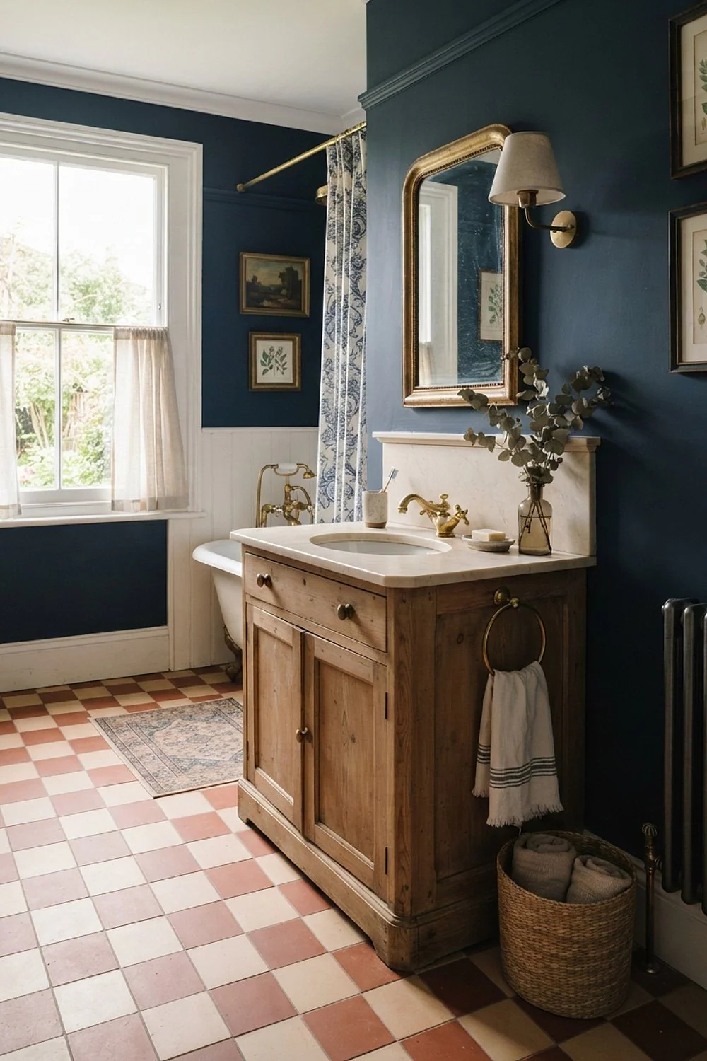
Unglazed terracotta paired with cream squares gives a Mediterranean checkerboard that feels like a farmhouse in Provence. The clay has a slightly chalky surface that photographs beautifully in afternoon sun, and the warm orange against cream keeps contrast gentle rather than stark.
It suits older homes and rooms with timber or plaster walls, where the earthy tones echo the materials already present. Seal it twice before grouting, because raw cotto soaks up soap and shampoo and will stain without protection. Skip it in a heavy-use family bath unless regular resealing is realistic.
16. A checkerboard inset framed by plain tile
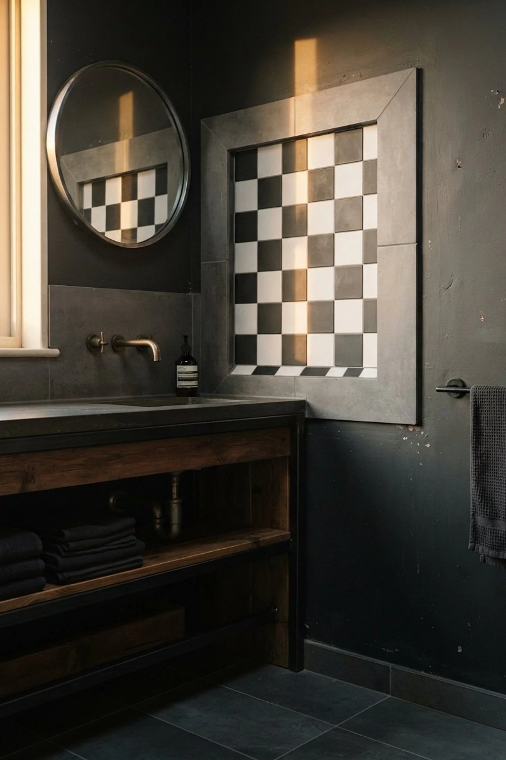
A 4 x 6 foot checkerboard panel set into a plain white or gray floor behaves like a built-in rug. The 4-inch solid border around it keeps the edges tidy and makes the cuts forgiving.
This is the move for large bathrooms where a full-field pattern would overwhelm, or for anyone nervous about committing. Place the inset in front of the vanity or tub, where eyes land first.
17. A pattern-lined shower niche
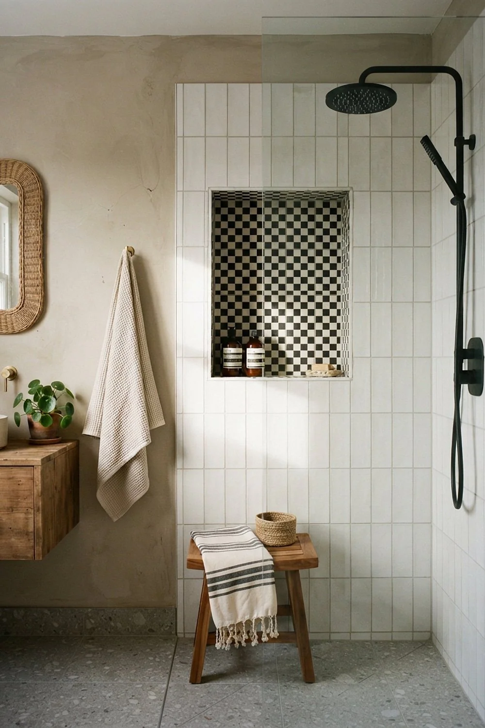
A niche between two studs on 16-inch centers is about 14 inches wide, and lining it with 1-inch checkerboard mosaic makes a tiny graphic moment. It also hides the shampoo bottles’ clutter better than a plain white box.
It suits modern walk-in showers with calm walls. Slope the niche floor slightly outward, because a flat shelf holds water and breeds mildew within a season.
18. Navy and white squares
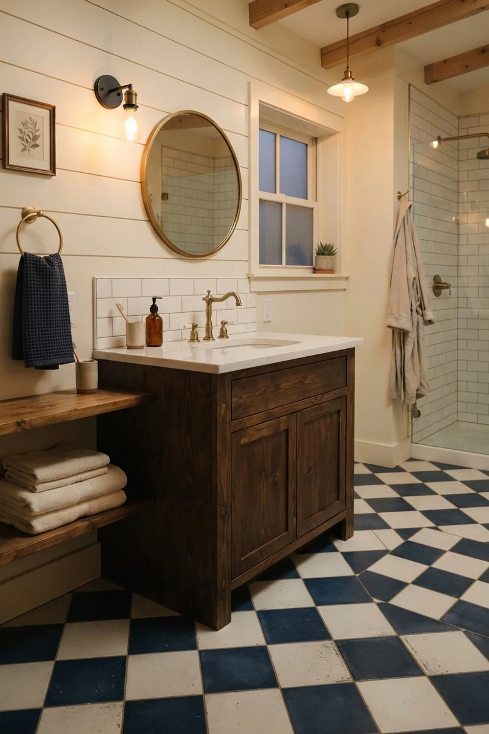
Navy reads nearly black at night but shows its blue in 8 a.m. light, so a navy and white floor shifts through the day. That’s a bonus in a bathroom used morning and evening.
Pair it with walls in a deep navy such as Benjamin Moore Hale Navy only if the room has a real window. In a windowless bath, navy walls plus navy tile will feel like a cellar.
19. A clawfoot tub painted glossy black
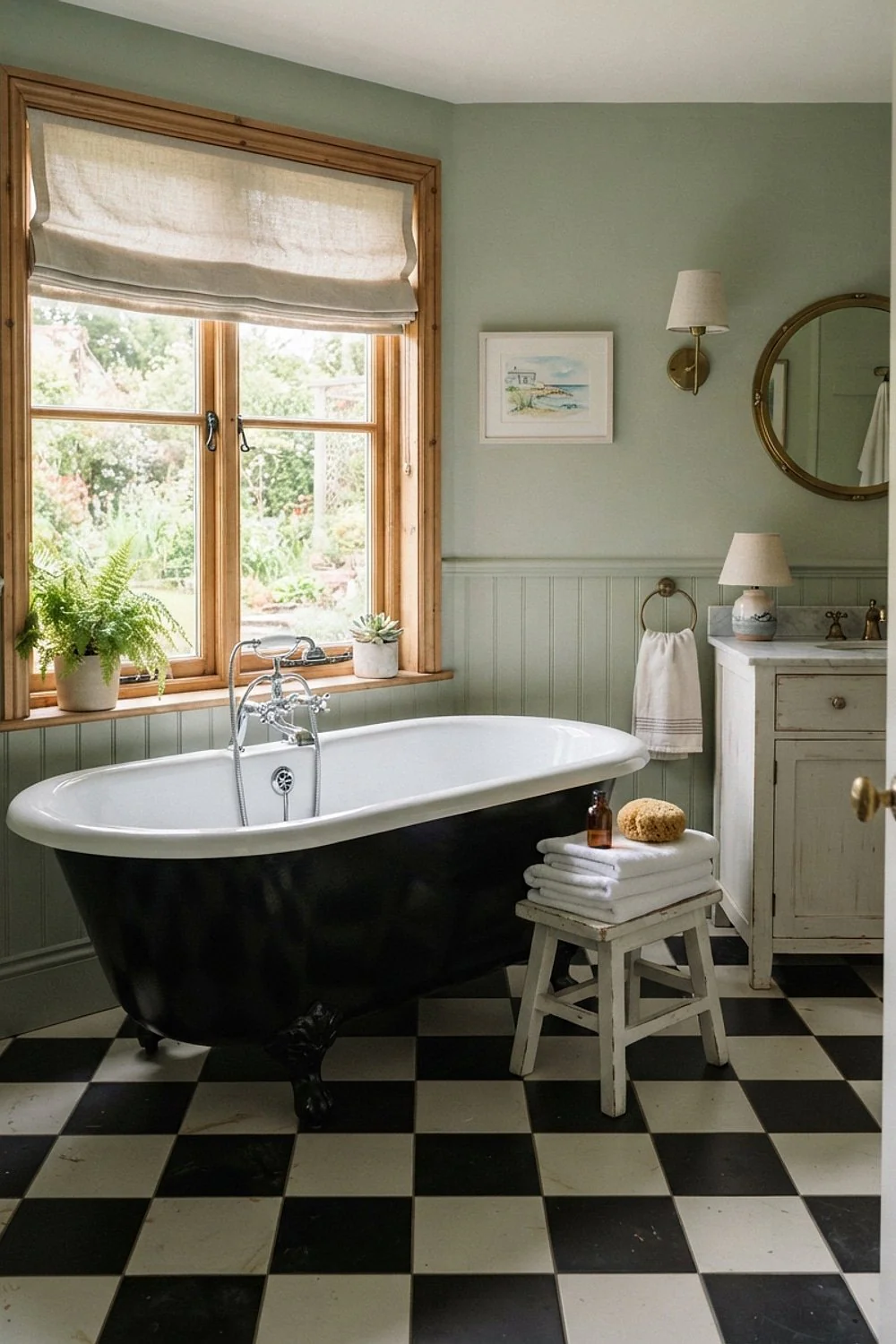
The outside of a clawfoot tub is a blank canvas, and glossy black paint turns it into a sculptural object on a checkerboard floor. The curves soften all those hard right angles.
It works best in bathrooms of at least 8 x 10 feet. Use an enamel formulated for tub exteriors and keep it off the interior, where water and soap will peel ordinary paint.
20. A washable cotton runner

A 2 x 6 foot flat-weave cotton runner breaks up the grid and gives wet feet somewhere soft to land. Stripes in cream and charcoal echo the squares without competing, so the rug reads as part of the scheme.
Plan on $40 to $80 and choose one that goes in the washer, which suits busy households where bath mats get damp daily. Avoid thick shag, which hides the floor you paid for and holds moisture against the grout.
21. 1-inch mosaic on a vanity backsplash
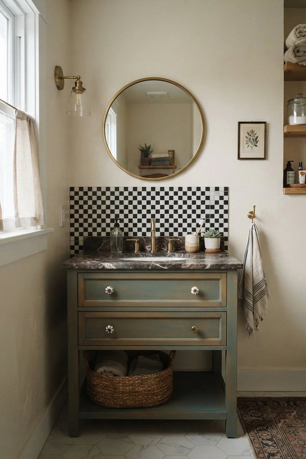
Mesh-mounted 12 x 12 inch sheets of 1-inch squares make a quick backsplash with a lot of detail. A 6-inch band behind the sink is plenty, and it saves the pattern from taking over.
It suits small powder rooms where the floor stays plain. The grout lines multiply, so keep it to splash zones and finish the top edge with a clean trim.
22. Mid-gray and white in a mudroom half bath
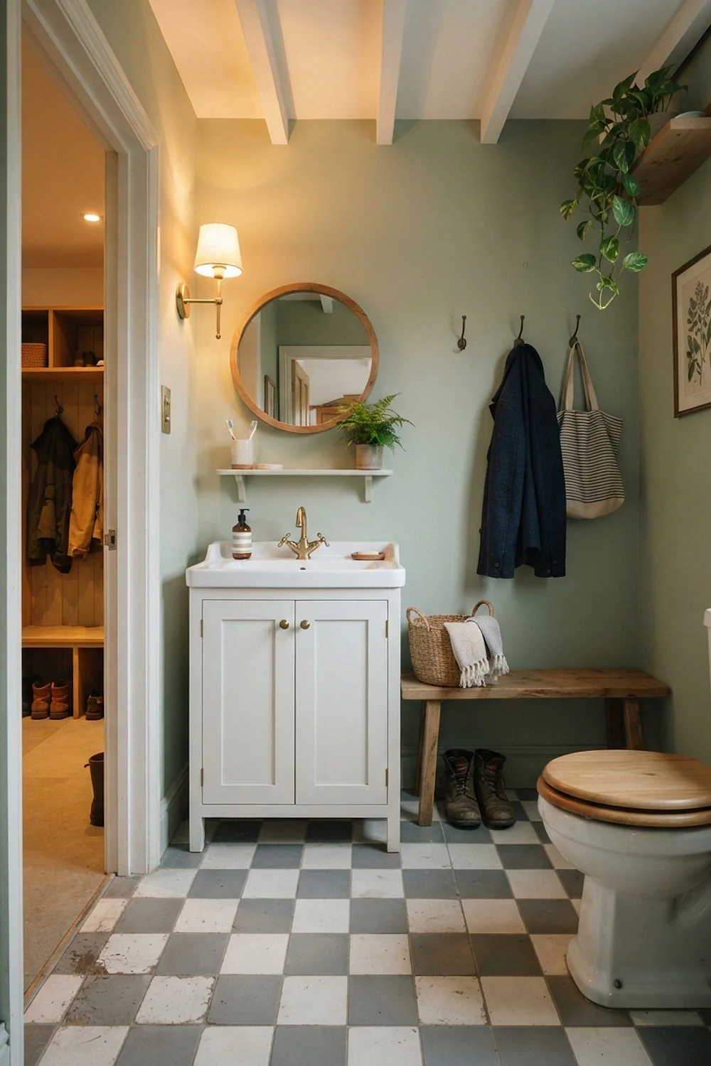
Pure black and white shows every speck of dirt and pale lint, which is rough in a half bath near the back door. A mid-gray and white checkerboard hides dust and tracked-in soil much better.
It’s the practical option for households with muddy boots and dogs. Pick a matte porcelain at 12 inches, and sweep once a day instead of mopping every time.
23. Cream and greige in a windowless bath

With no daylight, high contrast looks harsh under overhead bulbs. A cream and greige checkerboard keeps the pattern but softens it, so the room feels calm instead of clinical. It suits interior baths, basements, and converted closets where the tile has to carry the mood alone.
Use layered lighting: sconces at the mirror plus a dimmable ceiling fixture. The mistake is relying on one recessed can, which casts shadows across every grout line.
24. Peel-and-stick squares near a tub
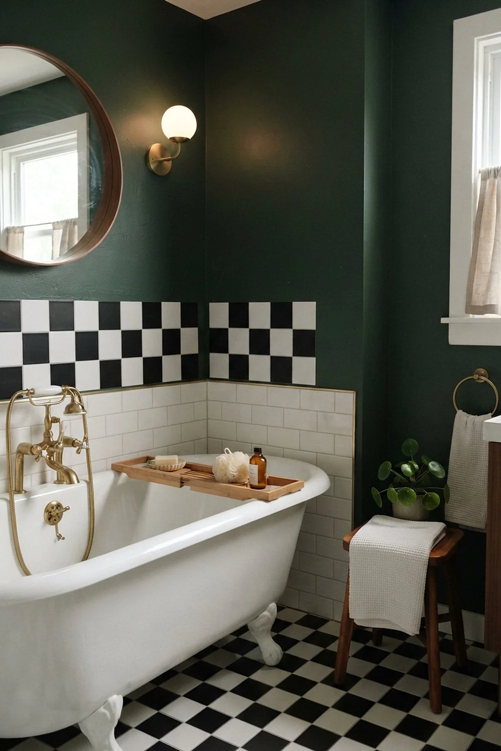
Peel-and-stick vinyl at about $2 to $4 per square foot is tempting, but the edges curl where steam and splashes collect near the tub. Within a year the corners lift and trap grime.
It only suits a dry powder room or a short-term rental. Roll the tiles firmly with a hand roller and keep a 1/4-inch gap from the tub edge, filled with silicone.
25. Sealed cement encaustic tile
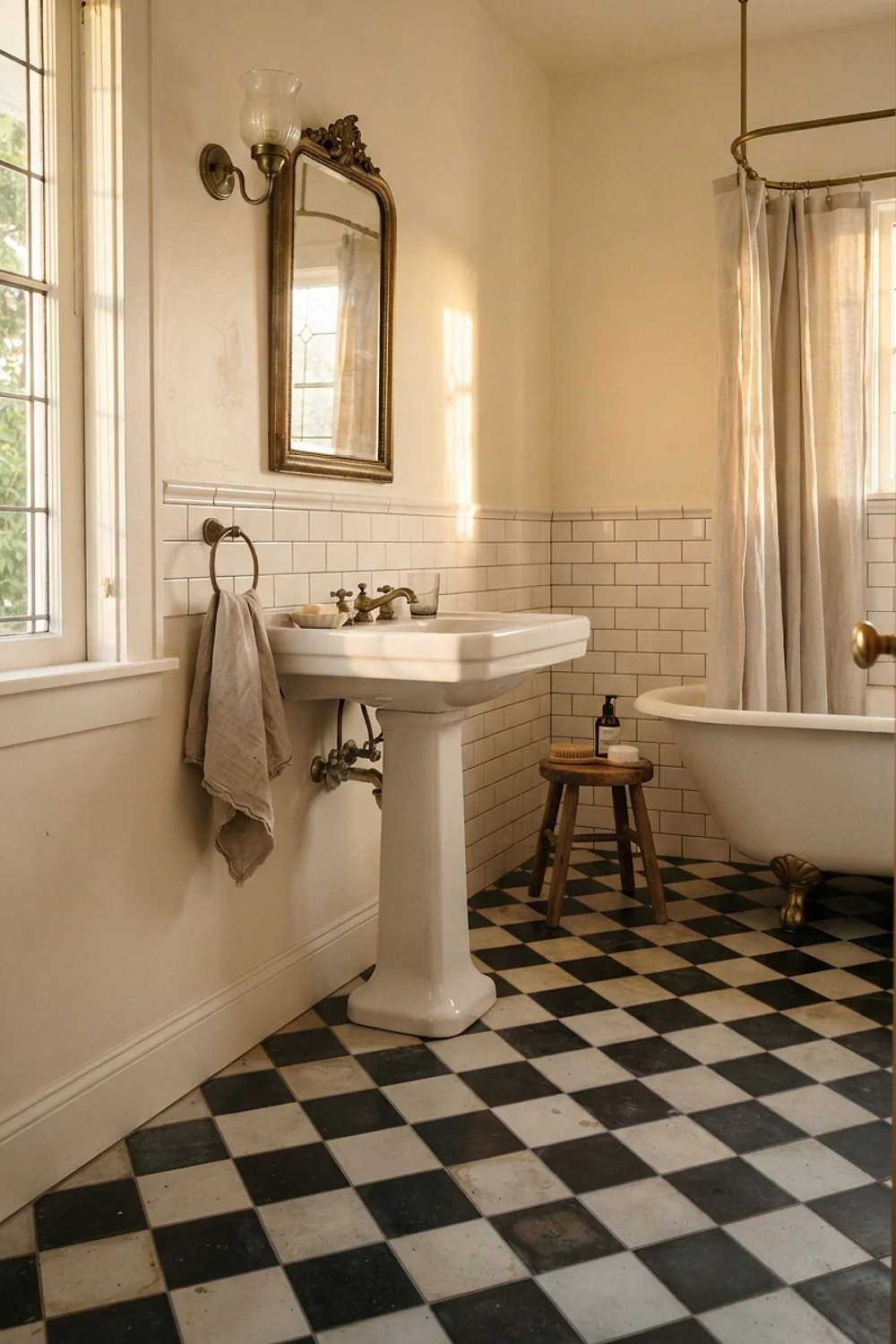
Cement tiles have soft, slightly dusty colors that no printed porcelain quite matches. The pigment sits in the body of the tile, so wear is invisible, and scuffs blend into the character instead of showing as chips.
They suit anyone who loves a patina and doesn’t mind maintenance. Seal before and after grouting, and use a pH-neutral cleaner, because acidic products eat the surface. Skip them for anyone who wants a wipe-and-forget floor.
26. Checkerboard wainscot to 36 inches

Running the pattern up the wall to chair-rail height, about 36 inches, gives a vintage look without covering a whole room. A painted ledge cap finishes the top edge neatly and gives a spot for a small vase or soap dish.
This is for traditional homes with high ceilings, where the pattern needs somewhere to go. Paint above it in a flat finish so the tile stays the focus. Avoid a cap line that lands at an awkward height against a window sill.
27. A built-in linen cabinet painted to match
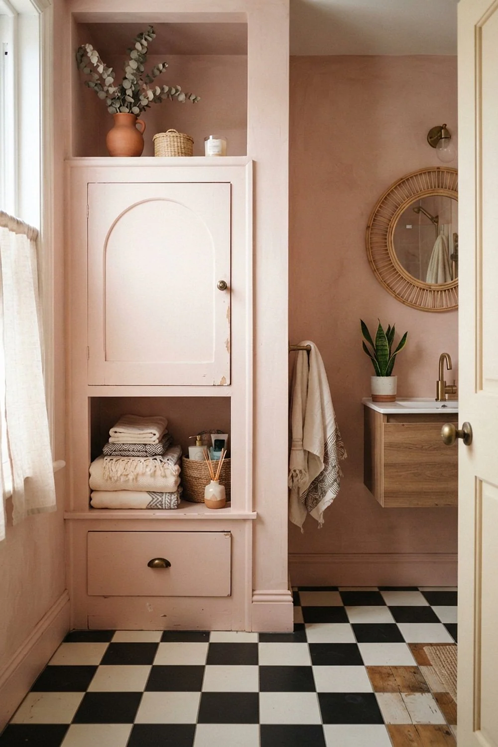
A tall cabinet painted in one of the floor’s two colors disappears into the pattern. Painted black, it reads as a strong vertical, and painted white, it vanishes against the wall. The color match is what lets a bulky piece feel like architecture.
It gives families the storage they need without breaking up the checkerboard with random furniture. Use a cabinet at least 12 inches deep so towels fit flat, and measure the door swing first so the cabinet never blocks it.
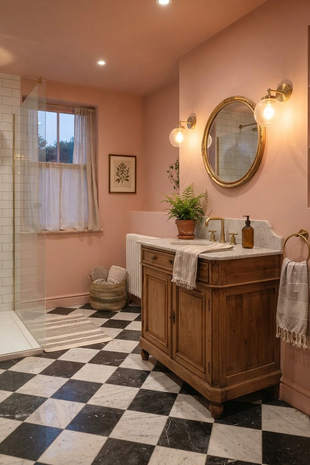
28. Blush pink and white
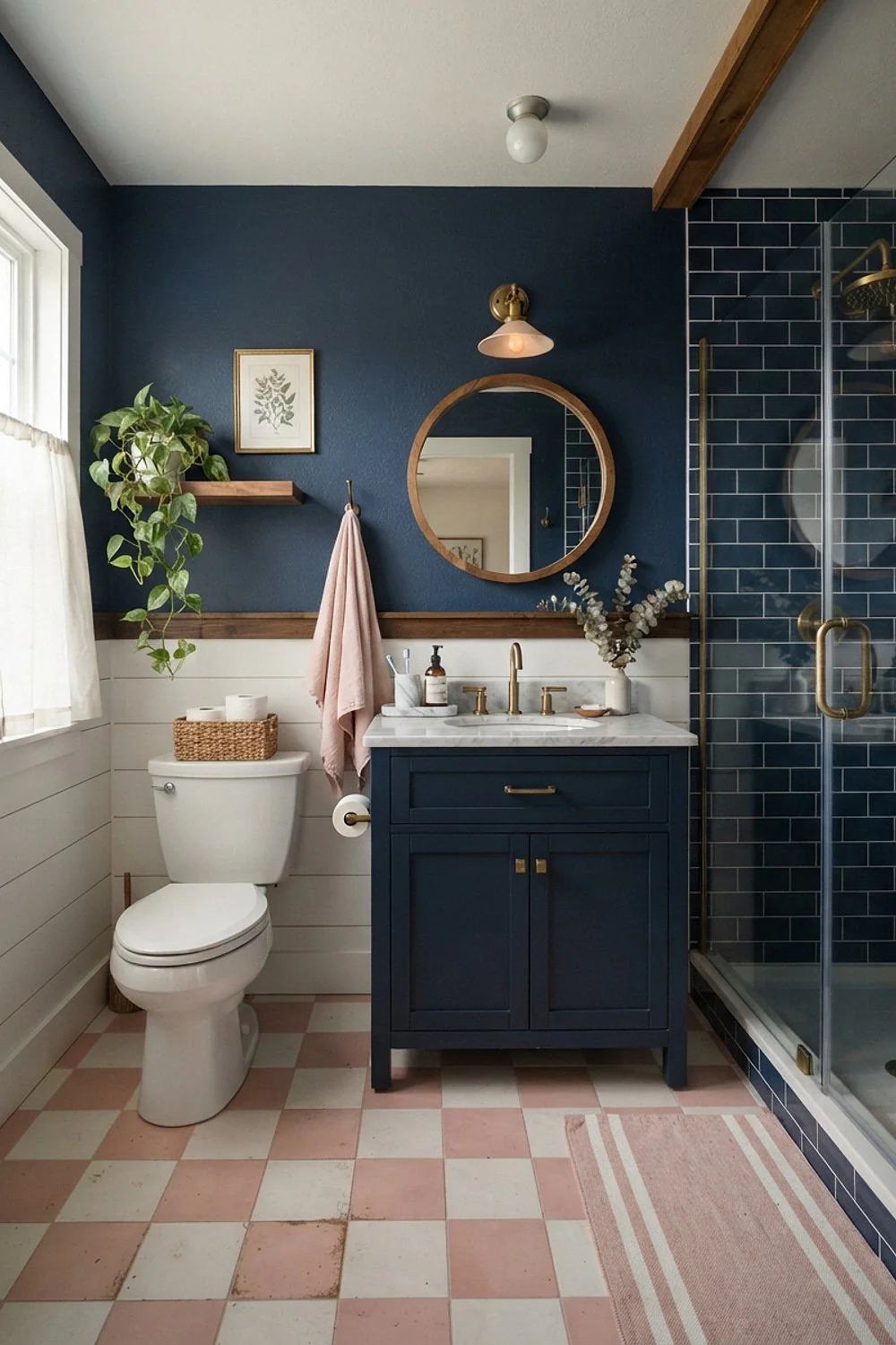
Blush and white squares are the softest entry into checkerboard, with enough color to feel fresh and not enough to feel juvenile. The low contrast also keeps water spots and dust far less visible than black and white does.
It’s a good fit for powder rooms and other rooms where guests wash up. Pull other room colors from the same family, like cream walls and a warm wood mirror frame. Avoid cool pinks, which turn chalky next to gray fixtures.
29. A skirted vanity over the checkerboard
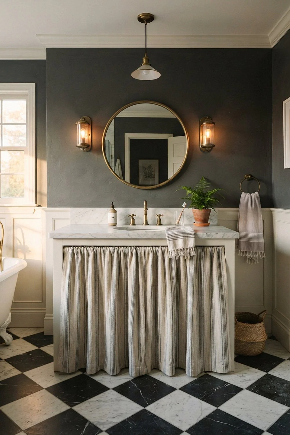
A cotton ticking skirt around a pedestal sink gives the floor a cottage-style partner. The soft fabric offsets the hard tile and hides the plumbing underneath, while the ticking stripe adds a gentle line against the squares.
It works for small rooms such as a powder room, where there’s no space for cabinetry. Choose a skirt that stops 1 inch above the floor so air can circulate, and use a quick-dry fabric, because a damp hem will go musty.
30. Honed limestone and white
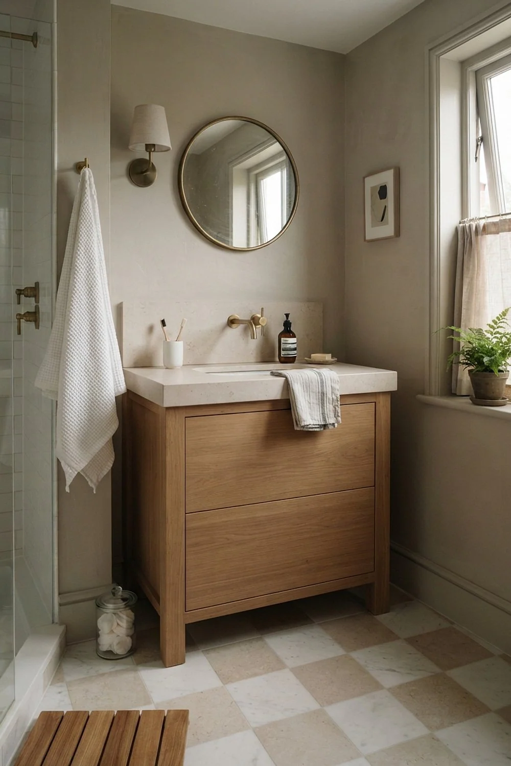
Honed limestone feels slightly silky underfoot, while glazed porcelain feels glassy. The gentle difference is noticeable every morning on bare feet, and the matte surface also looks calmer than polished stone.
Pair limestone with white marble for a softer take on checkerboard, a good match for a primary bath where the floor gets gentle use. Keep acidic cleaners, shampoo drips, and anything with vinegar away from it, since limestone etches easily, and wipe spills promptly.
31. A two-square border around a plain field
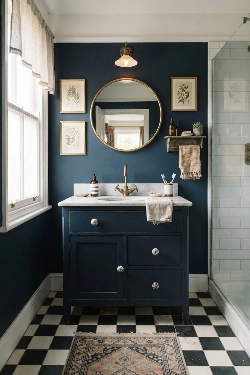
A band of checkerboard just two squares wide around a plain center is a gentler way to use the pattern. It frames the room like a picture mat, and the plain field keeps the busy part to the perimeter.
It suits people who like order and a more restrained look. Keep the squares at 4 to 6 inches so the border has enough repeats to read as a pattern, and plan the layout so the plain field meets the border without thin slivers.
32. Luxury vinyl checkerboard for a basement bath
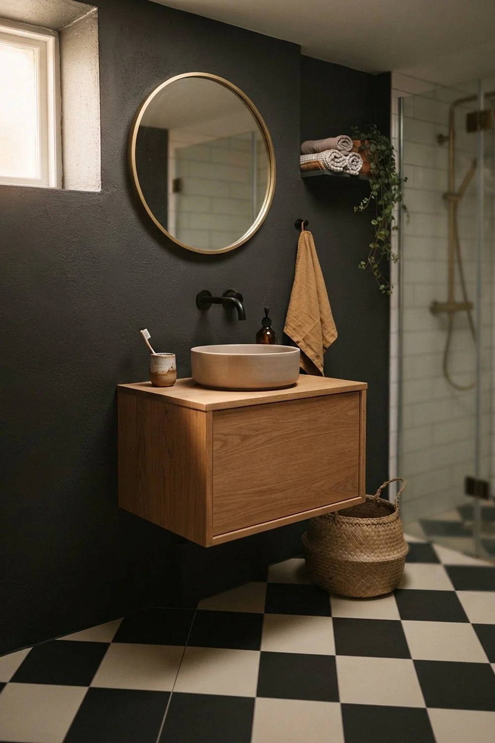
Basement slabs hold moisture, and wood or natural stone can suffer. Rigid-core luxury vinyl tile in checkerboard costs around $3 to $7 per square foot and tolerates damp concrete better.
Test the slab for moisture first, and use a vapor barrier if needed. This is the best fit for lower-level guest baths where durability matters more than a stone finish.
33. East-facing window and low morning sun
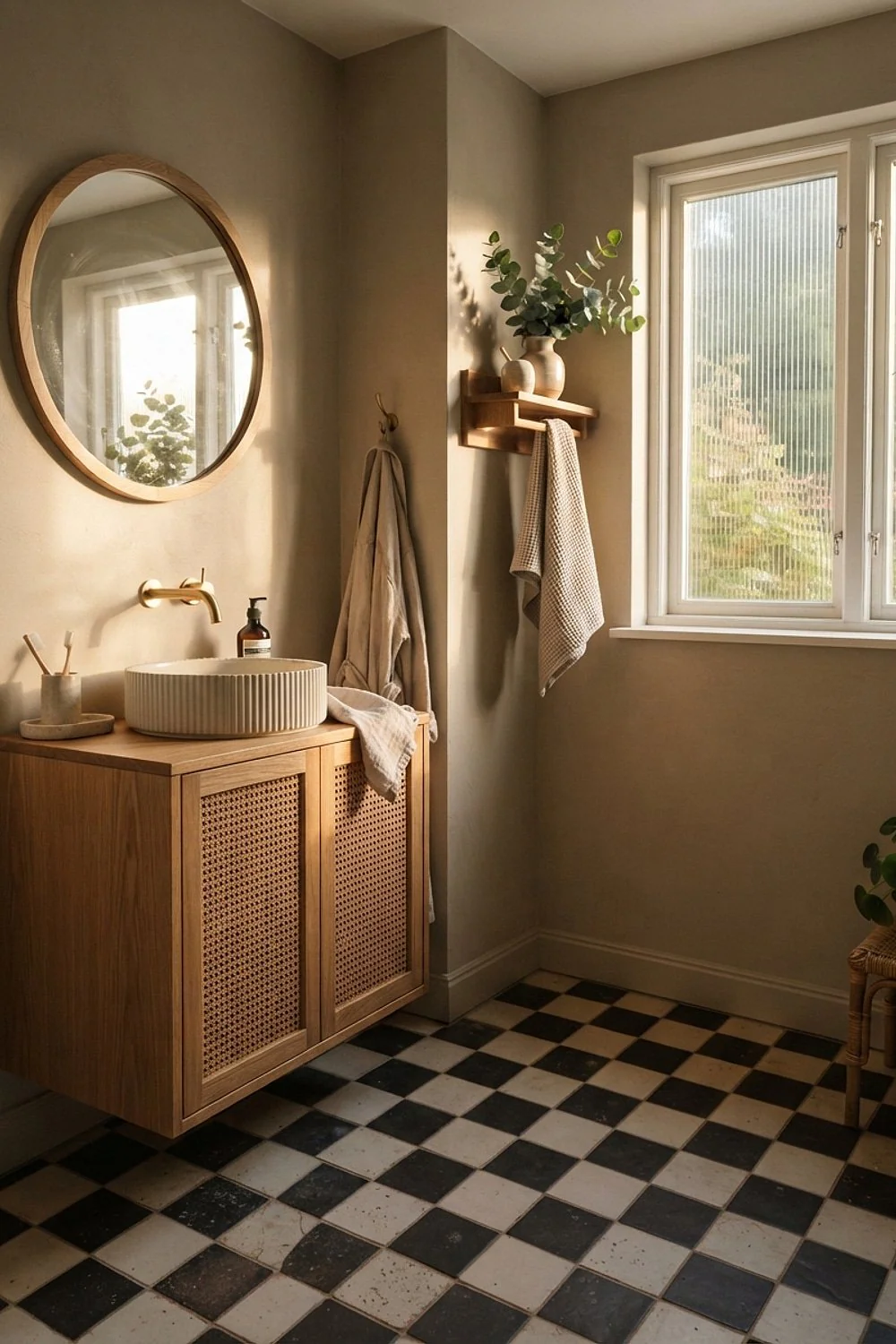
At 8 a.m. the sun comes in low from the east and rakes across the floor, which exposes every uneven tile edge. Honed finishes and thin grout joints handle it better.
This matters most to people who care about crisp lines. Ask the installer to check for lippage before the grout goes in, because it’s invisible at noon and obvious at breakfast.
34. Plain plaster walls, no wallpaper
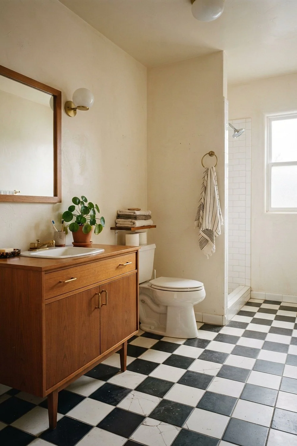
Checkerboard plus busy wallpaper is a fight neither wins. The floor already supplies the graphic, so walls in limewash or matte plaster let it breathe, and the soft texture adds depth without adding pattern. This approach suits renovators who want the floor to be the star.
If wallpaper is non-negotiable, pick one with a scale far from the squares, such as a large, loose botanical. Matching two geometric patterns almost always looks accidental, especially in a small bath where both are seen at once.
35. Terrazzo-look and white squares
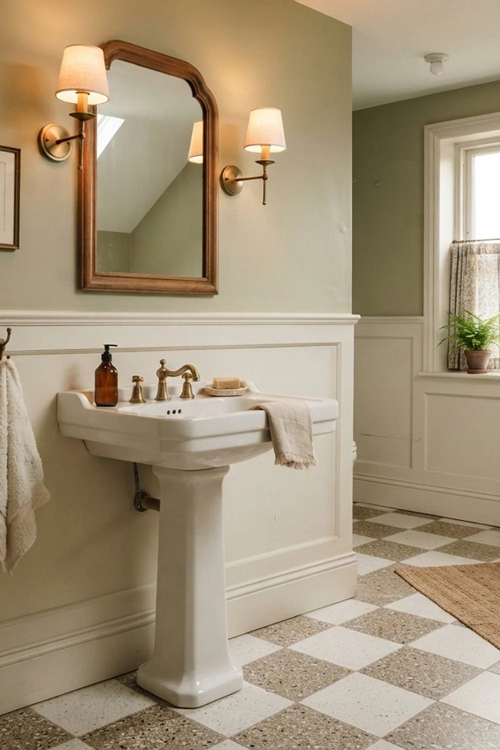
A speckled terrazzo-look porcelain alternating with plain white gives checkerboard a quieter, more modern feel. The flecks break up the contrast and hide dust, too. Porcelain also shrugs off water and stains, so it handles a busy family bath well.
It suits contemporary and mid-century homes. Pick a speckle small enough that it doesn’t look like confetti at the 12-inch scale, and order from a single dye lot so shades match across the whole floor.
Putting the space together
A checkerboard tile bathroom is easy to love in a photo and easy to botch on site. Most regrets come from the same few decisions, and each one is cheap to fix before the tile is on the floor.
Work through these steps in order:
- Measure the room and sketch the grid with a door-centered start line.
- Pick the tile size from the room: 8-12 inches for most baths, 24 inches only if the room is calm.
- Buy a full-size sample and look at it at 8 a.m. and again at 9 p.m.
- Choose a grout color from a sample board, not a chip.
- Order 10 to 15 percent overage and keep the leftovers.
Dry-lay first.
Leftover tile can also finish an outdoor shower wall, a small piece of backyard decoration that ties the house to the garden. Check the frost rating first if winters get cold.
DIY saves labor, but in a small bath the labor often rivals the tile cost, and a crooked grid is permanent. Hire a tile setter for the layout even if the rest is done by hand.
What’s fading out
As a checkerboard tile bathroom climbs, a few older habits are quietly leaving. Here’s what’s losing ground:
- All-gray bathrooms, where the floor, walls, and vanity share one cool tone.
- Wood-look porcelain planks in wet rooms, which now feel generic.
- Glass mosaic accent strips that stripe a wall at eye level.
- Matching bath sets, with rug, towel, and soap dish in one color.
The shared thread is blandness. People are tired of rooms that look pre-approved, and pattern, texture, and a bit of imperfection are filling the gap.
Where to start
A checkerboard tile bathroom pays off when the squares suit the room’s size, light, and daily traffic. Pick the finish for the windows, the colors for the walls, and the grout for the long haul.
Save or pin this list so it’s handy when tile shopping begins. Then pick one idea to try first, and measure the floor and the door line before ordering a single box.
Frequently asked questions
What size squares work best in a small checkerboard tile bathroom?
Squares of 8 to 12 inches suit most small baths, because the pattern repeats enough to look intentional. Go to 24 inches only if you want a quiet, minimal feel and can keep edge cuts above 6 inches.
Is a checkerboard floor hard to keep clean?
Not if the finish is right. Matte porcelain with epoxy or well-sealed grout wipes clean with a damp mop, while pure black and white shows dust, so mid-tones hide it better.
How much does it cost to tile a bathroom floor in checkerboard?
Material ranges from about $3 per square foot for vinyl to $30 or more for real marble, plus labor. Layout adds cuts, so expect a setter to charge more than for a straight grid.
Will a checkerboard tile bathroom hurt resale value?
A well-executed checkerboard tile bathroom in neutral tones rarely hurts and often helps, because the pattern has been popular for centuries. Bold colors or messy layouts are what put buyers off, so keep the palette classic.