
28 Dark Academia Study Ideas With Moody Paint Pairings
Dark walls win. Every one of these dark academia study ideas starts with a color decision, and the wrong undertone turns a candlelit library into a damp cellar by 4pm on a gray October afternoon.
Below are 28 palette and undertone pairings with named paint colors, then a method for testing them and a rescue plan if a wall lands badly. Choose by light direction and daily wear, not by how a photo looked.
Dark academia study ideas: The vision board
A convincing dark study follows a narrow formula. Use low-chroma darks with warm or green-leaning undertones, and add one pale color so the eye has somewhere to rest.
- Walls: a dark color with a light reflectance value under about 12, in eggshell or satin.
- Wood: one dominant tone, usually walnut, oak or mahogany.
- Metal: aged brass, pewter or black iron, never more than two.
- Light: bulbs between 2200K and 2700K, ideally on a dimmer.
Durability quietly decides most of these choices. A study that handles kids, dogs and daily elbows needs a scrubbable finish and full-grain materials, so each pairing below names what holds up.
1. Studio green walls with a tonal bookcase
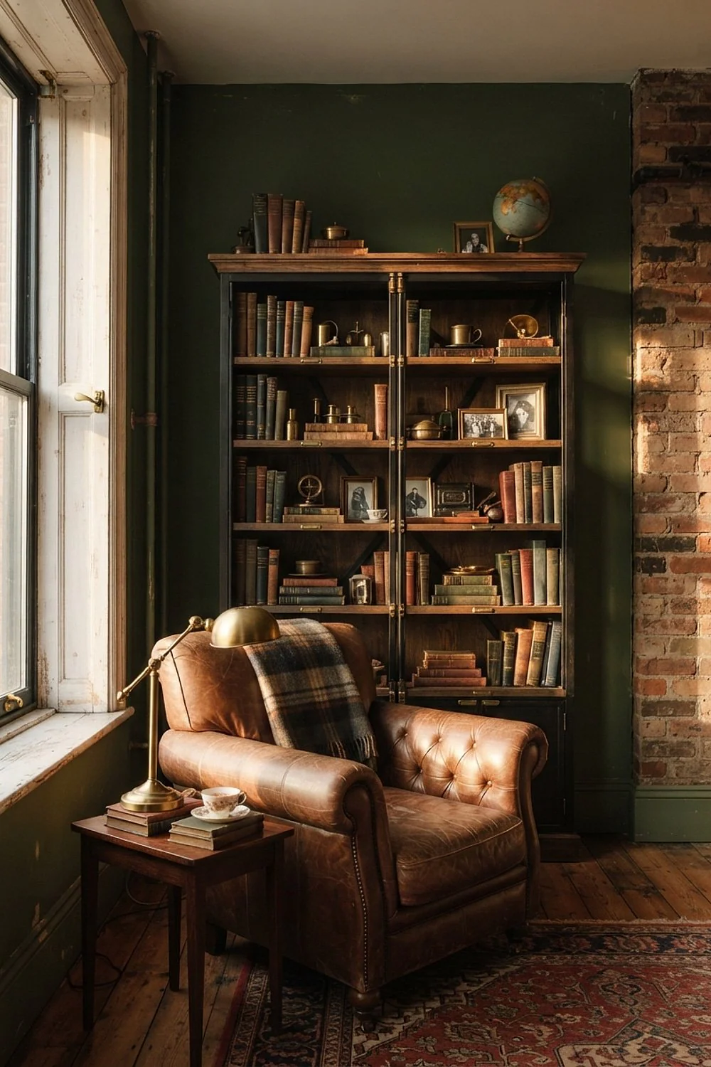
A bookcase painted the same dark green as the wall, such as Farrow & Ball Studio Green, swallows its own edges and turns 40 feet of mismatched paperbacks into one continuous texture. The spines become the pattern. This works best in a small study where open shelving would otherwise chop the room into pieces.
Choose satin on the shelves, not flat matte. Books slide in and out all day, and a chalky finish scuffs along every shelf edge within a few months.
2. Hale Navy walls with cream ceramics
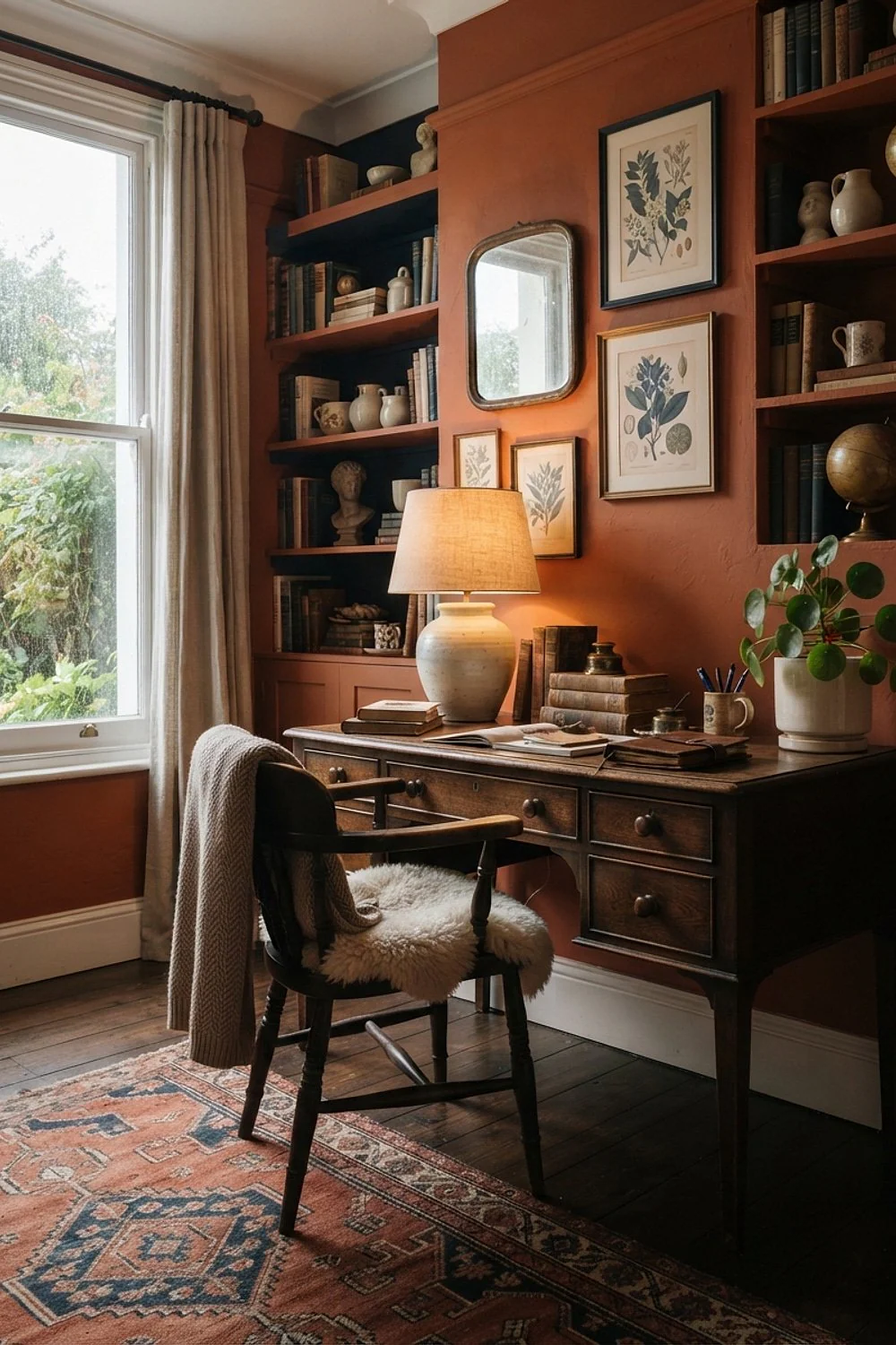
Cream ceramics look crisp as chalk against Benjamin Moore Hale Navy. Group three pieces at 6, 10 and 14 inches tall on one shelf and let the navy act as the frame. This suits north-facing rooms, where navy leans cool and needs a yellowed white to stay friendly.
Skip optic white entirely. Against a saturated navy it flashes like a camera bulb, and a crackle glaze on the ceramics adds texture without adding another color.
3. Book Room Red walls with the desk at a right angle
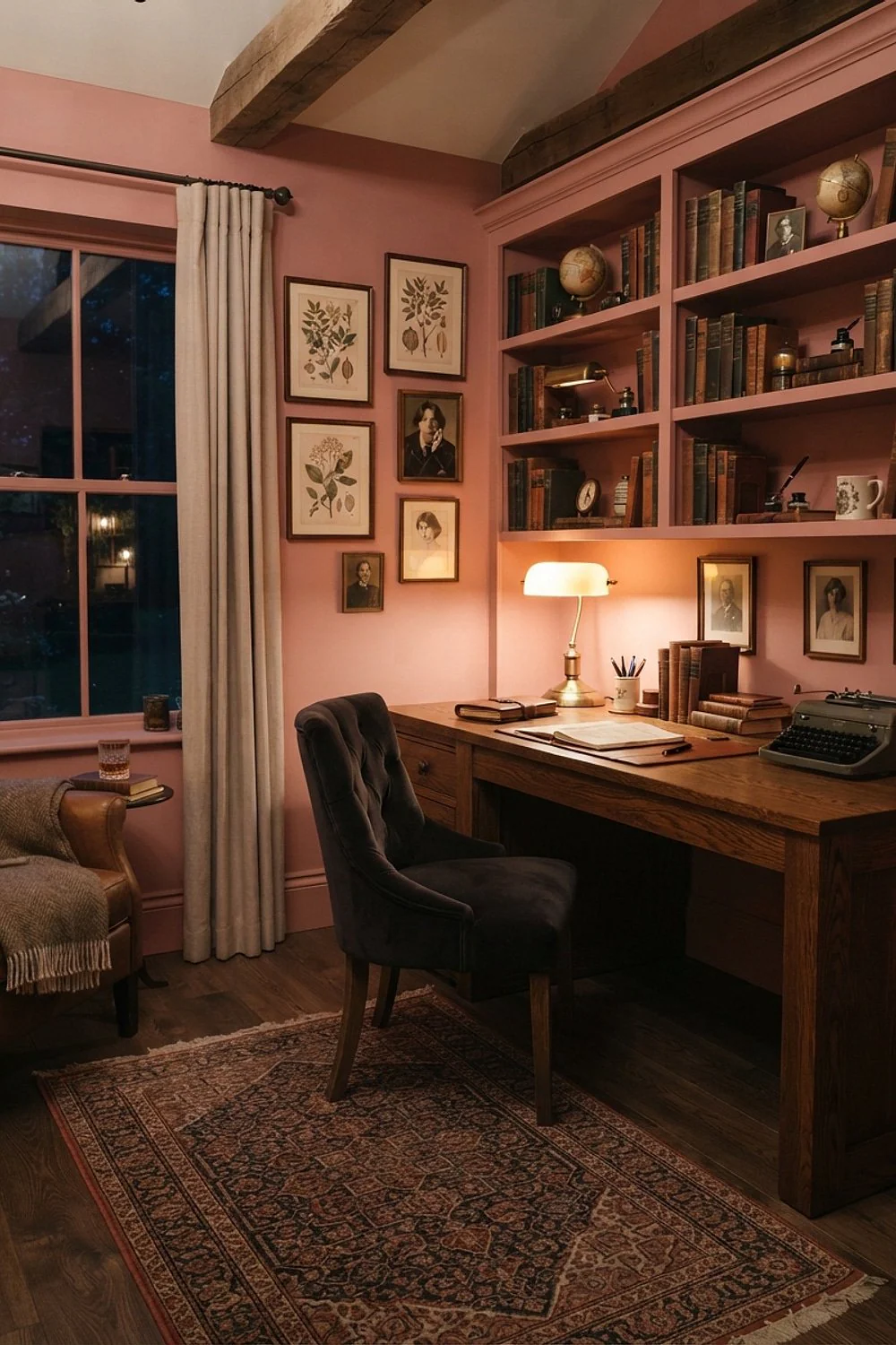
A desk set at a right angle to a Farrow & Ball Book Room Red wall, roughly 30 inches off it, keeps the red in your peripheral vision instead of behind the screen. Red walls bounce warm light onto a laptop and tint white pages pink.
This layout needs a room of about 9 by 11 feet or larger. In anything tighter, the wall glows like toaster coils at 4pm.
4. Kendall Charcoal with burgundy accents
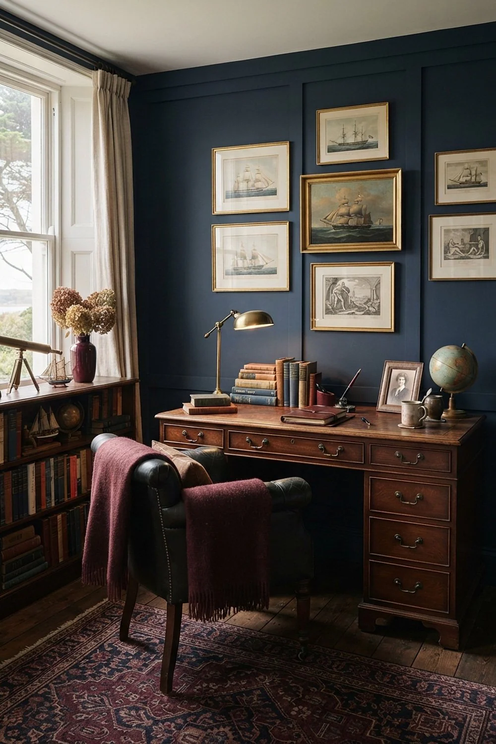
Pairing charcoal with blue-gray textiles is the common mistake, because Benjamin Moore Kendall Charcoal is a warm gray and cold fabric makes it look dirty. Swap in a burgundy wool throw (about $60 to $90) and a brown leather desk pad, and the gray reads as smoke instead of concrete.
It suits rooms with weak afternoon light, where the burgundy supplies the color the window doesn’t.
5. Urbane Bronze on walls, trim and ceiling
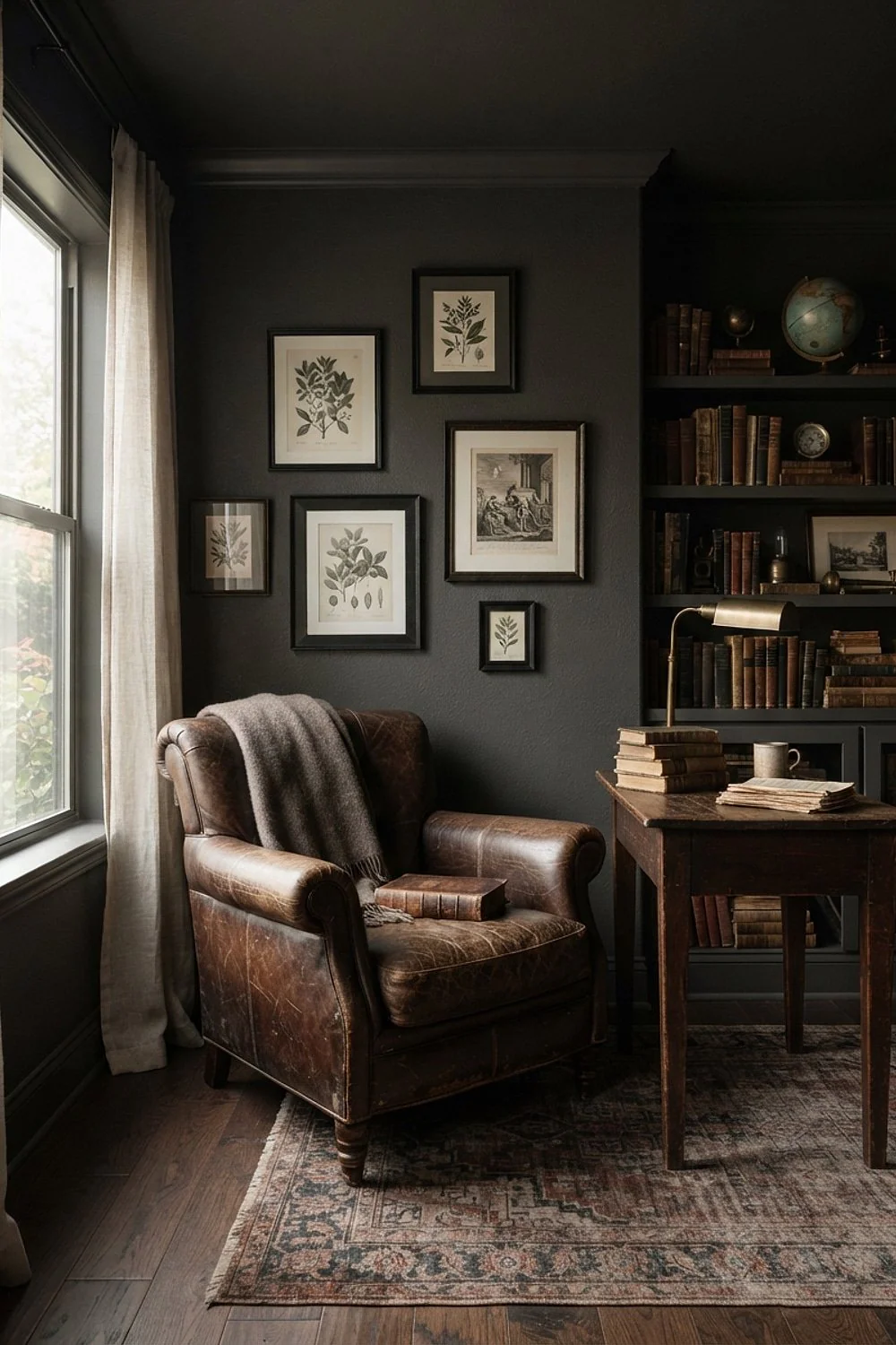
A ceiling painted to match the walls in Sherwin-Williams Urbane Bronze sounds wrong in a 10 by 10 foot room and works anyway. Corners vanish when every surface matches, so the room reads as a soft-edged volume instead of a small box.
Here’s the counterintuitive part: dark paint makes tight rooms feel larger only when nothing interrupts it. Skip the idea under 8-foot ceilings, and use flat paint overhead to hide roller marks.
6. Brinjal walls with a wool reading chair
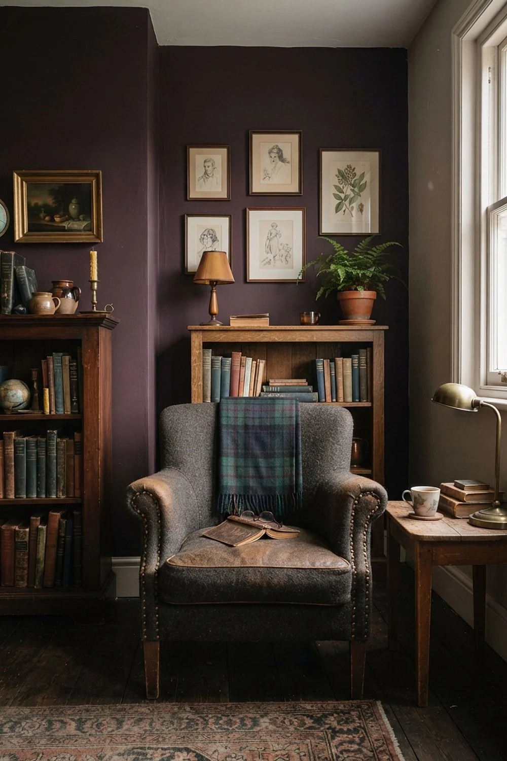
Plum-black Farrow & Ball Brinjal softens on a rainy Sunday around 4pm, when lamplight pulls the purple forward. Set a wool-blend armchair with a 17-inch seat height and a firm lumbar roll in front of it. Readers who sit an hour or more at a stretch will notice the difference.
Avoid velvet in the same plum. Matching hues flatten both surfaces into one dull mass.
7. Tricorn Black in a shared homework room
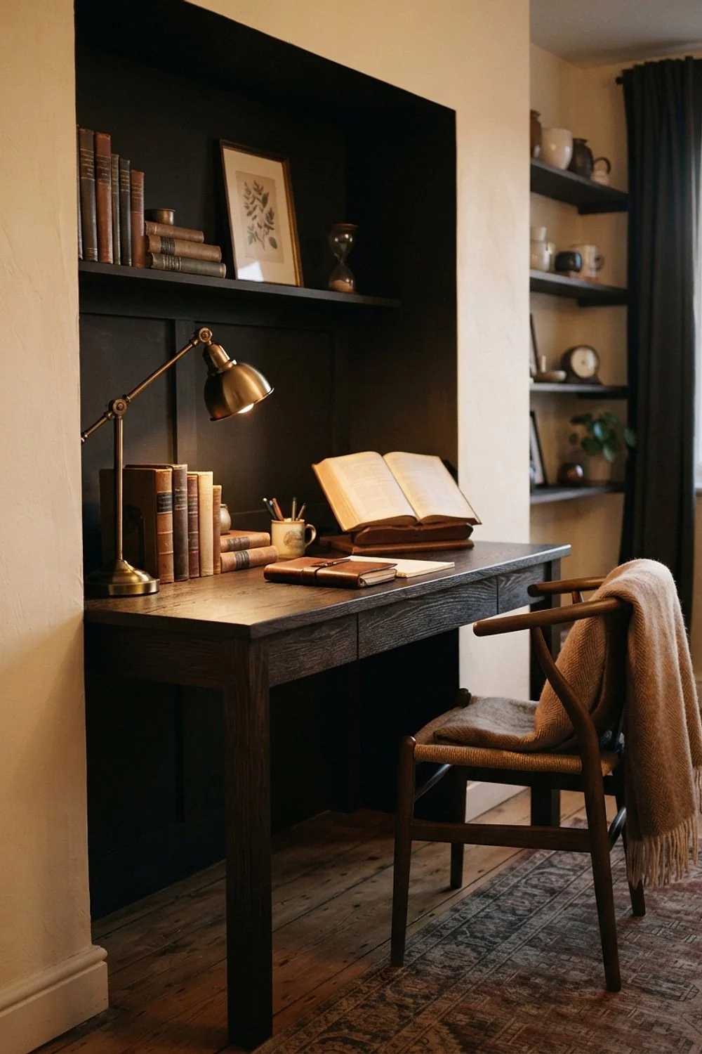
A scrubbable eggshell finish on Sherwin-Williams Tricorn Black is the practical choice for a study that children and dogs share. Dark paint hides fingerprints and tail swipes better than pale paint does, and a damp cloth lifts most of the dust that does show.
Use washable paint made for high-traffic rooms. Avoid flat black below 36 inches, where scuffs bloom as pale streaks.
Wood, leather and metal pairings that anchor dark walls
Paint sets the mood, but materials take the wear. These pairings match undertones first and surface durability second.
8. Green Smoke walls with a walnut desk
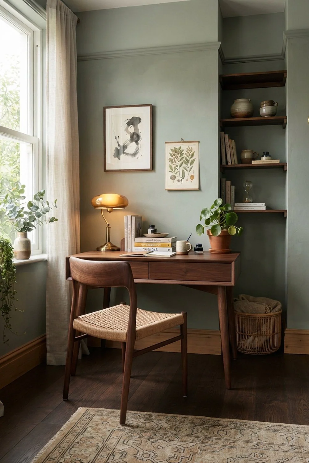
Walnut’s brown-violet undertone looks muddy beside red-based neutrals but settles beautifully against Farrow & Ball Green Smoke, a gray-leaning green. The green cancels the purple, so the wood reads as warm chocolate instead of bruised. This pairing suits a study with decent daylight and a desk that is already in hand.
Pick a desk with a satin oil finish, since raw walnut beside dark paint reads almost black. Hold the actual desk beside the swatch before painting, because stain batches vary widely and a sample photo can mislead.
9. Cognac leather against Aegean Teal
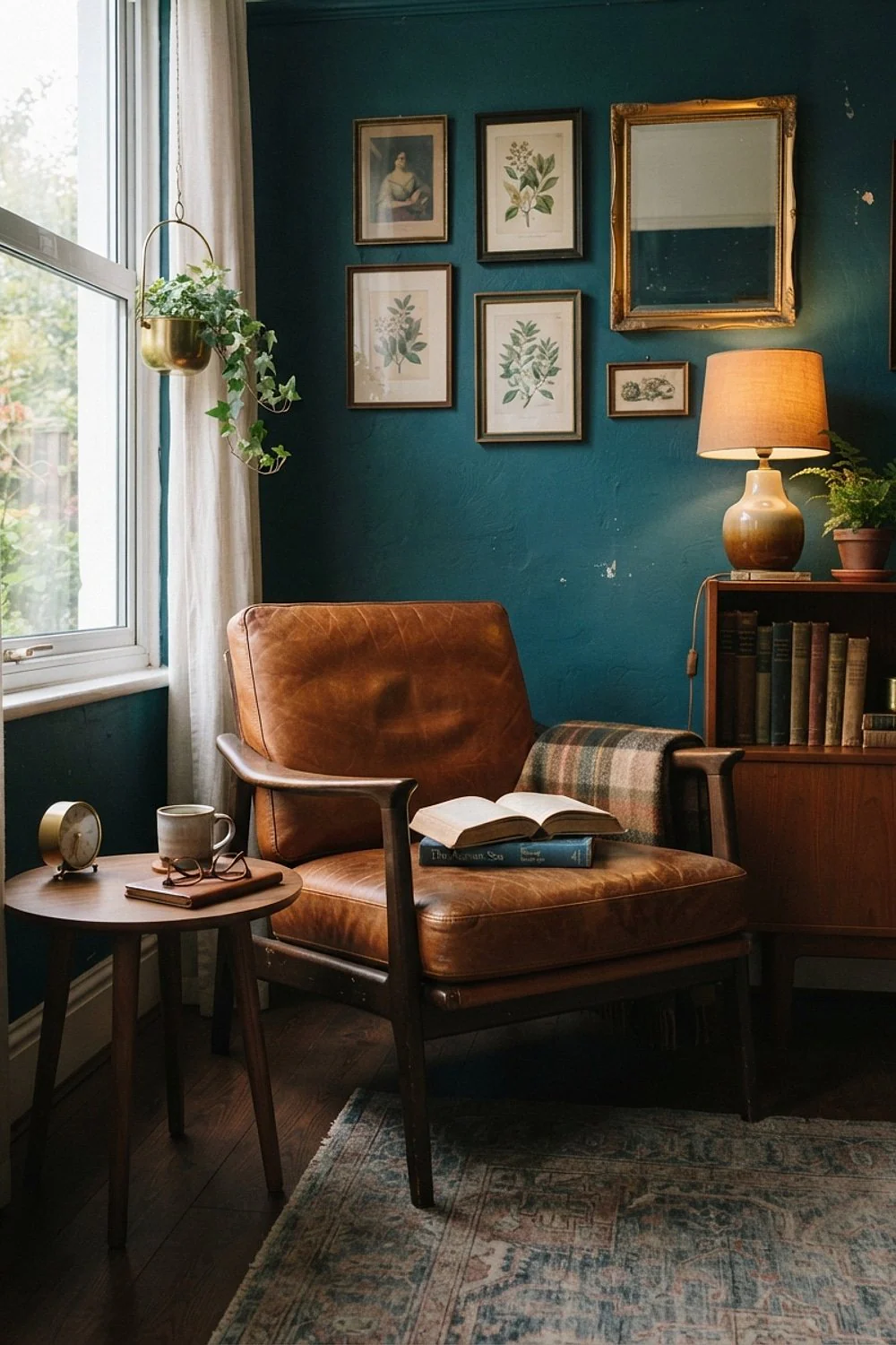
Full-grain cognac leather, which runs roughly $900 to $1,400 in a club chair, ages into a glossy patina while bonded leather peels within two years. Against Benjamin Moore Aegean Teal, the orange undertone looks deliberate, since orange and teal sit opposite each other and make both colors richer.
Pet claws leave scratches that rub out with a thumb. That makes it the durable pick for a busy house. The thing to avoid is any chair sold as leather without the words full-grain, since bonded surfaces are the ones that peel.
10. A green glass banker’s lamp on charcoal walls
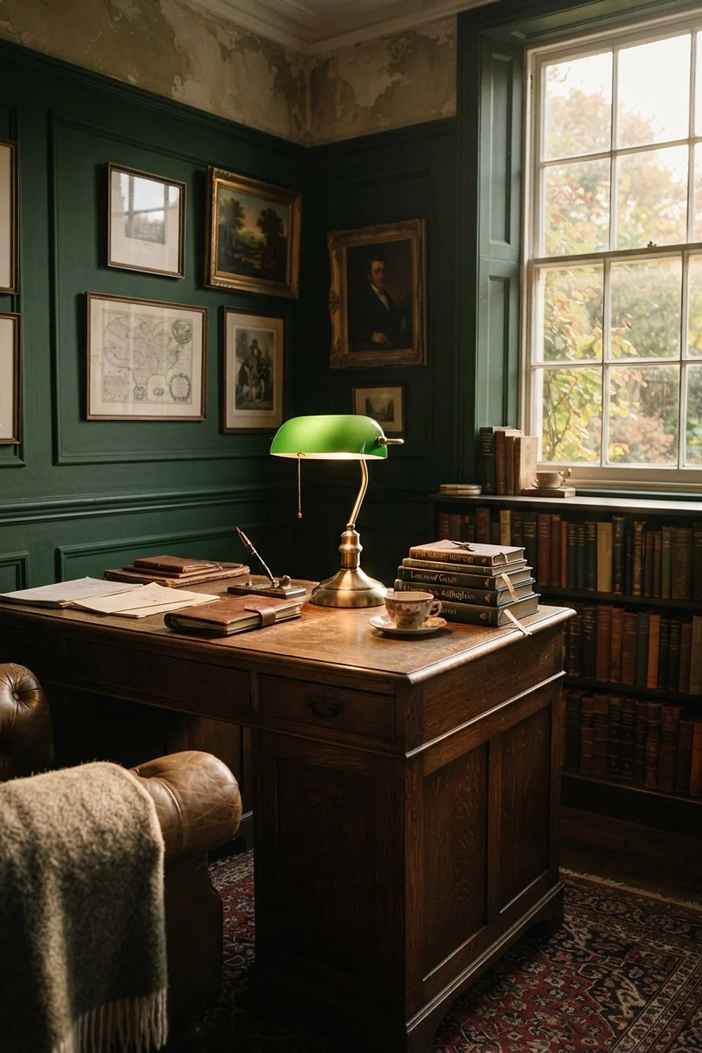
A green glass banker’s lamp throws a pool of light about 24 inches wide, and a 2700K bulb turns charcoal edges the color of strong tea. That warm glow is the reason the lamp works: it lights the page while the walls recede. It suits a desk pushed against one wall in a small room.
Keep overhead fixtures on a dimmer set below 40 percent so the lamp stays the main event. Avoid 4000K daylight bulbs. They flatten dark paint and push it toward blue.
11. Oak open shelving on a Wrought Iron wall
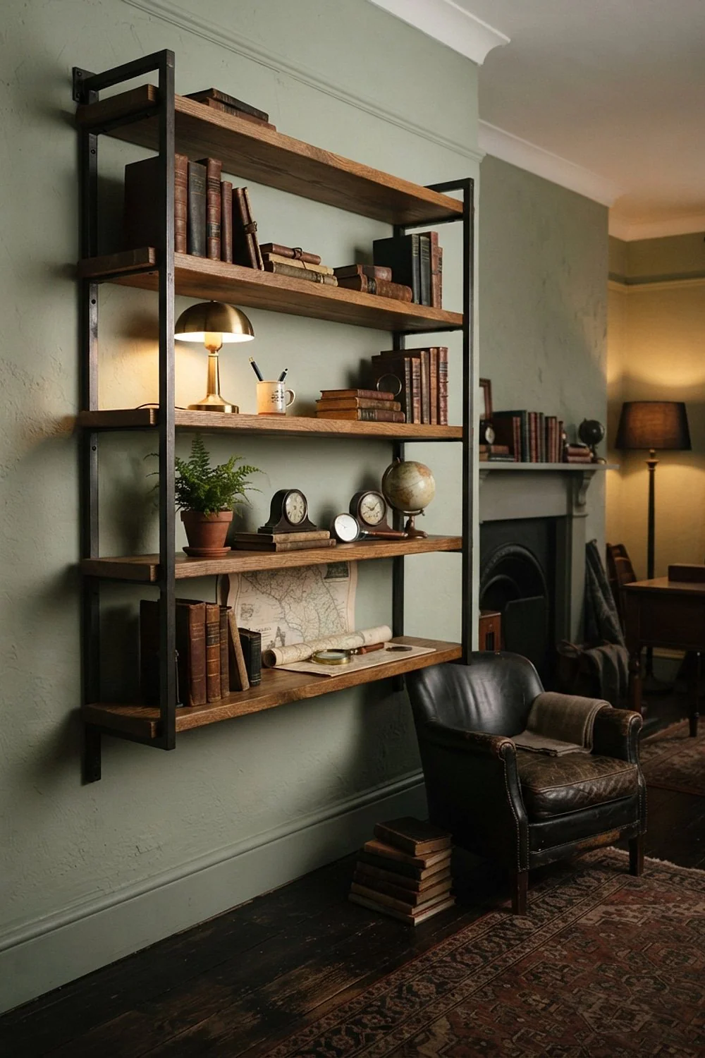
Oak shelves 10 inches deep, mounted on a near-black Benjamin Moore Wrought Iron wall, give the pale grain room to glow. Put closed cabinets underneath for printer cords and archive boxes, so only the good objects stay visible.
This suits renters with sparse built-ins, since freestanding cabinets move out with the tenant. Anchor into studs, because a full shelf of hardcovers weighs 60 pounds or more, and drywall anchors alone will not hold that.
12. Pewter trays on Stiffkey Blue
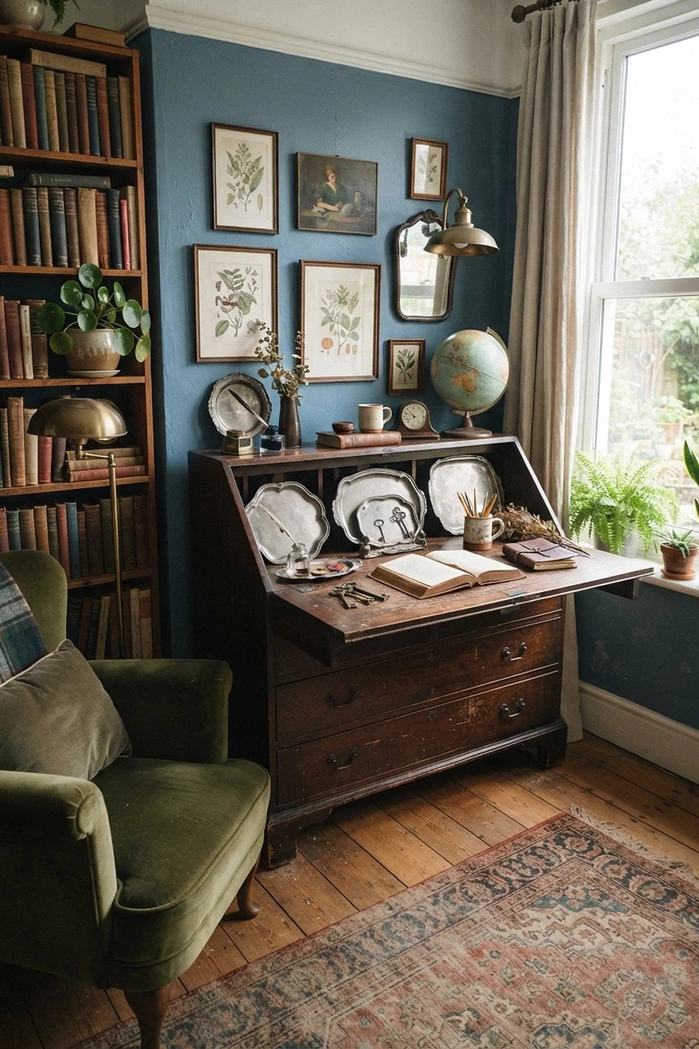
Pewter trays and candle holders grouped on a 24-inch console look best against Farrow & Ball Stiffkey Blue, because pewter’s gray cast echoes the blue’s gray base. The metal reads as part of the wall’s palette instead of a bright accent.
Secondhand pieces run about $15 to $40 each, which suits a tight budget, and a dull patina beats a polished one. Stop at two metals in the room. A third turns the look into a shop display.
13. A copper floor lamp behind an angled chair
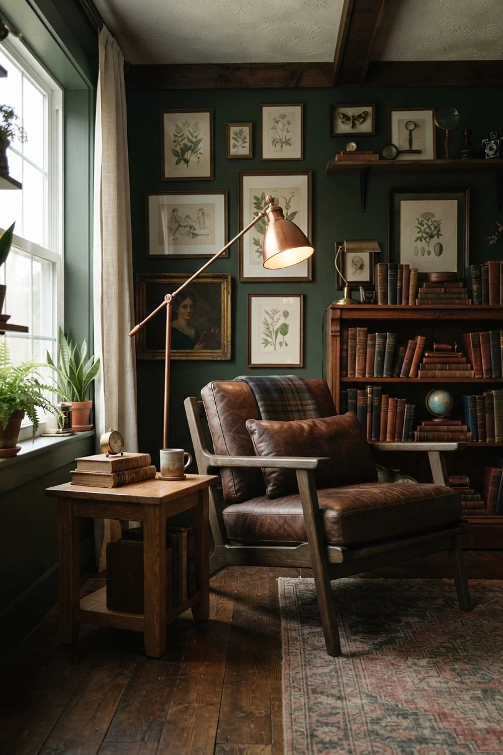
A 9-foot wall can hold a desk, a 12-inch-deep bookcase and a reading chair if the chair is angled about 30 degrees toward the window. Tuck a copper floor lamp behind its shoulder against a dark green wall.
The copper reads as a glow, not a gadget. This arrangement is a good fit for studio apartments where the study shares a room with the bed.
14. Mouse’s Back walls with black iron hardware
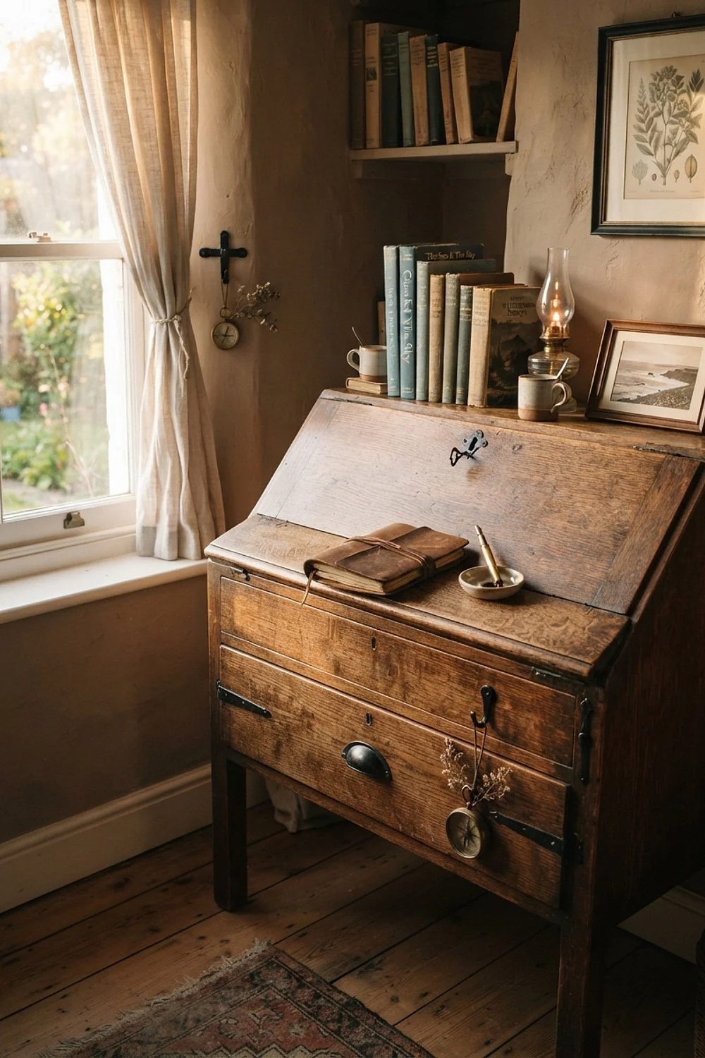
Mixing four metals is the common mistake in a study with Farrow & Ball Mouse’s Back walls, a brown-leaning taupe. Limit the room to black iron hardware plus one brass lamp, and the taupe looks collected instead of cluttered.
Iron also outlasts plated finishes on drawer pulls that get yanked 30 times a day, since plating wears through to a pale base metal at the edges. This approach suits a budget refit of an existing desk, where swapping pulls costs little. Check that every screw and hinge matches too.
Design inspiration and ideas
15. A burgundy and navy rug, 8 by 10 feet
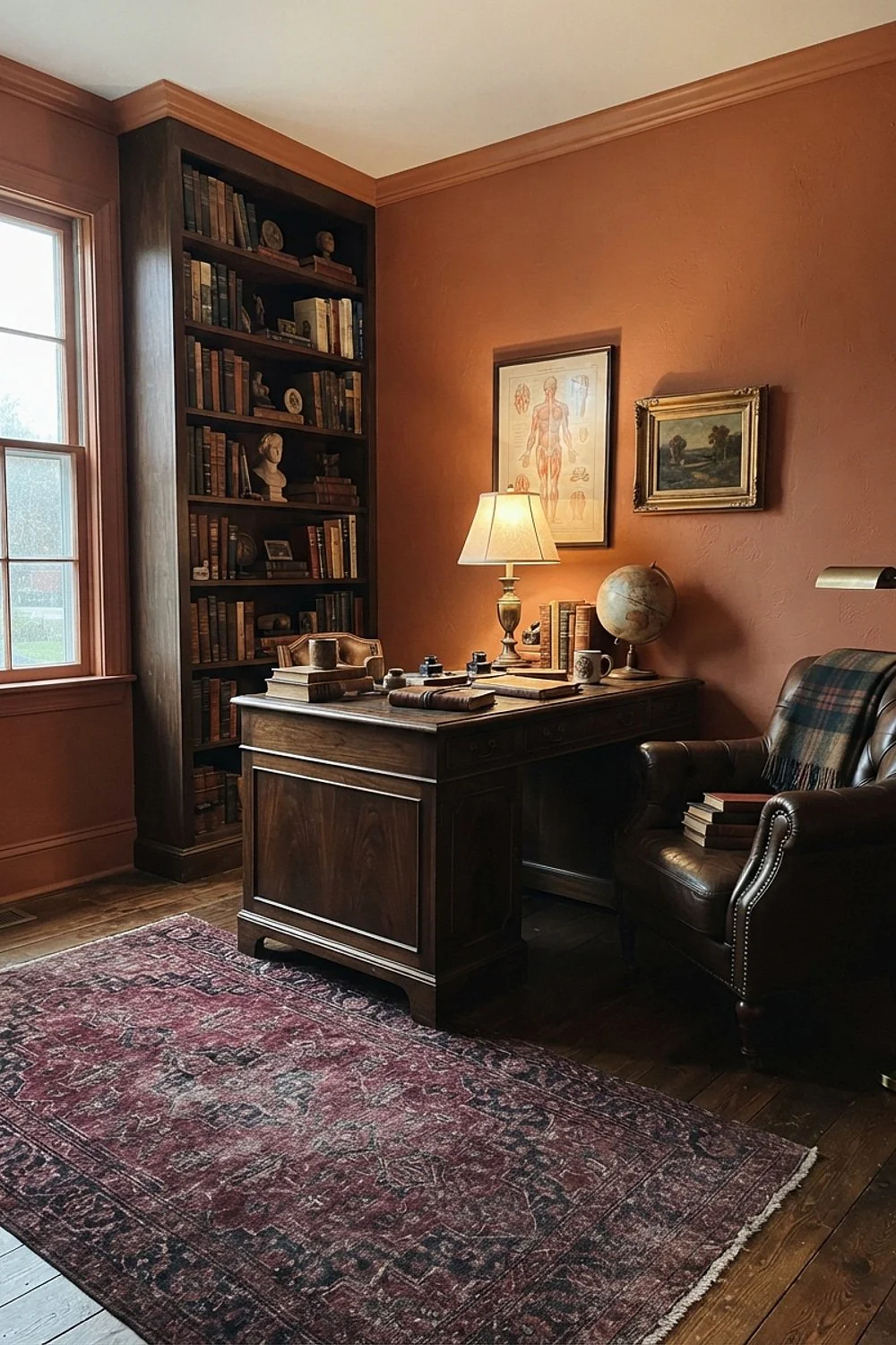
An 8 by 10 wool-blend rug, about $250 to $500, should reach under the front legs of every furniture piece so nothing looks like it’s floating. A burgundy and navy Persian-style pattern hides coffee drips and dog hair far better than a solid.
It fits rooms of 12 by 12 feet or more. In smaller rooms, drop to 5 by 8 under the desk chair.
16. A tartan throw in forest green and navy
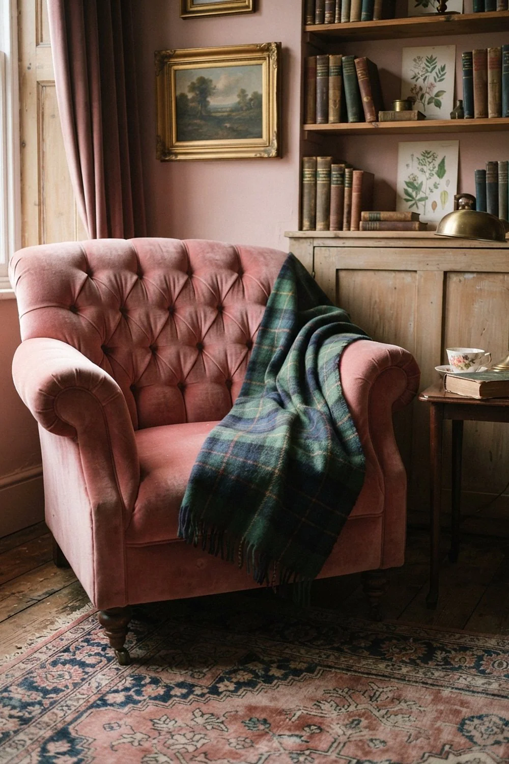
A 50 by 60 inch tartan throw drapes over a chair arm and ties green walls to navy accents. Tightly woven wool holds up to claws and laundry better than loose chunky knits, which snag after a few weeks.
That durability suits a home with cats or kids, where a throw gets dragged daily. Check that the tartan includes a thin line of your wall color. That one thread does the matching, and without it the plaid can fight the room.
17. Cream linen shades over black walls
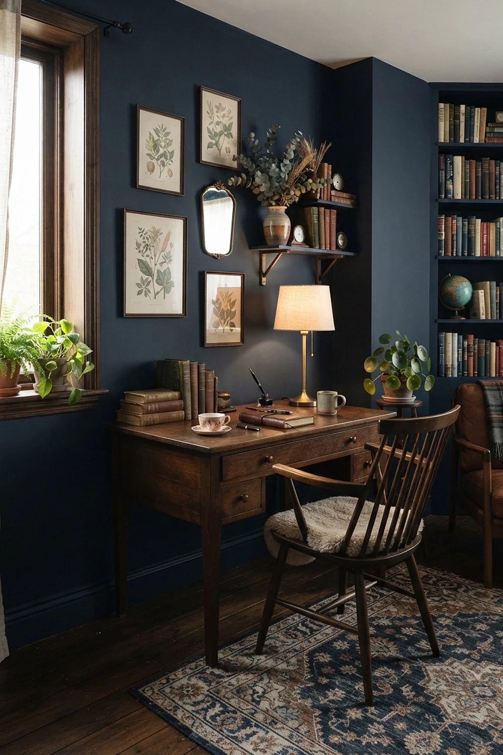
A cream linen shade about 14 inches across softens a bare bulb into a honey glow, which keeps black walls from swallowing the room at night. Lined shades are best because they diffuse light evenly and hide the bulb’s hot spot.
Cream suits small studies and corner desks where one lamp does most of the work. Dark shades on dark walls trap the light entirely, so they only make sense in a room with a bright window.
18. Gilt frames on oxblood walls
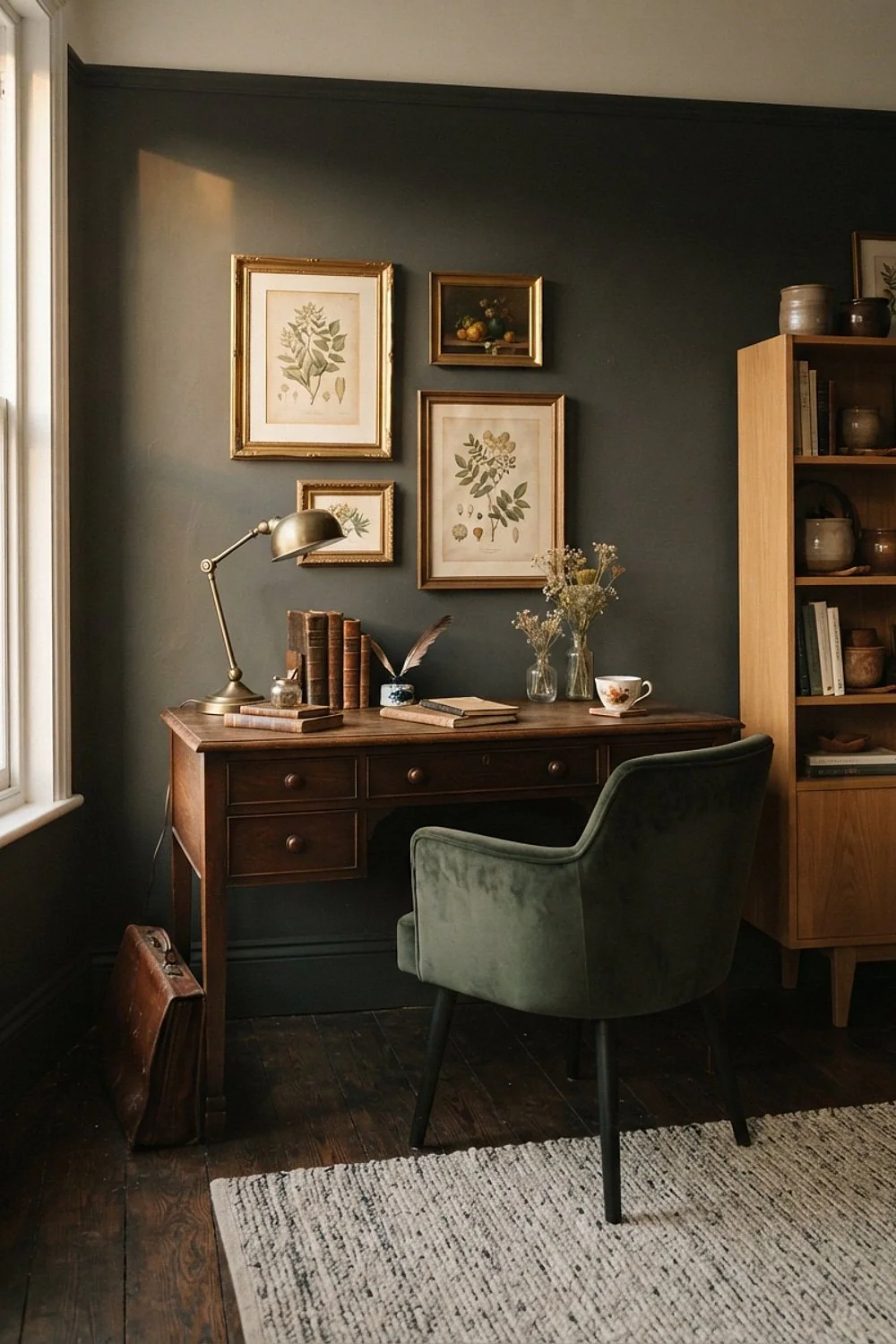
Antique gold frames glow against oxblood because gold’s yellow undertone completes the red. Hang each piece so its center sits about 57 inches from the floor, which puts the middle of the art at average eye level.
New gold frames can look like plastic, which makes thrifted wood frames a good budget route. Rub a dark wax into the corners to age them in about ten minutes. Wipe off the excess so the wax does not smear onto the wall.
19. A green marble desk tray on walnut
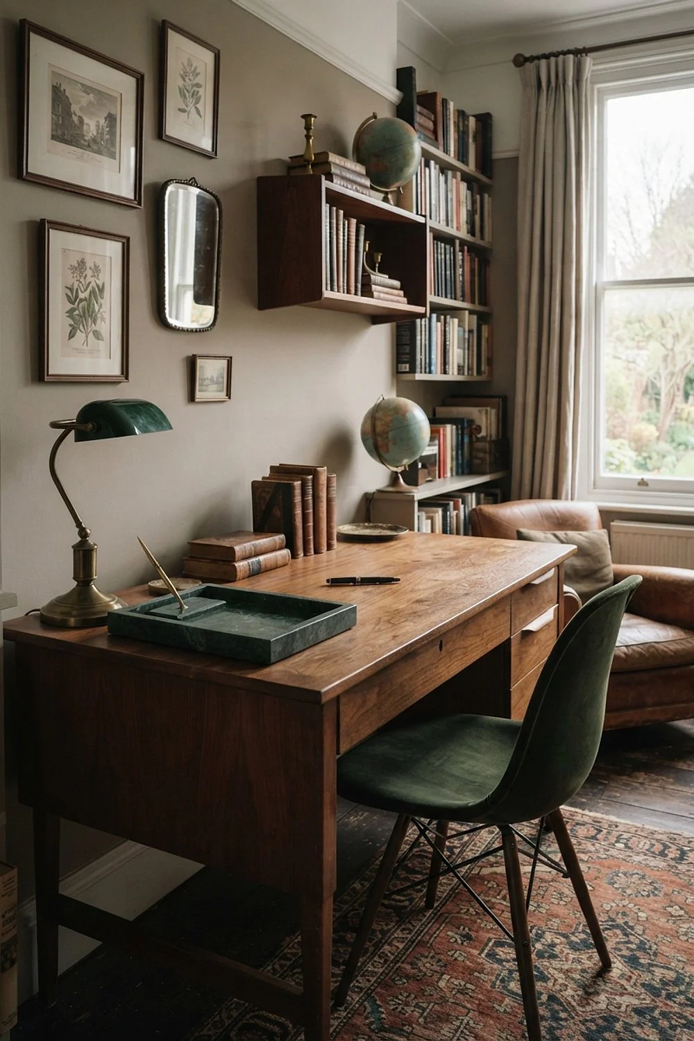
A honed green marble tray, about $35 to $70, holds pens, a candle and a lamp base on a walnut desk. Honed marble hides coffee etching that polished marble shows immediately, because a matte surface scatters light instead of mirroring each dull spot.
Seal it once a year if mugs are a daily habit. Stone is durable but porous, so spills of coffee or wine soak in if left. The tray suits a desk that already collects clutter, since it corrals small items into one tidy zone.
20. Beeswax tapers with a dimmer
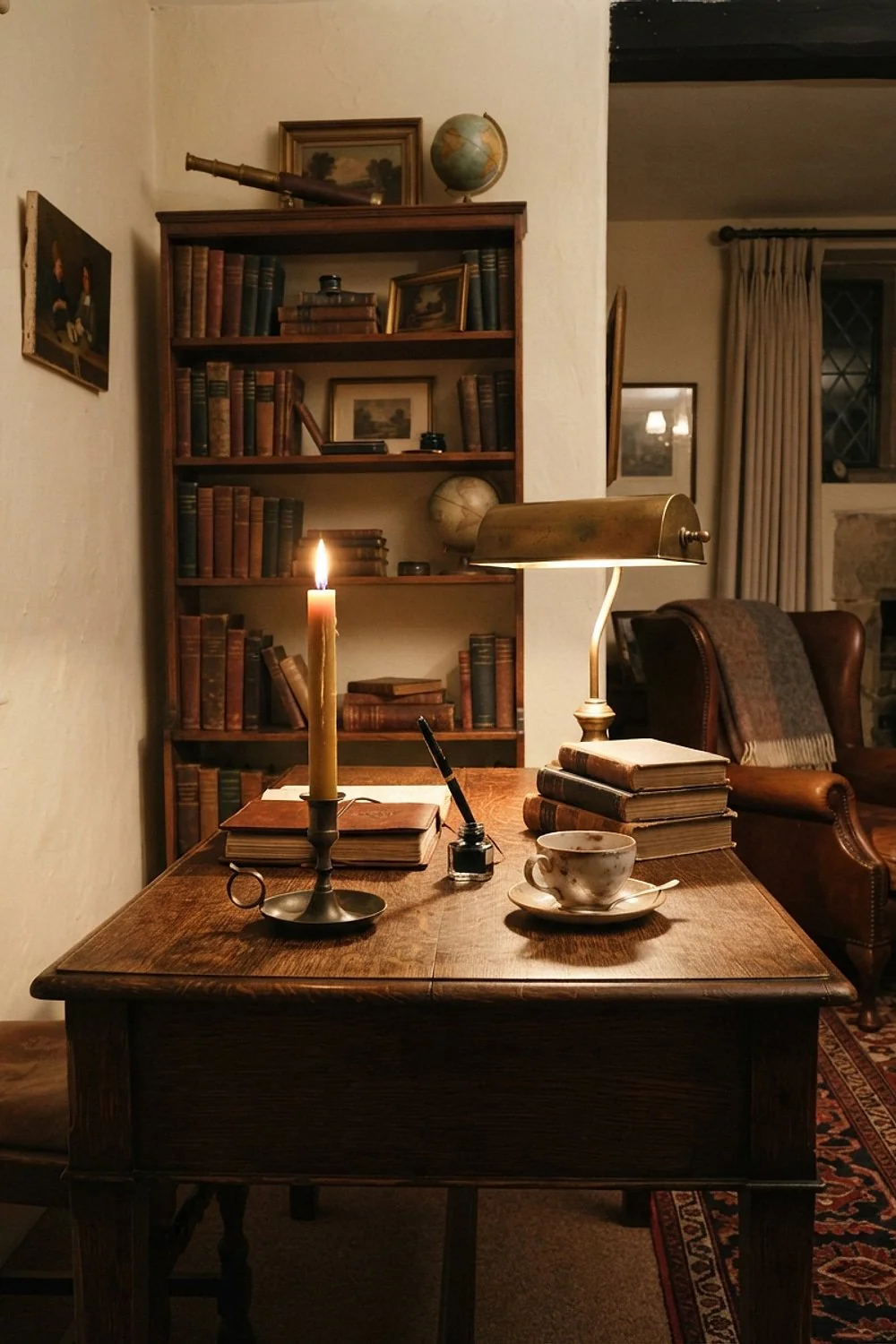
Beeswax tapers burn with a flame near 1900K, a color no bulb matches exactly, so the glow adds warmth that lamps alone lack. Pair them with a 2200K dimmer and keep them 12 inches from paper and books.
In a rental or a house with cats, flicker-style LED candles are the safer version. They give the same amber without the open flame, soot, or dripped wax on a rented floor. Never leave real tapers burning in an unattended study.
21. Linen archive boxes against olive walls
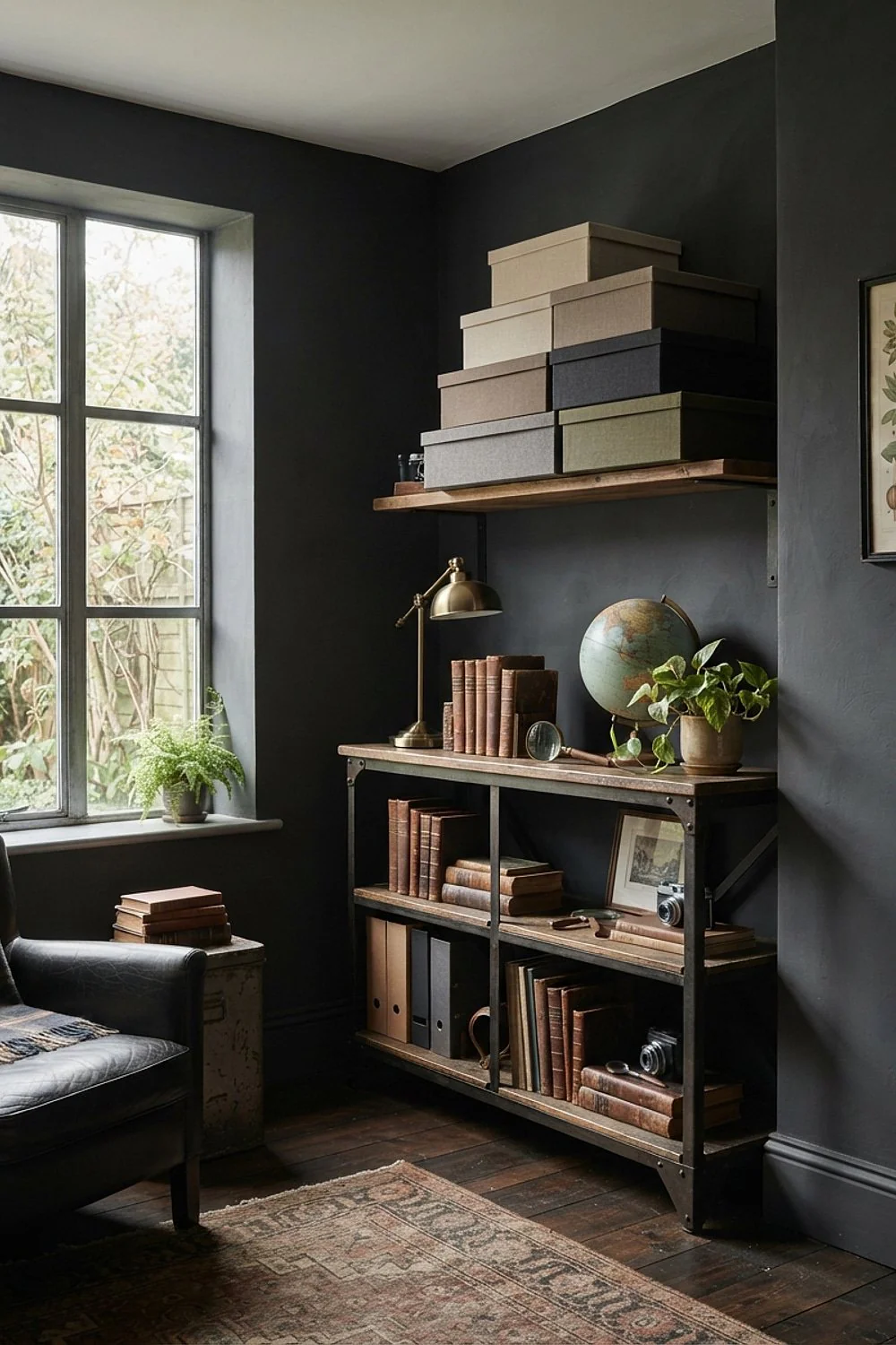
Linen archive boxes in oatmeal, about 10 by 12 inches, stack on a ledge and hide chargers and tax papers. Against olive walls, the oatmeal reads as parchment, not clutter, because its warm beige sits close to the green’s yellow base.
Label them with small brass holders. Unlabeled boxes get opened and rummaged until they look worse than the mess they were hiding. The setup suits a shared desk or a small apartment where paperwork has nowhere else to live.
Styling tips
22. Mustard velvet cushions on a teal sofa
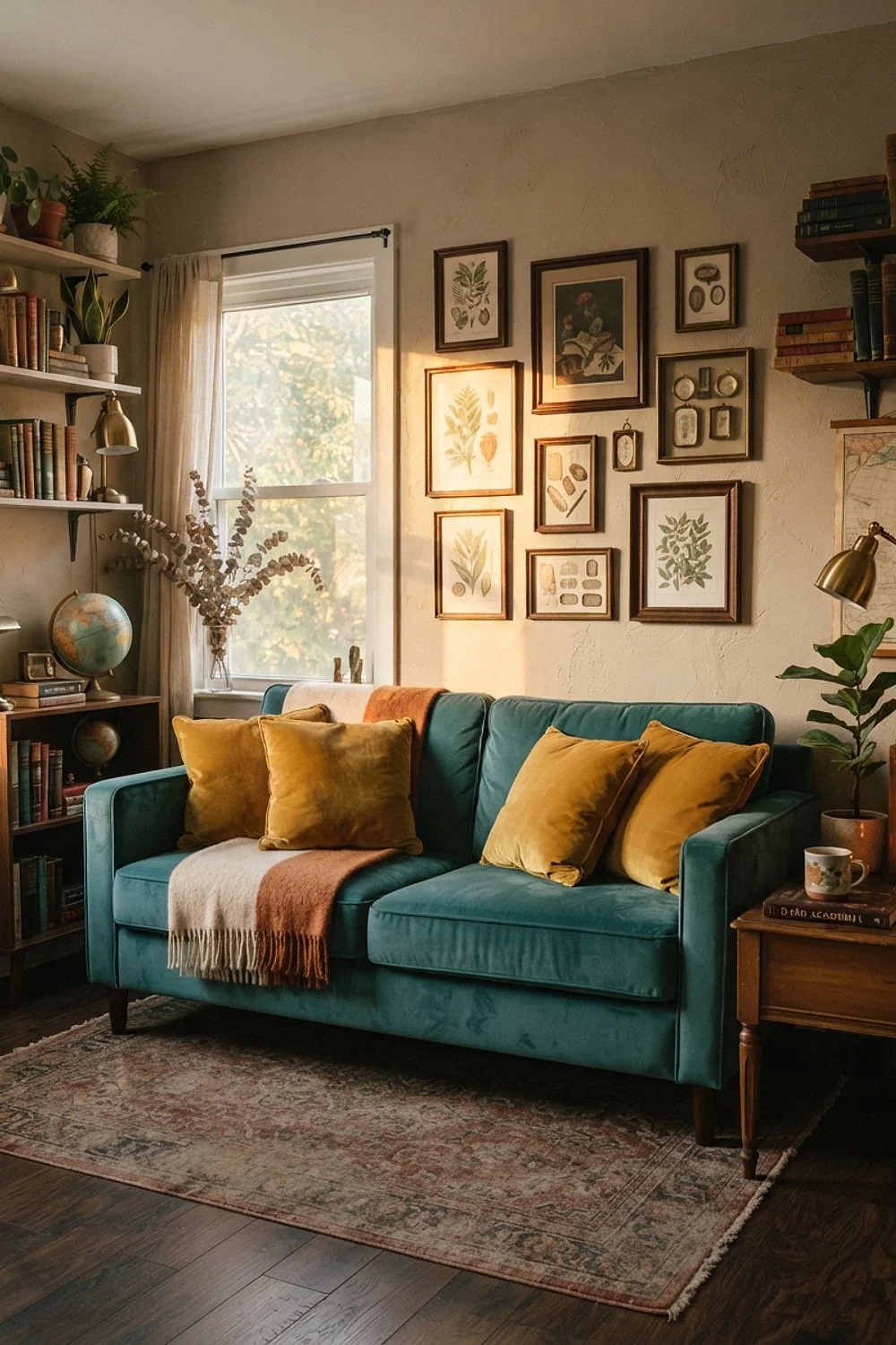
Mustard velvet cushions in a 20-inch size make a teal sofa look decided. The yellow sits opposite the teal’s blue and gives it contrast without competing with the walls, so the sofa looks styled rather than random.
Performance polyester velvet resists pet claws better than cotton velvet, which suits households with cats or dogs. Keep it to two cushions, since a pile of five makes the sofa look like a gift shop display.
23. Botanical wallpaper above a green wainscot
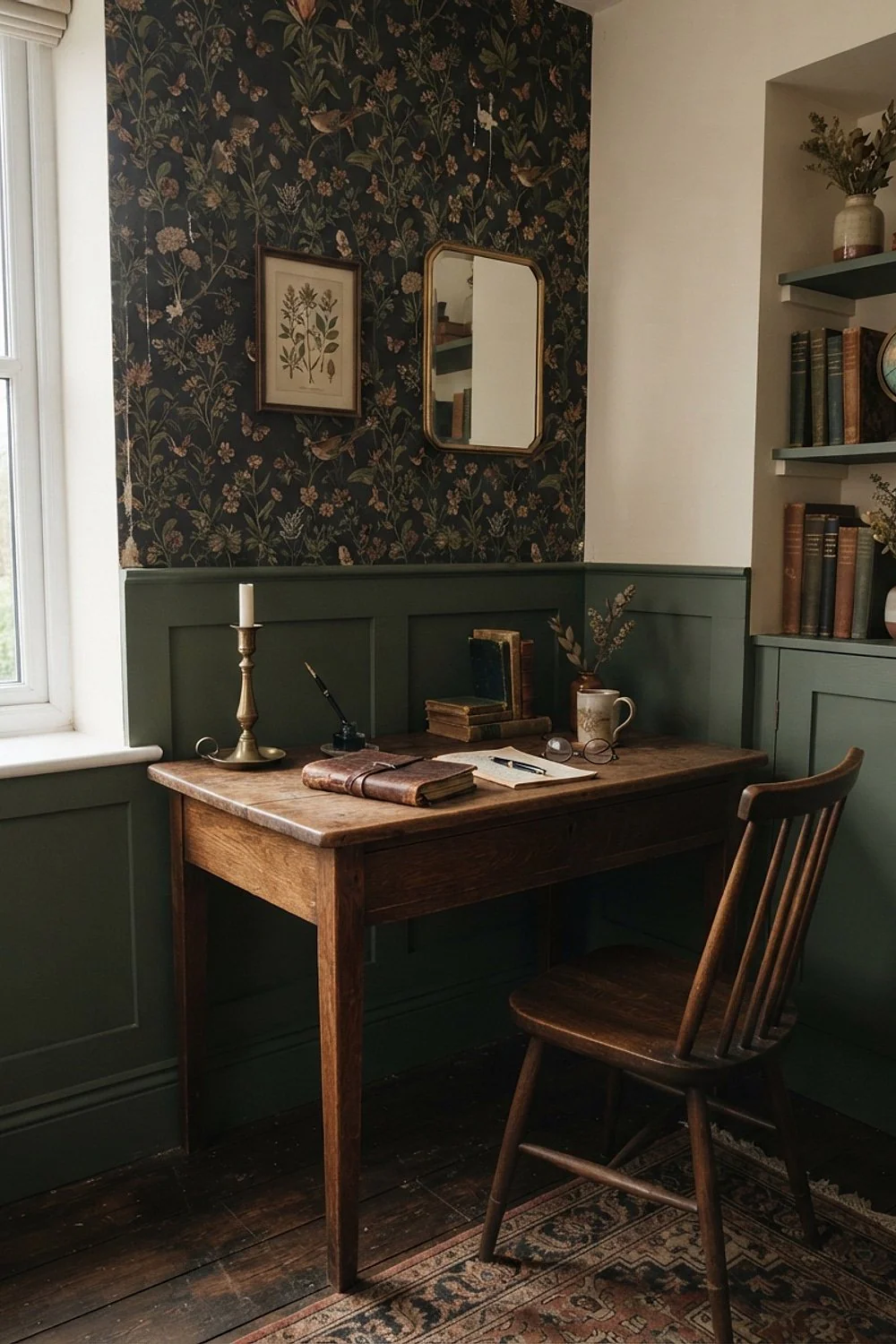
Wainscot topped with a chair rail at 36 inches protects the lower wall from chair backs, and botanical wallpaper above it brings in pattern without chaos. Paint the wainscot in a satin dark green and keep the paper’s ground color close to it.
This split suits long walls in a study that doubles as a hallway or guest room. Avoid a paper with a bright white ground, which cuts a hard line against the green and makes the rail look like a stripe.
24. Old White on the ceiling, not bright white
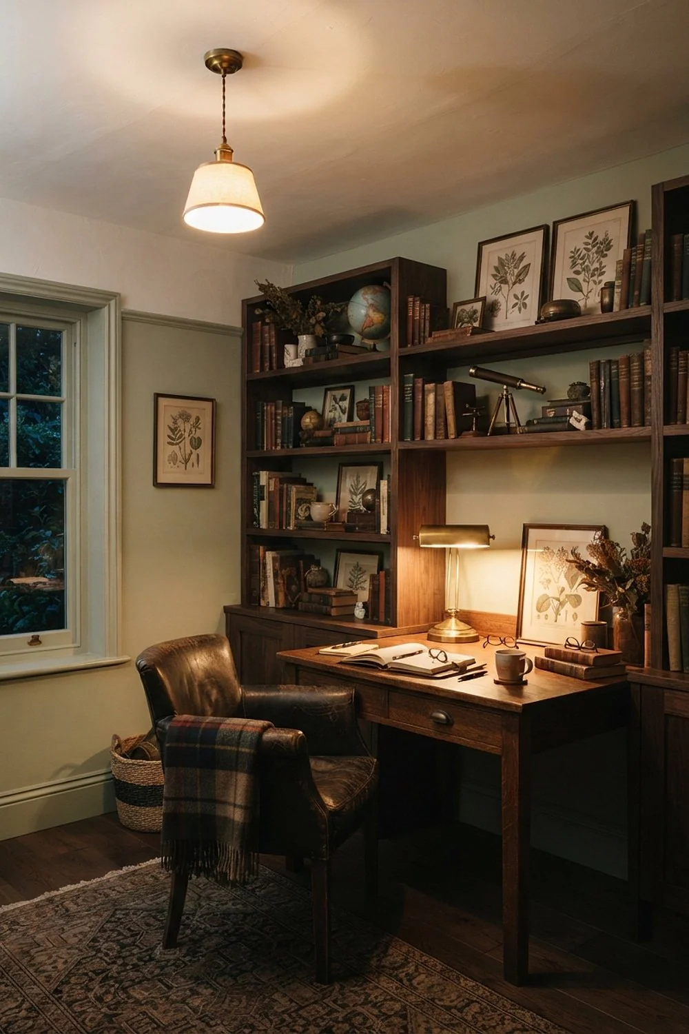
A bright white ceiling over dark walls draws a hard line that makes the room look cut in half. Farrow & Ball Old White, about $60 to $110 a gallon, softens the edge because its gray-cream cast sits closer to the wall color.
The common mistake is picking the whitest white for “light.” It reflects the least kindness back onto dark paint.
25. Oversized art with a cream mat
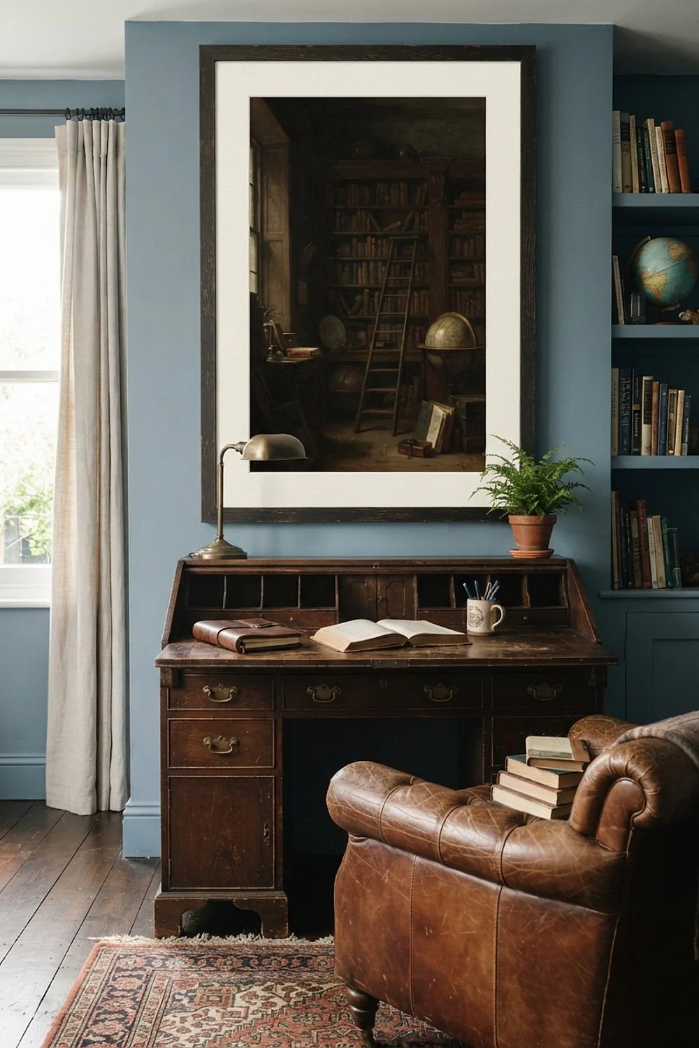
A 36 by 48 inch print with a 3-inch cream mat fills a dark wall the way a window would, and the cream border keeps the frame from vanishing. Small art against dark paint gets lost, so go larger than feels natural.
Center it about 57 inches high and hang it over a desk or console, not floating in the middle of the wall.
26. Lined drapes in plum or forest
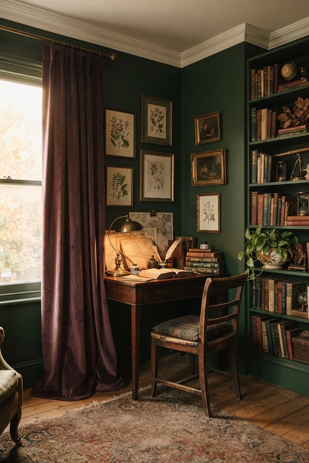
Lined wool-blend drapes hung 4 inches above the window frame and brushing the floor block winter drafts and soften sound in a room full of hard surfaces. The extra height also makes the window look taller.
They suit studies with a single large window and bare floors. Pick plum or forest, not black. Both colors read as rich shadow at night yet show real color by day. Black drapes beside black walls make the window look like a hole.
27. A green leather desk pad on oak
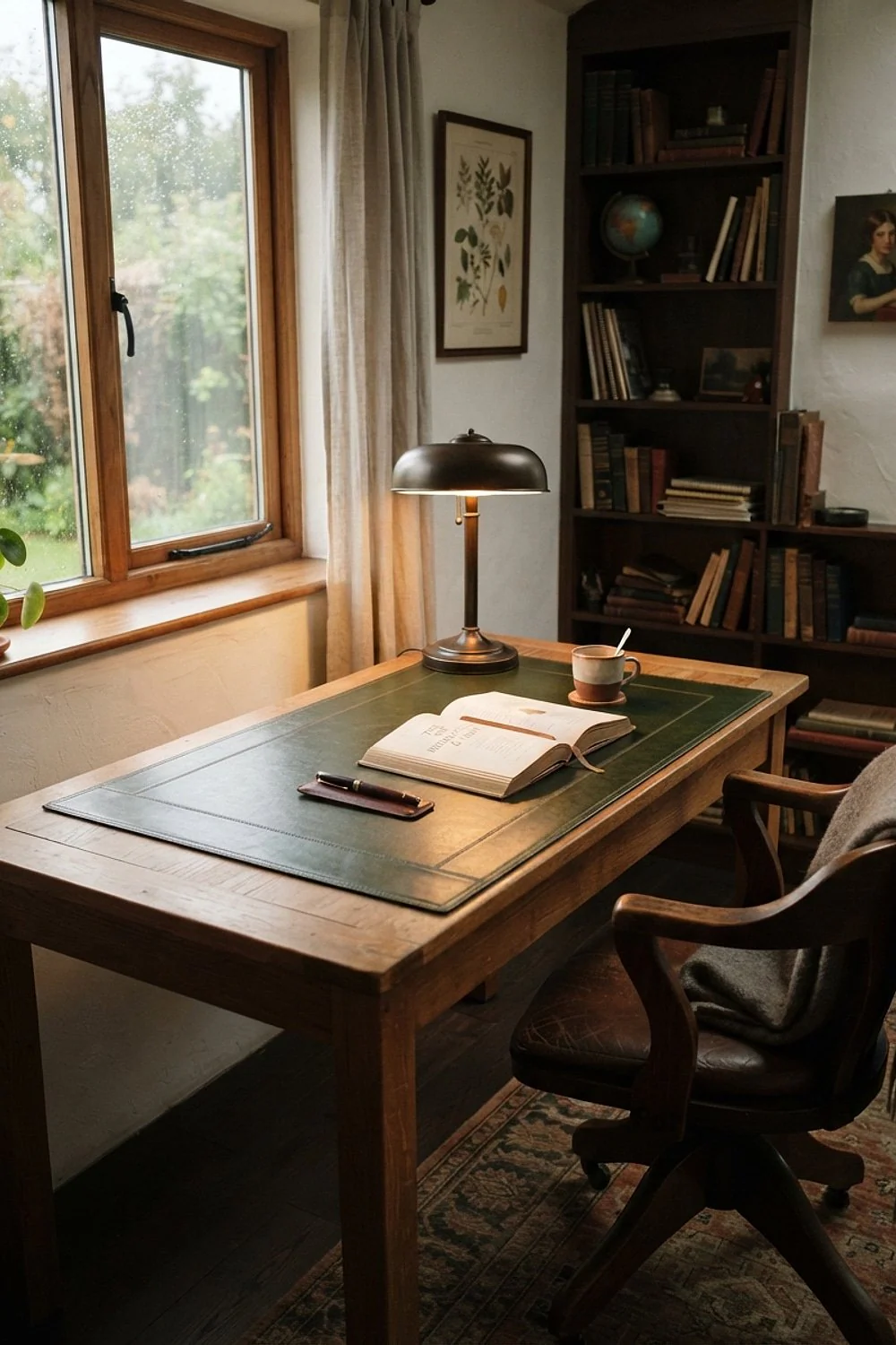
Pen pressure, laptop feet and mug rings all leave marks on an oak desktop, but a green leather desk pad, about $40 to $90, protects it from every one. Choose a vegetable-tanned one, which darkens attractively and wipes clean with a barely damp cloth.
It suits anyone who writes by hand daily, since the soft surface also cushions the pen and quiets the tap of a keyboard. Avoid thin vinyl, which cracks within a year and curls at the corners.
28. Black Fox walls with parchment accents
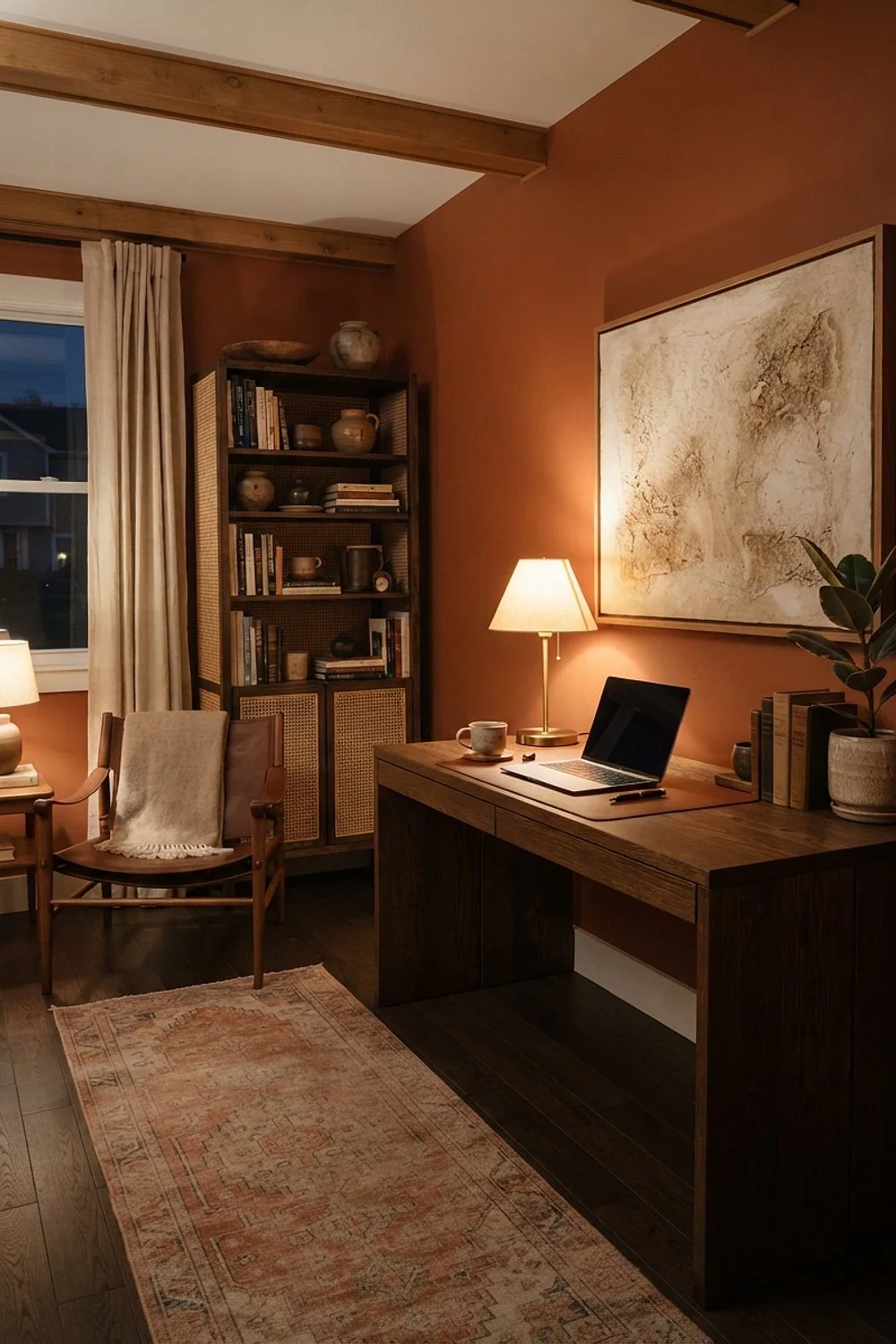
A brown-black wall such as Sherwin-Williams Black Fox makes parchment lampshades, bone-colored books and cream paper look like old pages, because the warm brown undertone flatters yellowed neutrals.
Use it where light is plentiful, such as a south-facing room, so the brown undertone stays alive. In a windowless room it goes flat. Add a second lamp at eye level to compensate, ideally with a warm bulb, since cool ones turn the brown muddy and gray.
Combining pairings without overload
Twenty-eight options can turn into a pile of competing ideas. Follow a simple ratio and the room holds together.
- One dark wall color covers about 60 percent of what the eye sees.
- One wood tone and one leather or textile family make up about 30 percent.
- One accent color, such as burgundy or mustard, fills the last 10 percent.
Check how the study meets the rooms around it too. Adjacent room colors should share an undertone with the study, or the doorway becomes a jarring seam.
Garden sheds converted into studies follow the same logic. Backyard decoration in moss, bark and slate sits beside a dark interior without a clash.
Testing colors before you commit
Dark academia study ideas depend on light more than on paint chips, so sample before committing. A swatch the size of a playing card lies, especially in dark colors.
- Paint two poster boards, each 2 by 2 feet, with two coats. A sample pot runs about $8.
- Check them at 9am, 4pm and after dark with your actual bulbs on.
- Prop the boards against the wall, the floor and beside the desk, since light bounces differently in each spot.
- Hold your real fabric, wood and metal samples against them.
Look for color drift. If Hale Navy turns purple under your 2700K bulbs, or Studio Green goes muddy beside your oak, you’ve learned that before covering 400 square feet of wall.
Mistakes that keep showing up
Dark academia study ideas go wrong in three predictable ways: too purple, too flat, or too cold. Each has a fix that doesn’t start with repainting.
Don’t repaint yet.
- Too purple: change the bulbs to 2200K amber and add a yellow-green textile such as an olive throw.
- Too flat: add a second light source at eye level and a glossy object, like a brass lamp or a glazed vase.
- Too cold: introduce a cognac leather chair or a wool rug with rust tones.
- Still wrong after two weeks: sand lightly, use a stain-blocking primer, and apply a corrected color in two thin coats.
Give a dark wall two full weeks before judging it. Your eye needs that long to stop comparing it with the old color.
Where to start
Dark academia study ideas reward patience and a good undertone match. Pick one wall color, one wood and one accent from the pairings above, and let the light in your room decide the rest.
Save or pin this list so it’s ready when you start. Your first move is simple: paint one 2 by 2 foot sample board in Studio Green or Hale Navy and check it at 4pm.
Frequently Asked Questions
Can dark academia study ideas work in a small room with one window?
Yes, and small rooms often suit them best. Paint the walls, trim and ceiling the same dark color so the corners disappear, and use 2700K lamps at desk height. Keep curtains light enough to let in daytime brightness.
What finish holds up best for dark academia study ideas with kids or pets?
Eggshell or satin in a washable formula holds up best. Flat paint is prettier but scuffs and polishes unevenly when wiped. Protect the lower 36 inches with a chair rail or wainscot if the room gets heavy traffic.
Can I try dark academia colors in a rental?
Yes, with removable options. Peel-and-stick wallpaper in a dark botanical print works on one wall, and large framed art in dark tones adds depth without paint. If your landlord approves paint, tint a gray primer first to cut the number of coats.
Do dark paint colors need more coats?
Usually two coats over a tinted primer, and sometimes three over a light wall. Skipping the primer leaves streaks where the old color shows through. Let each coat dry fully, about 4 hours, before the next.