Midcentury Color Palettes That Make a Living Room Feel Right
A walnut sideboard turns the color of strong tea around 4 p.m., and everything near it has to cope with that. Nobody warns you about this when you pick a paint chip under store lighting. In a midcentury modern living room, the wood does half the color work before a single wall gets rolled.
The short answer: start with a creamy or greige base, let walnut or teak carry the depth, and limit the saturated colors to two or three from the 1950s and 60s palette. Think olive, mustard, teal, burnt orange and a deep navy. The 32 pairings below show exactly how to combine them, with undertones that behave.
The color logic behind a great midcentury modern living room
A midcentury modern living room follows a pattern that’s easy to spot once you know it. The walls stay quiet, the wood stays visible, and color arrives in big, flat, confident blocks like a sofa, a rug or a single lacquered cabinet.
Light decides everything here. A south-facing room can handle a pale olive that would look like dishwater in a north-facing one. Check the room at 8 a.m. and again at 9 p.m. under lamplight before choosing anything.
- Pick the wood tone first, because it can’t be repainted.
- Match every neutral to that wood’s undertone, red or yellow.
- Limit saturated colors to three, and repeat each at least twice.
- Keep finishes flat or eggshell, since glossy walls show every roller mark.
Walnut and creamy white
A walnut credenza against Benjamin Moore White Dove walls is the most forgiving starting point in the style. The soft cream undertone keeps the wood’s red-brown from turning muddy, and the wood stops the white from reading clinical.
Keep the credenza top to three objects: one ceramic lamp, one stack of books, one low bowl. Crowd it and the contrast stops mattering.
Skip bright optical whites here. Next to walnut they make the wood look sallow and slightly orange.
Teak and sage green
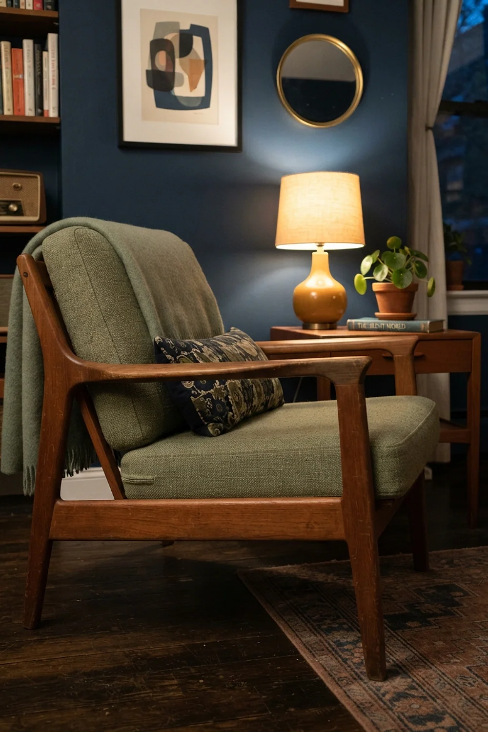
Teak has a yellow-honey undertone, so a gray-leaning sage such as Sherwin-Williams Sea Salt sits beside it without a fight. A used Danish teak sideboard runs about $400 to $900 secondhand, and the sage wall makes it look deliberate rather than inherited.
The common mistake is picking a sage with too much yellow. Teak plus yellow-green reads as a 1970s basement.
This works best in rooms with decent daylight, since sage goes flat and slightly gray after dark.
Avocado green and burnt orange
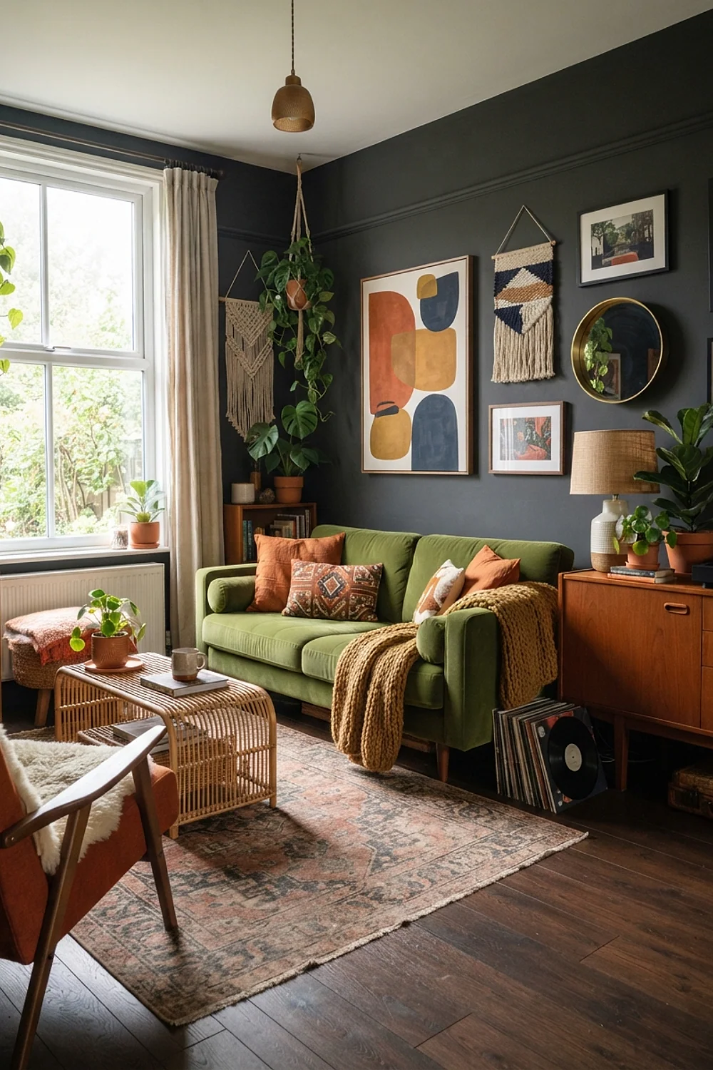
Avocado with burnt orange is the loudest classic pairing in the era, and it only works in proportion. One olive-avocado armchair and a single orange throw are plenty. Paint the walls neither.
Both colors have heavy yellow undertones, so they glow together under incandescent bulbs. Under cool LEDs they turn drab, so use 2700K bulbs.
Choose this for a larger room with a neutral rug. In under 150 square feet it overwhelms quickly.
Mustard and charcoal
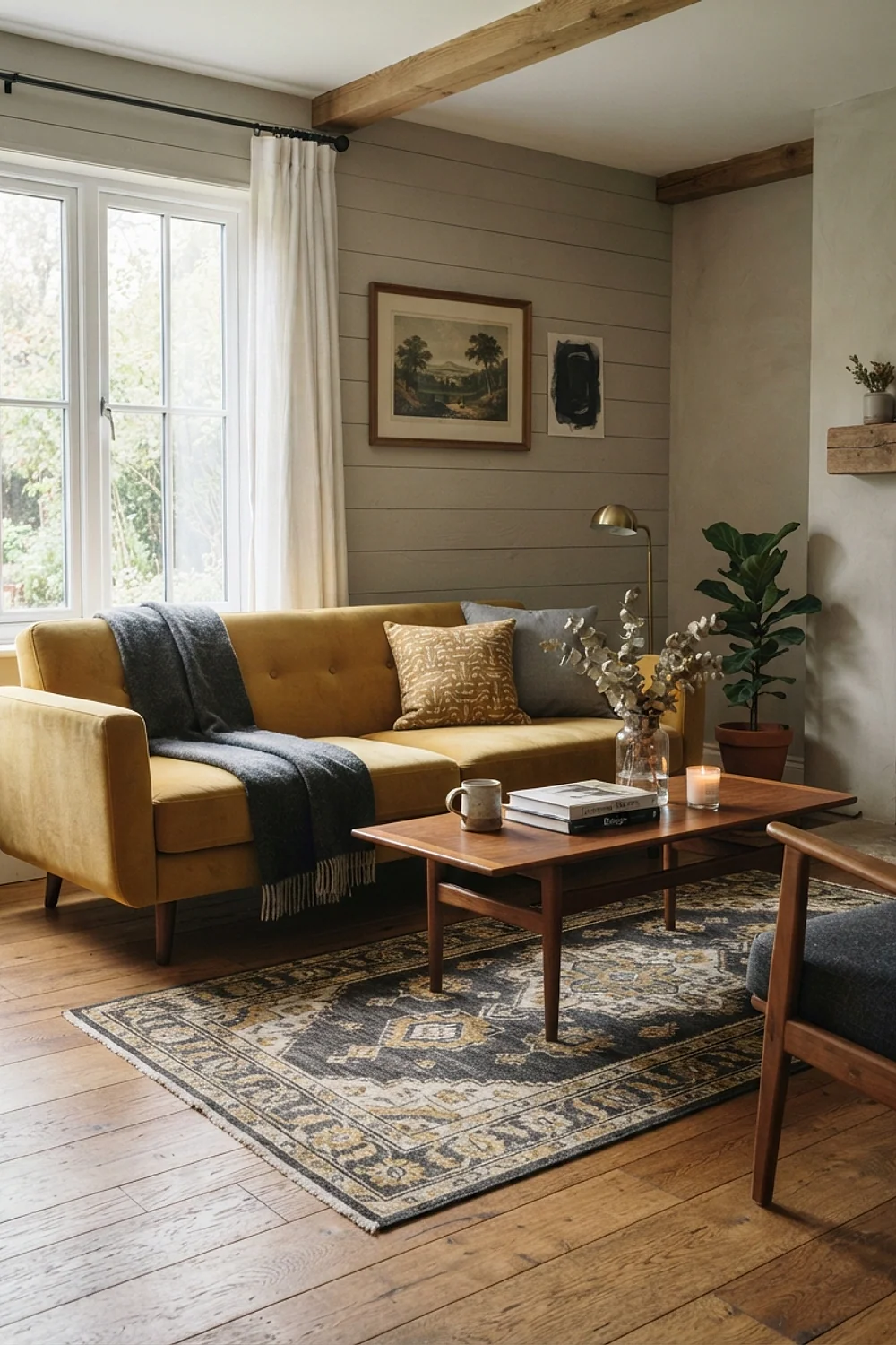
Charcoal gives mustard something to push against. A mustard sofa in a nubby wool against Benjamin Moore Kendall Charcoal looks sharp in the afternoon, when side light picks out the weave.
Here’s the thing: mustard fails in dim rooms. It sinks to brownish-olive, so keep this pairing for spaces with at least one large south or west window.
A dark wall also eats about 20 percent of your lamplight, so plan on one more floor lamp than you think you need.
Navy and cognac leather
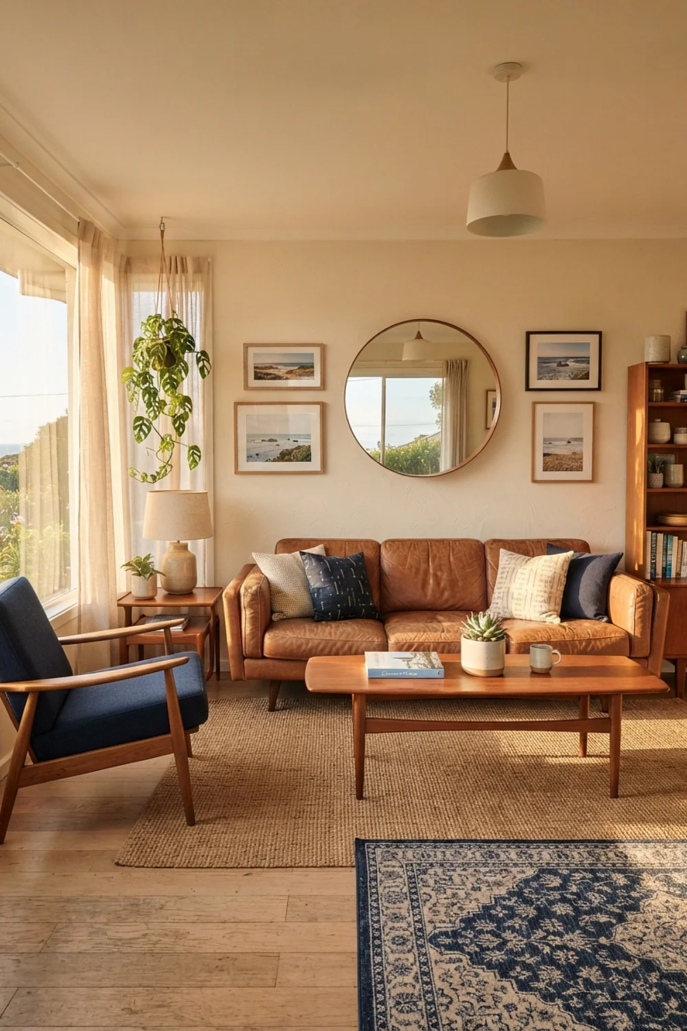
A deep navy such as Benjamin Moore Hale Navy behind a cognac leather sling chair is a pairing that rarely goes wrong. Blue and orange-brown sit opposite each other on the wheel, so each makes the other look more saturated.
Real leather chairs in this tone start around $700, but a good vintage find is often under $400. Expect natural creases, which look better than a flawless surface.
Keep the trim white or you’ll get a heavy, boxy room.
Teal and walnut
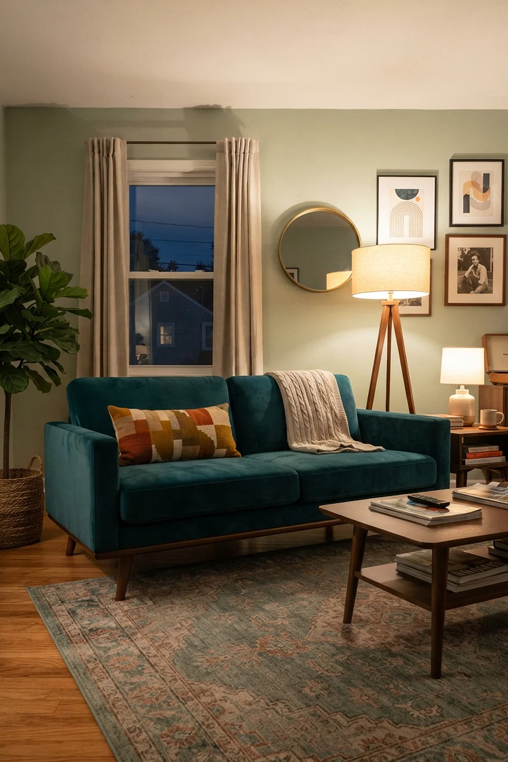
Teal reads cooler than most midcentury colors, which makes it the pick for rooms that run hot with sun. Benjamin Moore Aegean Teal on a single wall cools down a west-facing room and flatters walnut’s reddish cast.
Use it on the wall behind the sofa, not across all four. That’s where your eye lands first, and it frames the seating area.
Avoid a teal rug too. Two big teal fields in a room under 200 square feet start competing.
Greige walls and rust accents
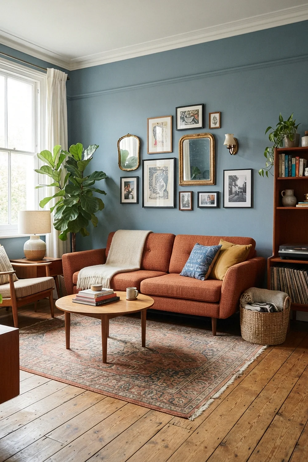
A greige wall like Sherwin-Williams Accessible Beige gives rust something to rest against. Rust is a muted red-orange, and on a beige base it looks earthy rather than loud.
Arrange rust in a diagonal across the room: a pillow on the sofa, a vase on the far shelf, a rug corner. The eye travels along it and the room feels larger.
Renters love this one, because beige is the least offensive wall color to repaint at move-out.
Olive and cream bouclé
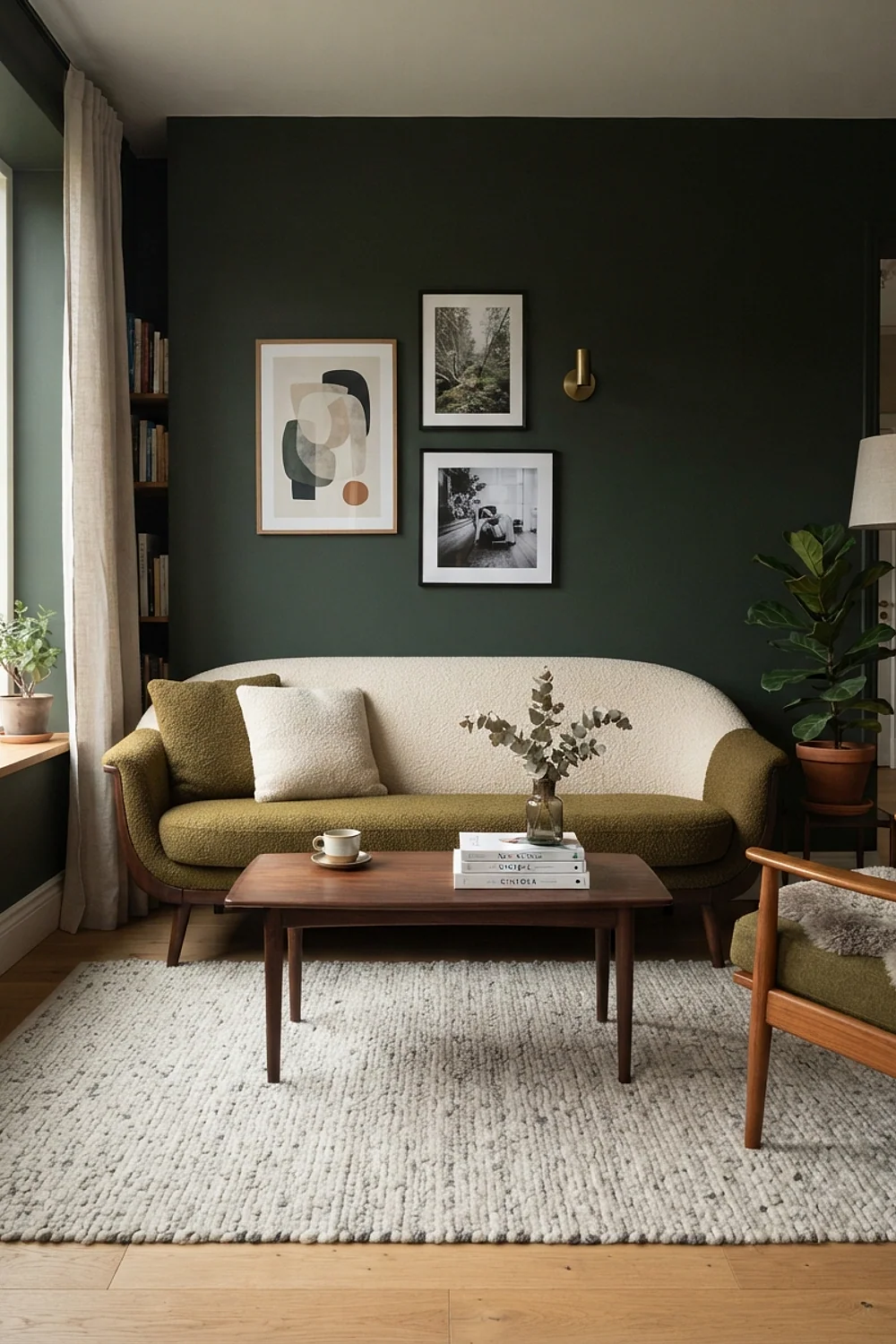
An olive wall with a cream bouclé sofa is soft where most midcentury palettes are crisp. The nubby fabric catches light on its loops, so the cream never reads as one flat block.
Pick a muted olive, something like Sherwin-Williams Evergreen Fog, not a bright yellow-green. The gray in it matters because it lets the cream look clean beside it.
It’s a fine choice for households with no small children. Cream bouclé and juice do not coexist.
Terracotta and chocolate brown
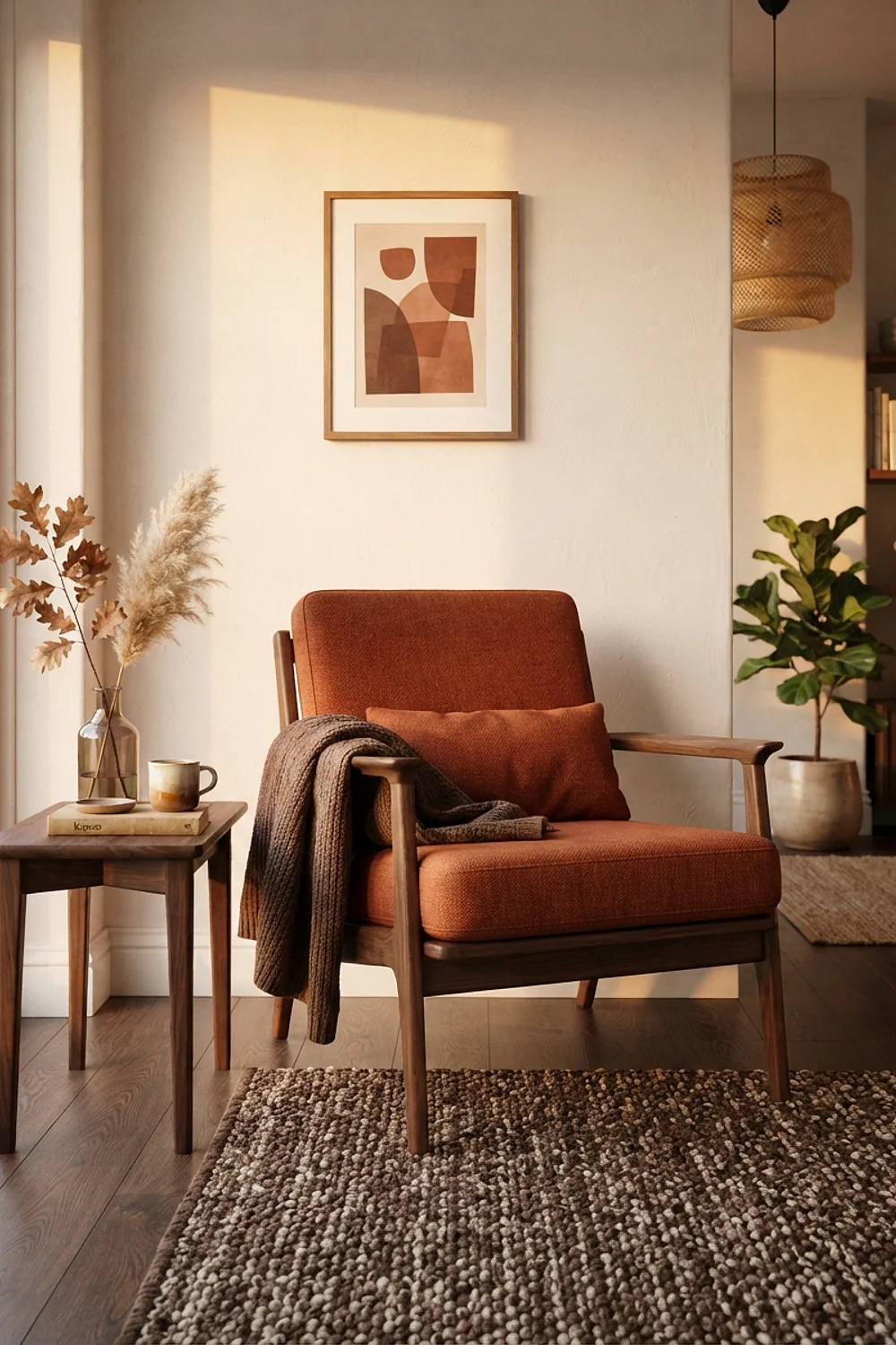
Terracotta against chocolate brown is a monochrome-adjacent scheme where both colors share a red base. Sherwin-Williams Cavern Clay on the walls with a dark brown velvet sofa feels like the inside of a good boot, in the best way.
A gallon of quality paint runs roughly $60 to $70, and this scheme needs just one wall in terracotta. Test it first, since clay colors can turn pink in morning light.
Use it where evening is the main time in the room.
Pale gray and brass
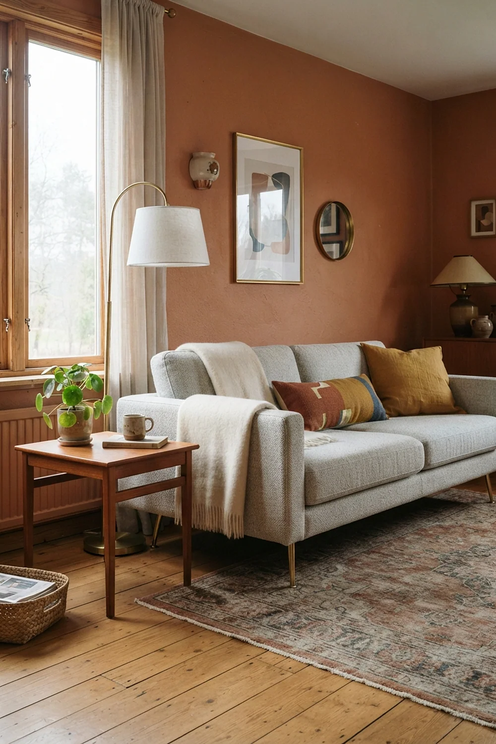
Pale gray is the cool answer to the style’s warm reputation. Benjamin Moore Edgecomb Gray, which leans slightly toward beige, backs up a brass floor lamp and gives the metal a glow it doesn’t get on white.
Brass has a yellow undertone, so avoid a blue-gray wall. The two will look as if they belong to different decades.
This suits smaller rooms, since light gray bounces about 60 percent of the daylight back into the space.
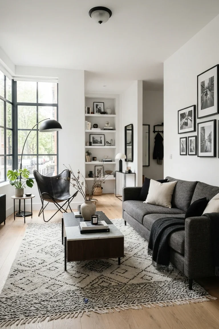
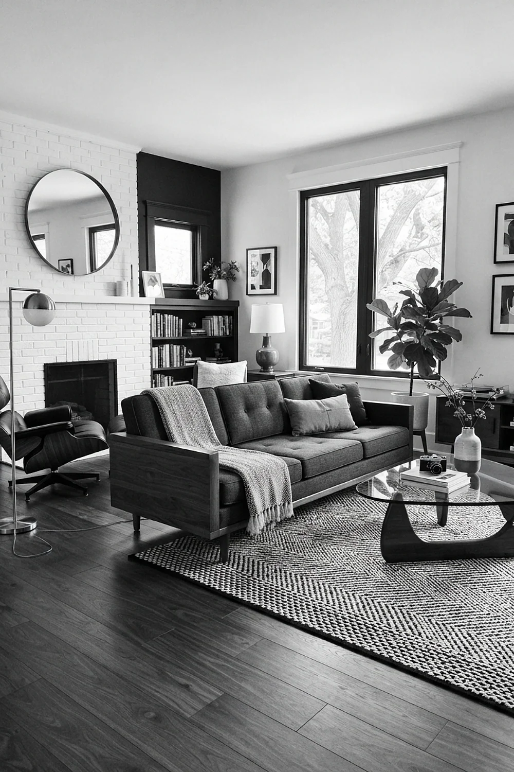
Black, white and oak
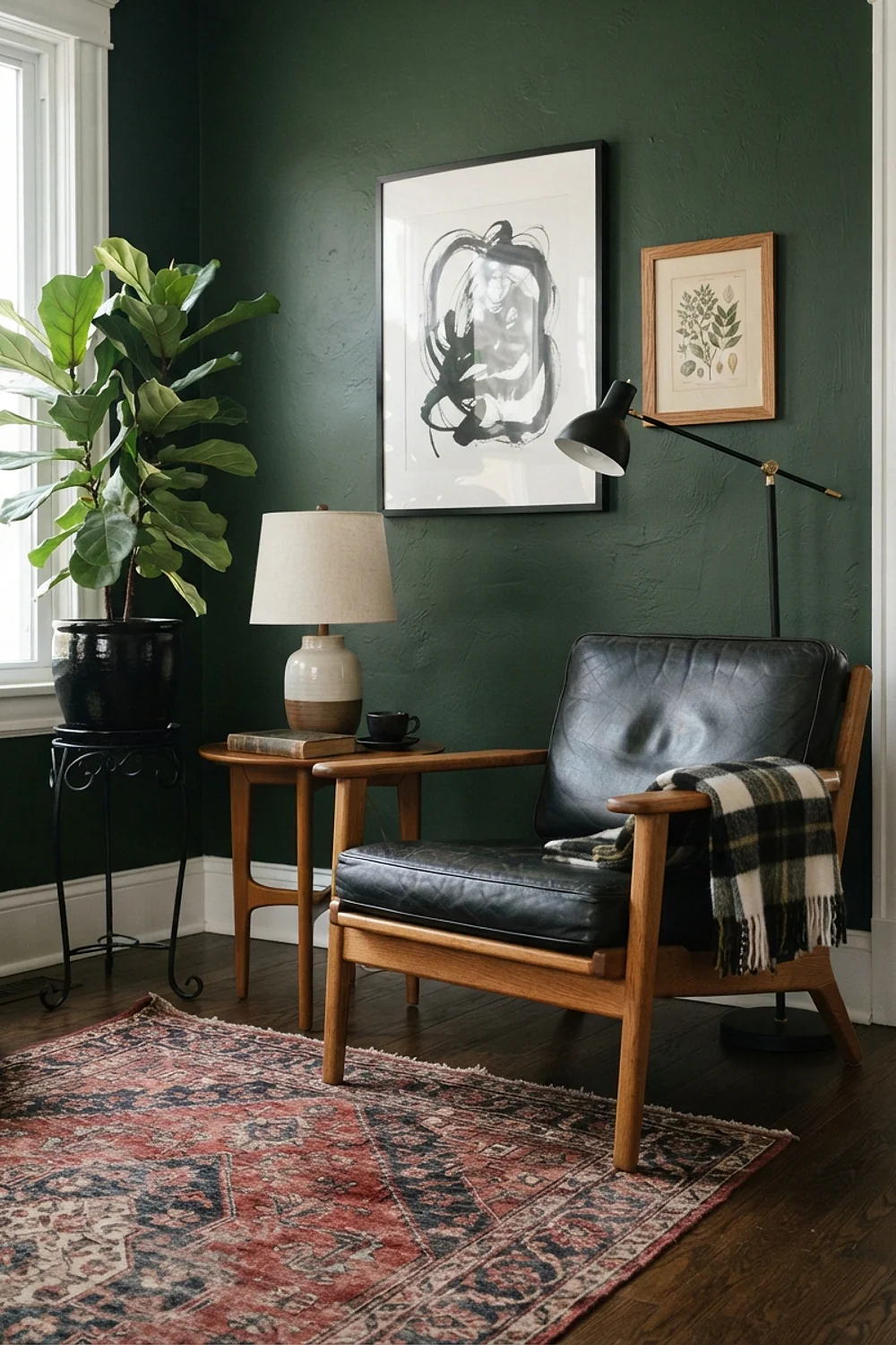
Black metal legs on a light oak coffee table, set against crisp white walls, give a clean graphic effect. The oak keeps the contrast from going stark, which is how this palette fails in an all-white room.
Black belongs in thin lines: picture frames, a tripod lamp, chair legs. Use it in a thick form like a sofa, and it dominates.
The combination is forgiving for people who dislike color, and it lets a single art print carry the personality.
Dusty blue and mustard
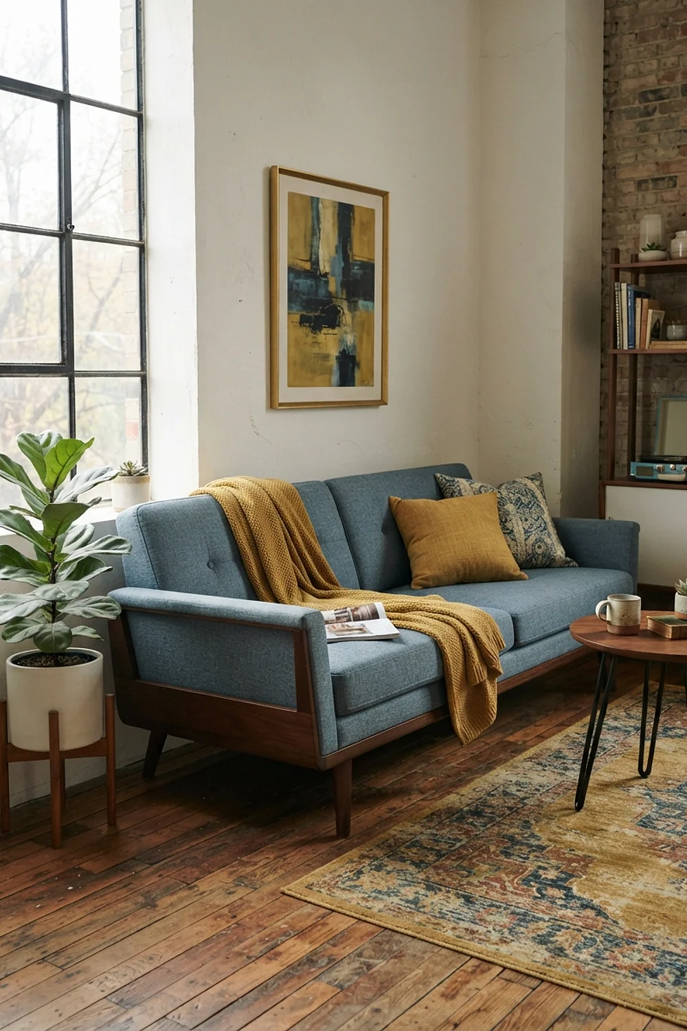
Dusty blue with mustard is the soft version of the navy and orange rule. Benjamin Moore Wythe Blue is gentle, and a mustard throw against it feels like a sunny afternoon rather than a loud statement.
Both colors need gray in them to stay muted. Without it, the pairing reads like a children’s nursery.
Keep it to an east-facing room if you can. Morning light makes blue look clean, and mustard picks up warmth as the day goes on.
Forest green and tan leather
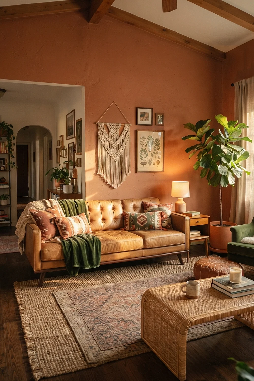
Forest green walls with a tan leather sofa have the feel of an old library. Benjamin Moore Salamander is deep enough to nearly read black at night, and the tan leather becomes the lightest thing in the room.
A tan leather sofa in the midcentury shape (low back, tapered legs) costs $900 to $1,800 new, though secondhand pieces are common. Check the cushions for sagging before buying.
Don’t use this in a room with one small window.
Burnt orange and aqua
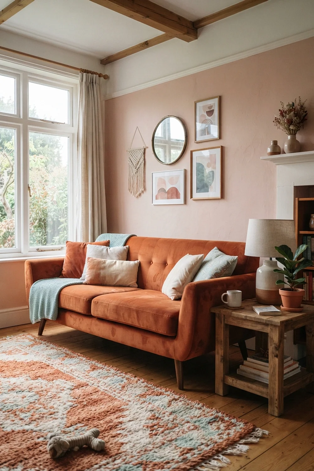
Burnt orange and aqua come straight from 1950s kitchens and atomic-age postcards. A single aqua ceramic lamp on an orange side table shows the pairing at its best, because the cool and warm hues are close in value.
The danger is balance. Equal amounts of each look like a theme park, so make one color roughly four times more present than the other.
It suits people who like a playful room and own a lot of vintage glassware.
Cream and espresso
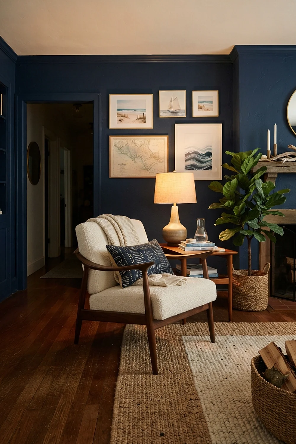
Cream and espresso brown is the quietest pairing on the list. Dark wood floors under cream walls make a room feel calm, and the contrast is strong enough to define edges without color at all.
This is a good base for a gradual build. Add one color at a time, an olive pillow first, a rust blanket later, and the palette never feels cluttered.
The weakness is a flat mood in rooms with no daylight, so add texture through wool and linen.
Taupe and black accents

A taupe wall like Benjamin Moore Pale Oak softens black accents so they feel intentional rather than harsh. A black Eames-style chair against it looks like furniture, not a hole in the wall.
Taupe has both gray and brown in it, which is why it adapts to different woods. It’s less likely to fight your floor than a pure beige.
Test it at dusk. Taupe can shift toward purple in cool evening light, and that surprise is easier to catch before the walls are done.
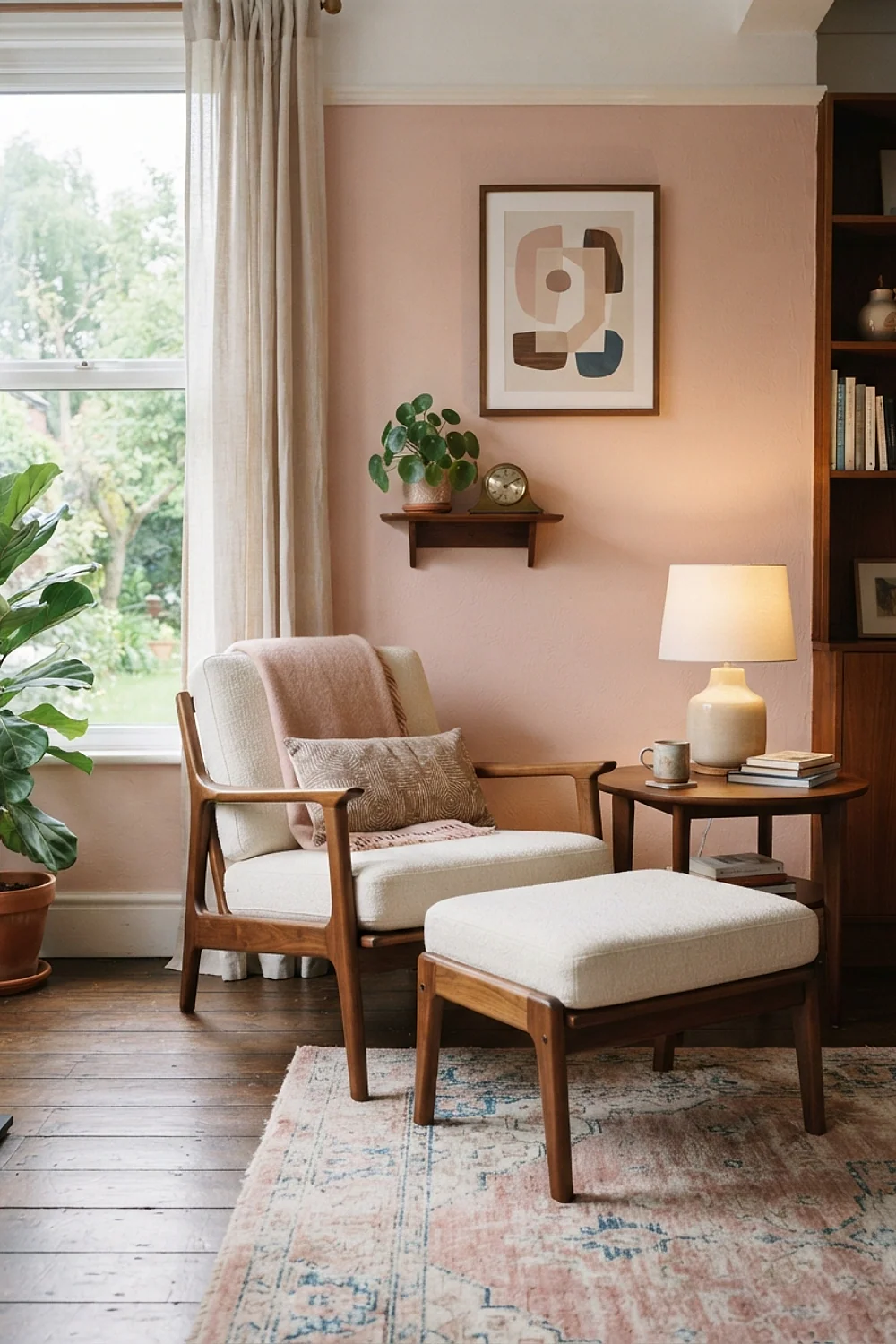
Sage and blush

Sage with blush pink sounds modern, but it echoes a lot of 1950s living rooms. A blush velvet chair against sage walls is gentle and works in a living room with plenty of daylight and fewer than three people sitting in it.
Keep the pink dusty, with gray in it, not bubblegum. A throw pillow at about $35 tests the idea before you commit to a sofa.
Warm brass hardware ties the two together.
Chocolate walls and white trim

Painting walls a deep chocolate with crisp white trim is bolder than people expect, and it flatters mid-tone wood furniture. Because the room recedes visually, a 12 by 14 foot space can feel intimate rather than small.
Counterintuitively, dark walls often make a small room feel bigger. The corners disappear, and you stop reading the walls as a boundary.
It needs enough lamps, though. Plan three light sources at different heights, none above eye level.
Mushroom and olive
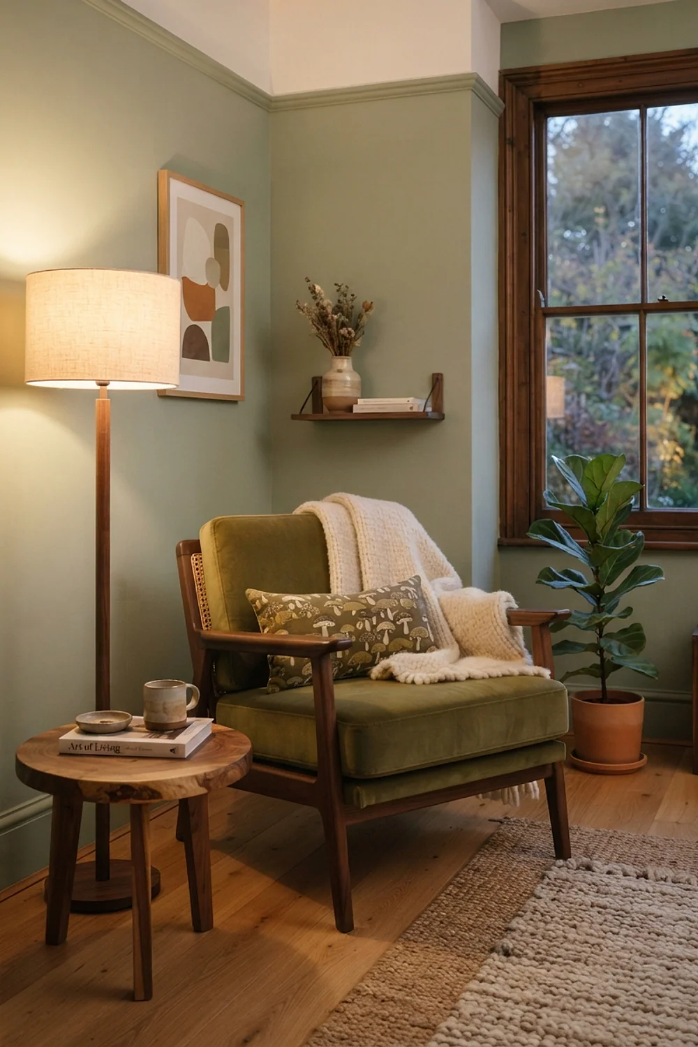
A mushroom-gray wall paired with olive upholstery sits in the in-between zone where neither color shouts. Sherwin-Williams Repose Gray with an olive wool sofa gives a layered look that holds up in any light.
The mushroom needs a hint of brown. Cool grays beside olive make the olive look dirty.
This is a smart pick for open-plan rooms, because the neutral base blends into adjoining spaces without a hard color break.
Soft peach and deep teal
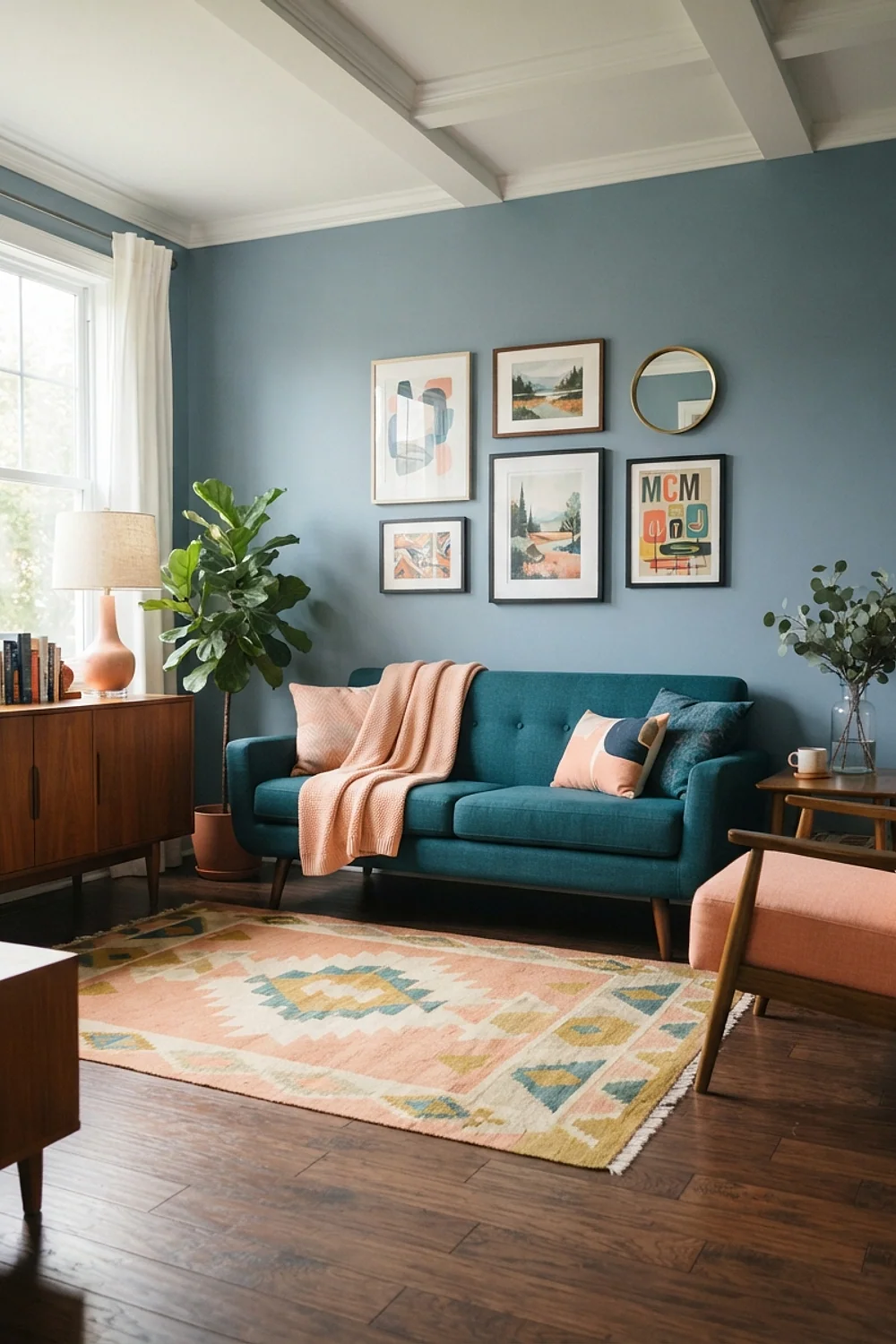
Peach and deep teal are opposites with similar softness, which makes them easier to live with than red and green. A peach wall in a sunroom with a teal armchair feels playful and lived in, not themed.
Keep the peach pale and the teal dark. If both are mid-tone, they blur into each other.
Choose this for a room that mostly gets used on weekends, since it’s a mood color, not a work-from-home one.
Charcoal and tangerine
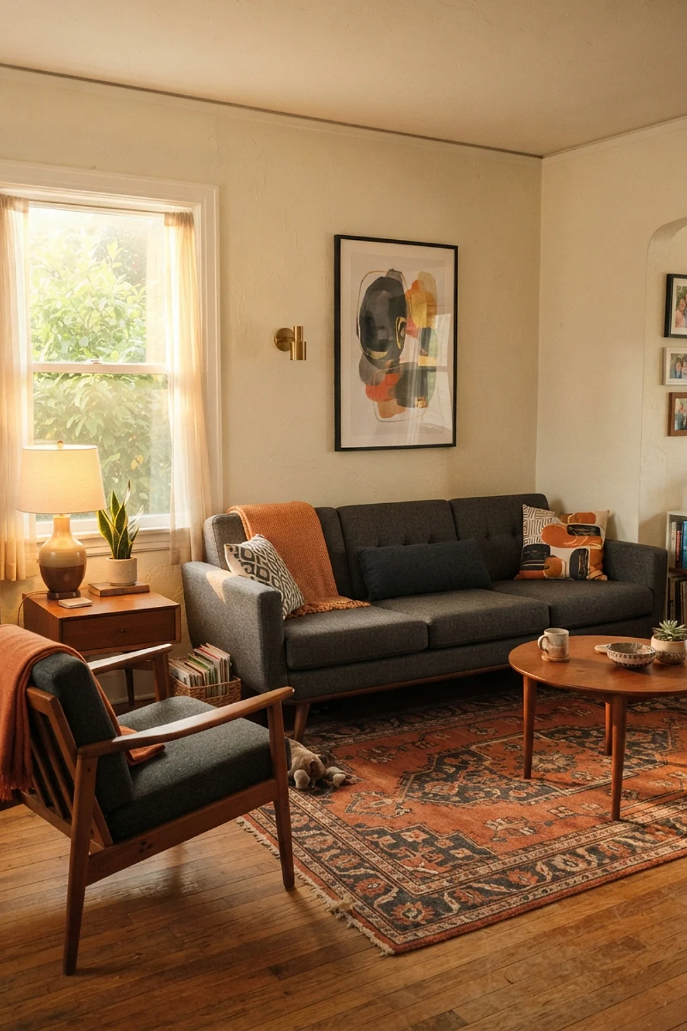
A charcoal sofa with a single tangerine pillow cluster is graphic and direct. The orange is the only warm color in the room, so it reads like a signal flare against the dark gray.
A set of three pillows in tangerine wool costs around $80 to $120 total, a small price for this much punch.
Don’t add a second accent color. The pairing works because it’s restrained.
Butter yellow and walnut
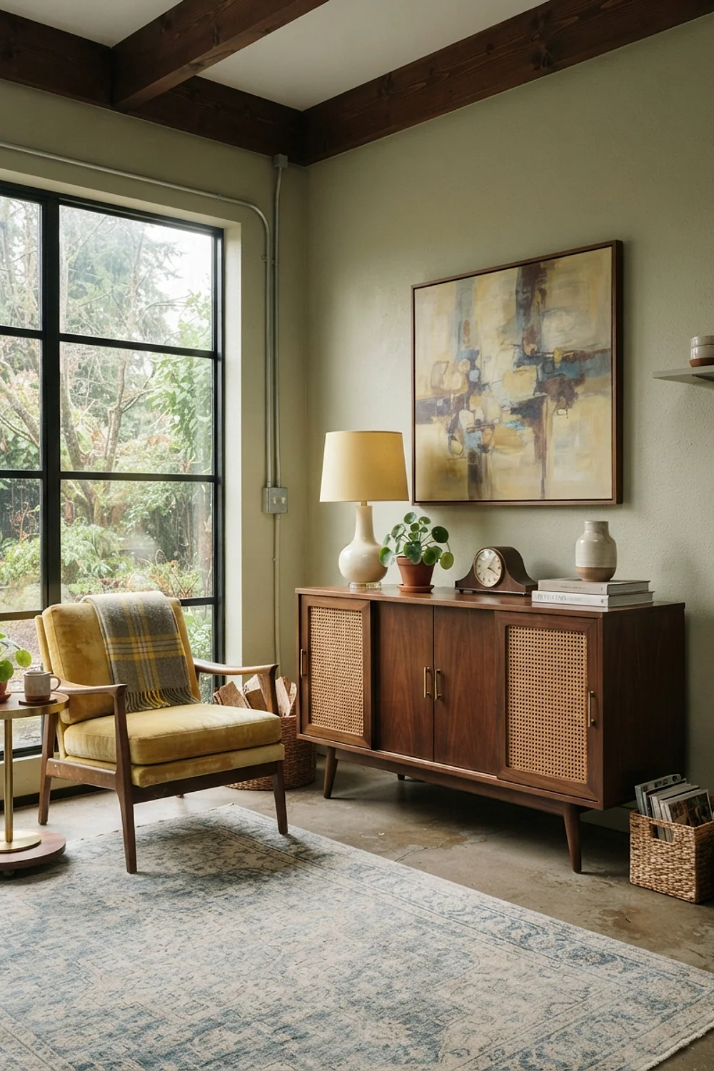
Butter yellow on the walls with walnut furniture gives off golden light even on gray days. A pale yellow like Benjamin Moore Hawthorne Yellow can look sunny on a February afternoon when everything outside is slate.
Yellow is risky because it can turn green under blue-leaning bulbs. Use 2700K lighting and test three swatches on different walls.
North-facing rooms benefit most. They need color that holds its own without much sun.
Slate blue and oatmeal
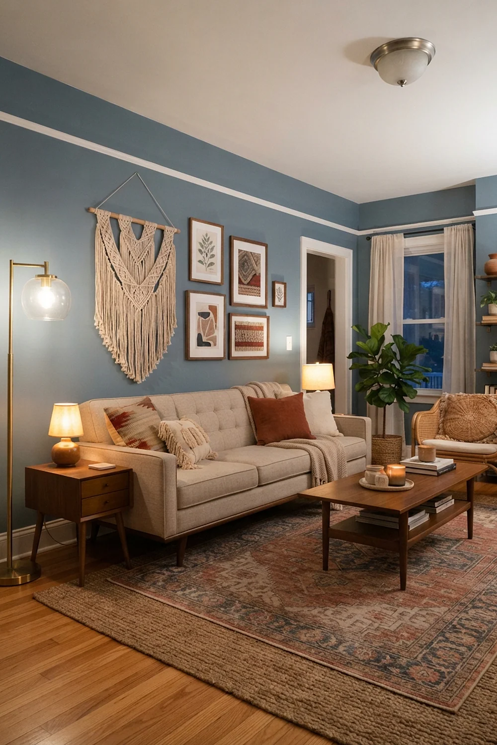
Slate blue walls with an oatmeal linen sofa produce a quiet, almost Scandinavian read. Oatmeal is a yellow-gray neutral that keeps the blue from going icy.
Use wool or heavy linen for texture. The blue plus cream combination can get flat without a tactile layer.
It fits a living room that doubles as a reading space, since the contrast is gentle on tired eyes at 9 p.m.
Moss and rust
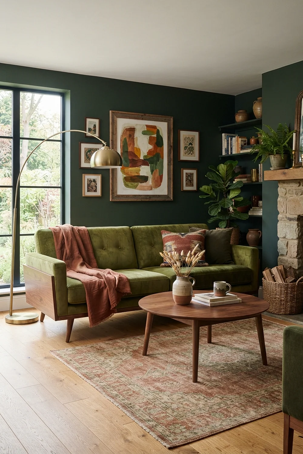
Moss green and rust share a yellow undertone, which is why they feel related rather than opposed. A moss velvet sofa with a rust kilim rug is a solid pairing for a room with wood floors.
Look at the rug’s other colors. A kilim with black or cream detail keeps the moss and rust from merging into brown.
It’s an autumn-feeling palette that works year-round if you keep the pillows light in summer.
Off-white and one red
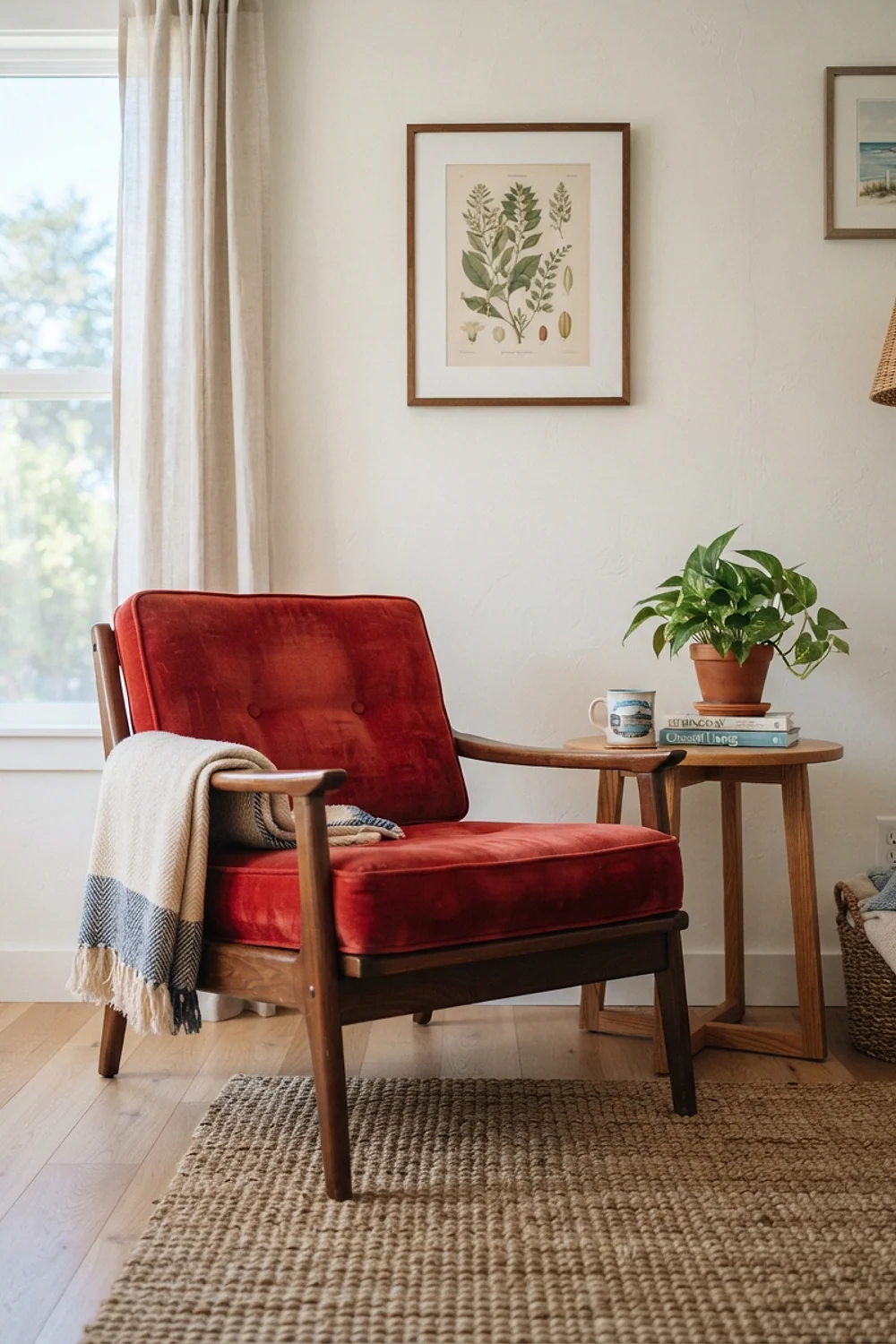
An off-white room with a single red object, like a lacquered chair or a vintage poster, is the minimal take. Sherwin-Williams Alabaster holds the walls, and Benjamin Moore Caliente shows what a true red looks like.
A single red armchair from a secondhand shop can run $150 to $350. It becomes the room’s focal point without overwhelming it.
Don’t add a second red object. One is a choice, two is a theme.
Greige and chartreuse
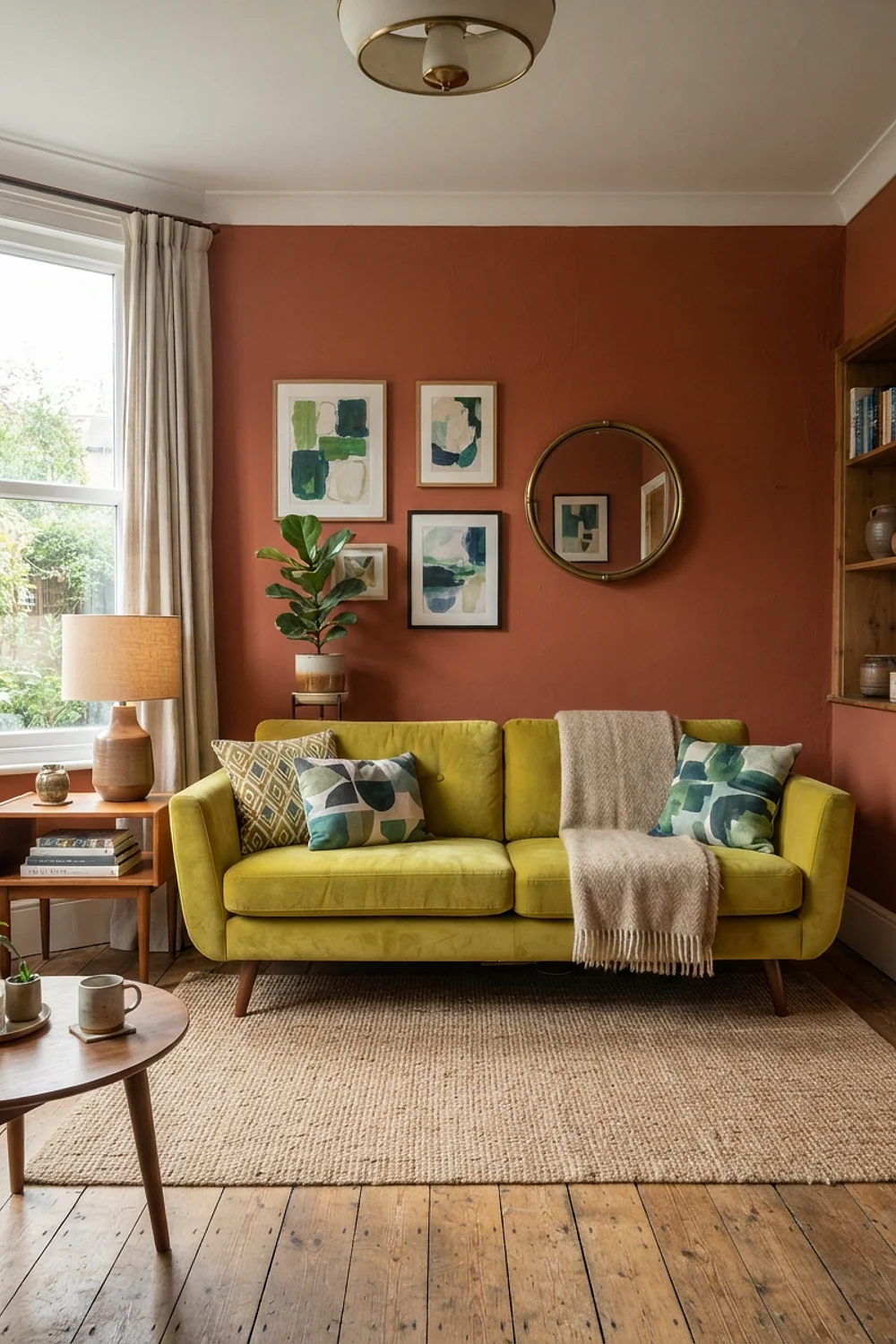
Chartreuse is the hardest color on this list, and greige is its best partner. A chartreuse pillow or ceramic stool on a greige background feels fresh, because the neutral absorbs the shock.
Use it in small doses: a bowl, a throw, a lamp base. At sofa scale, chartreuse tires the eye within a week.
It suits people who rearrange often, since small objects are easy to swap out.
Plum and brass
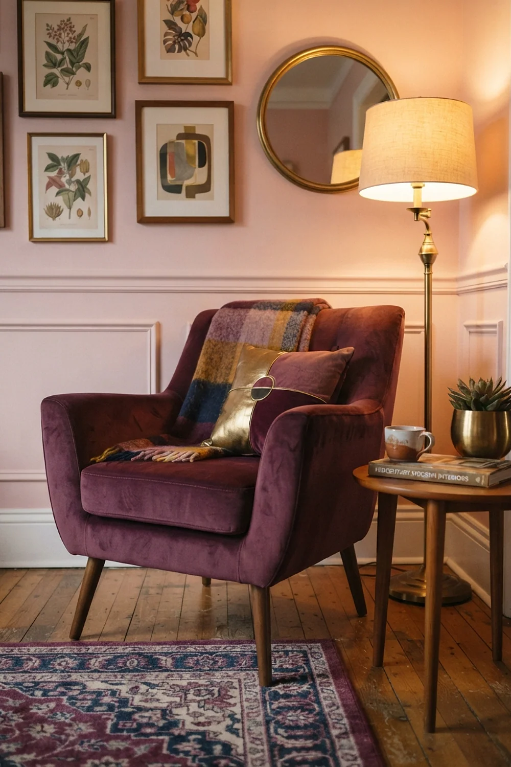
Plum is an underused midcentury color, and brass makes it look rich without being fussy. A deep eggplant velvet chair beside a brass floor lamp looks best in evening light, when both colors deepen.
Avoid pairing plum with silver or chrome. The blue undertone clashes with the metal’s coolness.
It’s a bold choice for a smaller living room used mainly after dark.
Warm gray and pumpkin
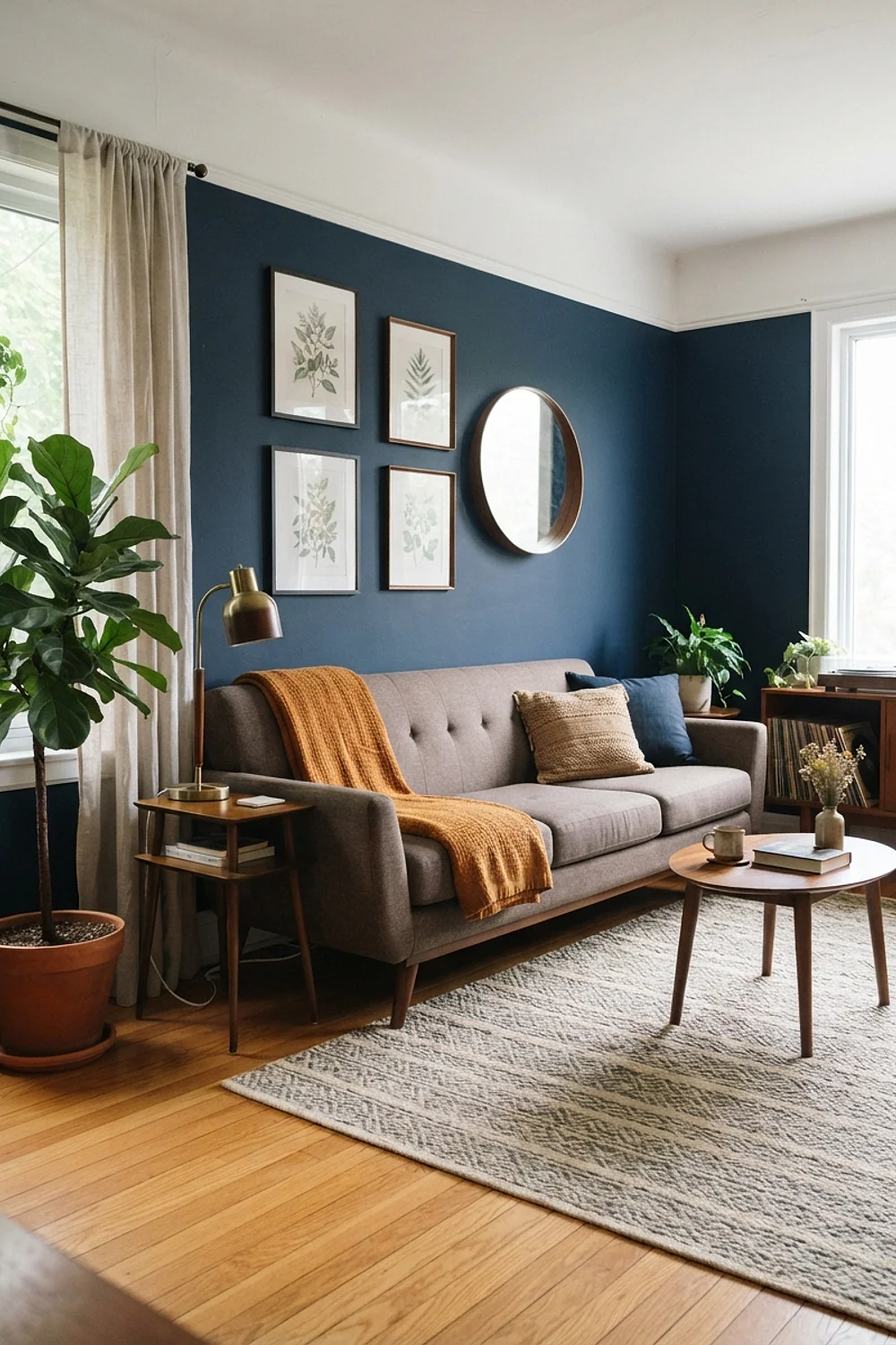
A warm gray wall with pumpkin accents is the autumn-ready pairing. The gray keeps the orange from looking like Halloween, because it dampens the saturation.
Keep the pumpkin to velvet or wool. A glossy plastic version looks cheap, while a textured fabric catches light softly.
The palette suits families who want color without a heavy commitment, since gray walls are neutral enough for resale.
Brick red and cream
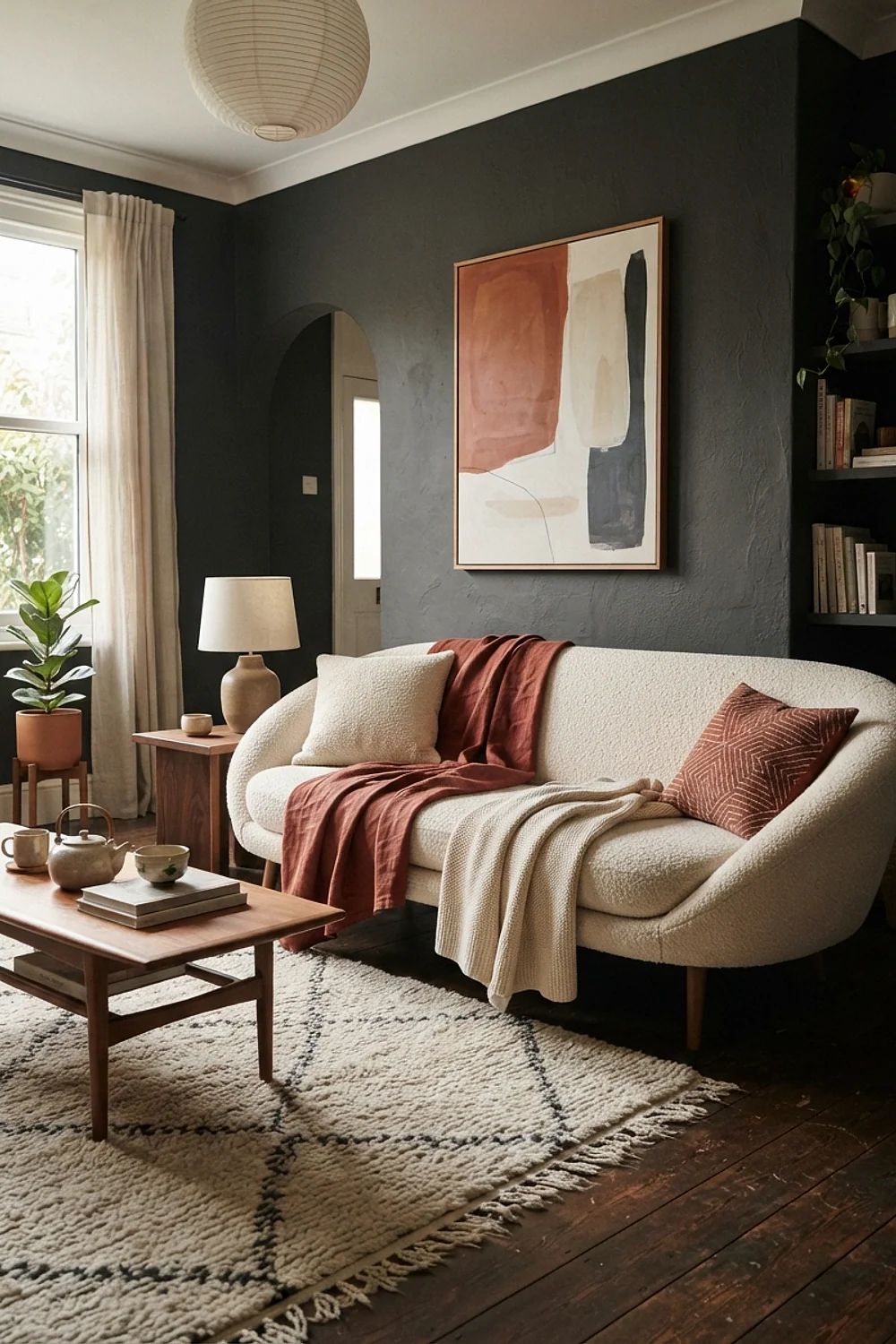
Brick red with cream is a classic that looks like an old diner in the best way. A cream wall with a brick-colored sofa costs little to try with a $40 throw before you commit to upholstery.
Choose a brick with brown in it. Pure red turns aggressive, and brick keeps things grounded.
It works in a living room with lots of natural wood, which balances the heat of the red.
Cool white walls with teak and black metal
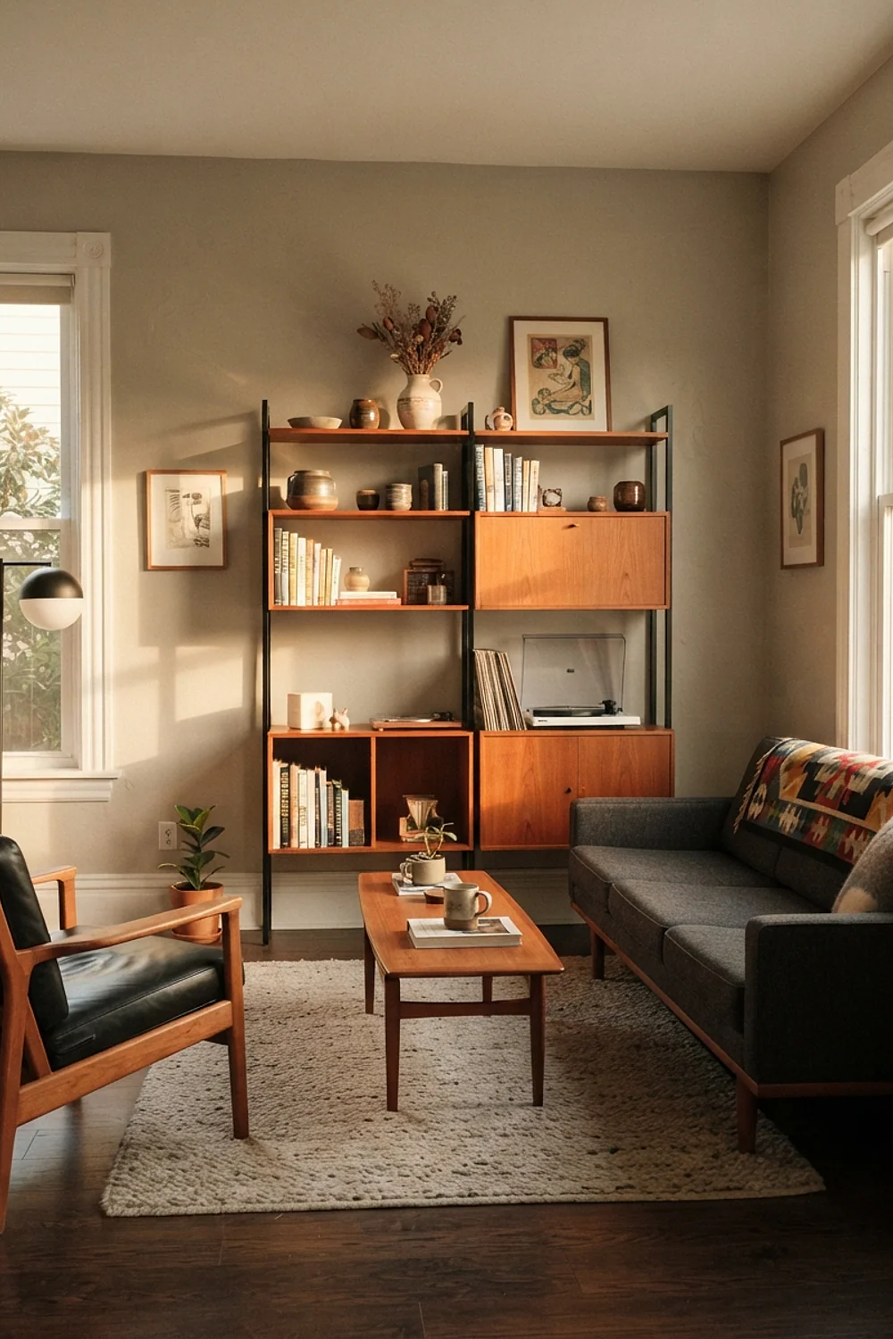
Cool white walls beside teak can look harsh if the white leans blue, but in a north-lit room they correct the yellow cast. The teak warms the space, and black metal legs sharpen it.
Choose a white with very slight gray, not a stark one. It tames the glare from big windows.
It’s a smart answer for rooms where daylight is cool and the wood needs to carry the warmth.
Tobacco brown and sky blue

Tobacco brown leather against sky blue walls is a relaxed pairing, with the energy of a vintage travel poster. The blue lifts the leather’s heaviness without competing.
Pick a soft sky blue rather than a bright one. Too saturated, and it overpowers the brown.
It suits a living room with a casual, lived-in feel, where the leather can wear naturally over the years.
Wood tones with one saturated rug
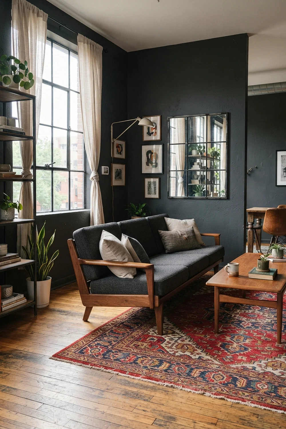
Walls, sofa and floor in similar wood and cream tones, with a single saturated rug, is the safest way to try bold color. A 5 by 8 foot rug in teal, orange or deep red carries the whole room.
Rugs are the easiest thing to change. If the color wears out its welcome, you’ve lost one object, not a paint job.
Pick a rug with a pattern that includes a neutral from your walls, so the color feels connected.
Testing colors before you commit to a midcentury modern living room
Paint chips lie. The 2-inch card under fluorescent store lighting tells you nothing about a wall that gets raking sun at 4 p.m. and lamplight at 9. Use samples, and use enough of them.
- Paint two 2 by 2 foot patches on separate walls, one near the window and one in the darkest corner.
- Check both at 8 a.m., noon, 4 p.m. and after dark.
- Hold the wood sample or fabric swatch directly against the patch.
- Leave the samples up for at least three days, including one overcast one.
Sample pots run about $8 each, which is cheap insurance against repainting a whole room. Paint directly onto the wall for a first look, since that’s where the color will live.
…actually, no, scratch that. Paint onto white poster board instead and tape it up. The existing wall color bleeds through a thin sample and skews what you see, and you can move the board around the room.
Look at the board beside your largest wood piece. That’s the comparison that tells you whether the undertones agree.
It’s not foolproof. But it works.
What went wrong
A midcentury modern living room with the wrong color isn’t a disaster, and you rarely need to repaint everything. Identify what’s wrong first: too yellow, too dark, too cool, or too much of a good thing.
- Too yellow: add a gray or blue-leaning element nearby, like a slate pillow or a navy print.
- Too dark: bring in a lighter rug and a second lamp at sofa height.
- Too cool: swap bulbs to 2700K and add one wood or leather piece.
- Too loud: repeat the accent color in a smaller amount elsewhere so it reads as a theme, not a mistake.
If the wall color itself is wrong, a quart of the right paint costs around $25 and covers one accent wall. Painting only the wall behind the sofa often fixes the whole room.
Here’s the thing: most color problems are really undertone problems. Match the undertones of wall, wood and fabric, and the saturation usually sorts itself out.
How to get the look
Use a rough 60-30-10 split. About 60 percent of the room is your wall and large-furniture neutral, 30 percent is wood and a secondary color, and 10 percent is the loud accent.
- 60 percent: walls, sofa, large rug in a quiet tone.
- 30 percent: wood furniture, curtains, a secondary color.
- 10 percent: pillows, art, one lamp or vase.
Repeat each accent at least twice, at different heights. A rust pillow on the sofa and a rust vase on a high shelf makes the eye travel.
One swatch at a time
A good midcentury modern living room comes together slowly, one tested color at a time. Pick the wood tone, match the neutral to its undertone, then add saturated accents in small, repeatable doses.
Save or pin this list so you can come back to it when you’re ready to start. First step: tape one poster-board sample next to your biggest wood piece and look at it at 4 p.m.
Frequently asked questions
What is the best paint color for a midcentury modern living room?
A creamy white or greige is the safest base, such as Benjamin Moore White Dove or Sherwin-Williams Accessible Beige. It lets wood and saturated accents do the work. Match the neutral’s undertone to your wood.
Can I use dark paint in a small living room?
Yes, and it often works better than expected. Dark walls blur the corners, so a room of 12 by 14 feet can feel cozy rather than cramped. Add at least three lamps at different heights to compensate for lost light.
How many accent colors should a midcentury modern living room have?
Two or three is the ceiling. Repeat each in at least two places, at different heights, so they read as intentional. A fourth color usually tips the room into clutter.
Does a north-facing room change which colors work?
Light that cool pulls colors toward blue and gray. Choose paints with a yellow or red undertone, such as butter yellow or terracotta, to counter it, and use 2700K bulbs after dark.